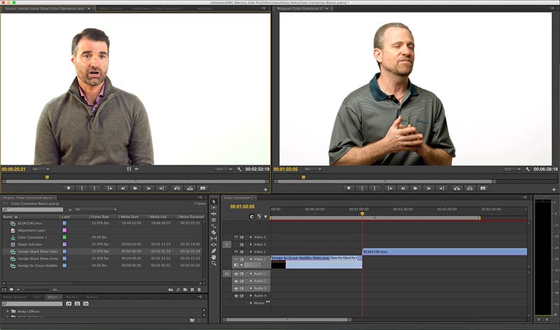
While there are a lot of great color correction tutorials online, sometimes all one needs is a simple breakdown of the terms and tools and how they relate to color correction, grading or otherwise. Yes, we all want to achieve that cinematic look in post. But there are some fundamental principles at play here. And, sure, you can add any effects filter you want but if you don’t know the difference between luma and gamma, or believe that by simply adjusting the brightness/contrast will somehow improve your dynamic range… then all you’re left with is a visual akin to a filtered image on Instagram.
Not that there’s anything wrong with that. Especially if it’s the kind of look you want to achieve anyway. However, color correction is not just about making your image look pretty. It’s about matching your footage from clip to clip. Not only that, it is also about hitting a standard that can be universally accepted on a big screen, a computer monitor or your spanking new UHDTV.
There are two principal factors you need to be cognizant of while color correcting your footage: color balance and dynamic range. “Color balance” refers to balancing the amount of red, green and blue recorded onto your footage. “Dynamic range” refers to the number of levels of black to white. The greater the dynamic range, the closer your footage approximates what the human eye can see. In fact, it is the dynamic range component that will allow your digitally recorded footage to look like analog film stock as film stock has always had a wider dynamic range than video.
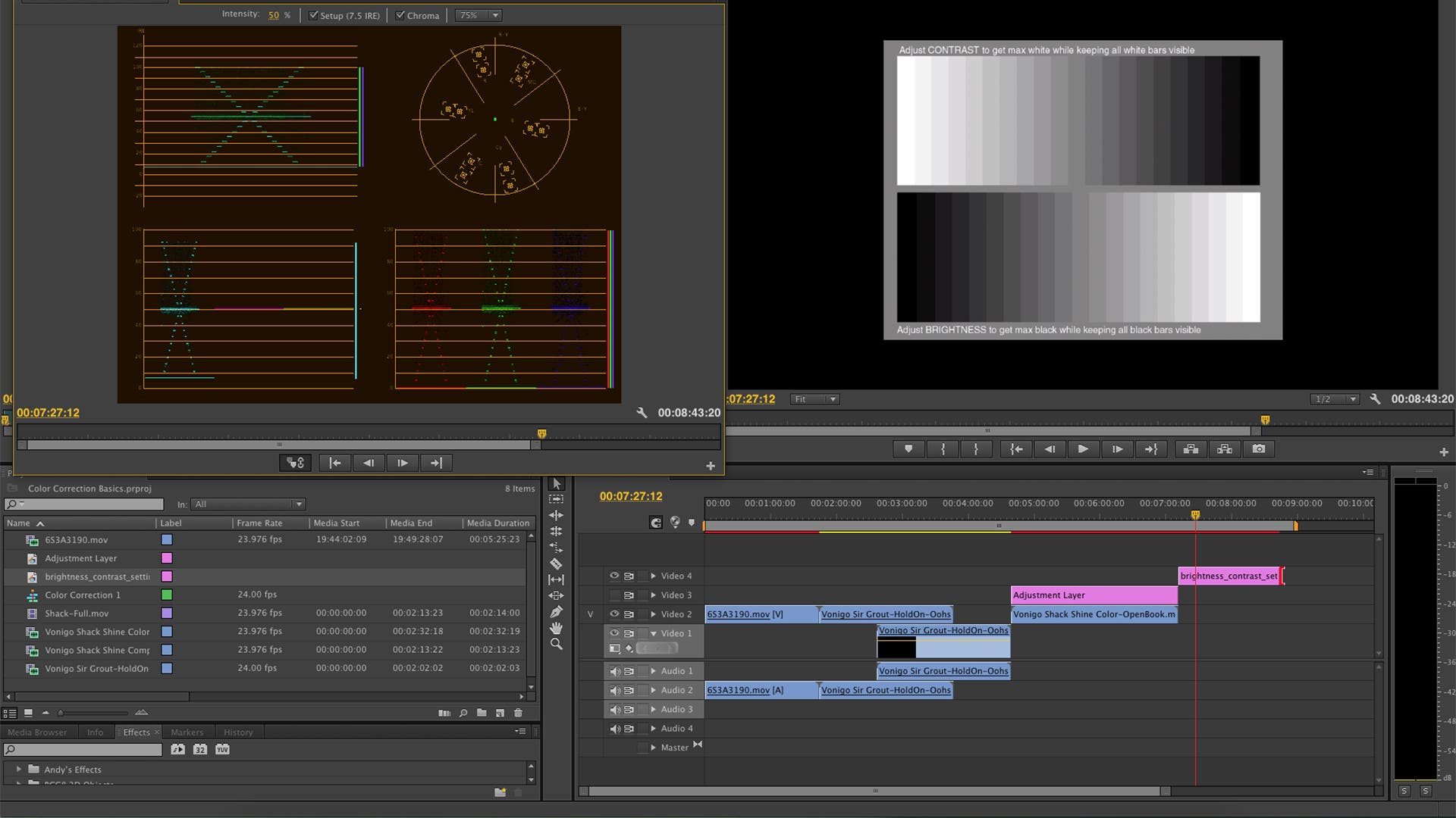
Check out the contrast chart appearing in the image above. It features a basic gradient of blacks through whites. This chart helps to determine whether the dynamic range is maintained depending on how bright or dark you want the visual to be. Which is a very handy tool to have. Especially when it comes to the point I am about to make with regard to the brightness/contrast effect. You know what I’m talking about. Not only is the brightness/contrast filter the most over used plugin on any non-linear editing system, it is quite possibly the most unnecessary.
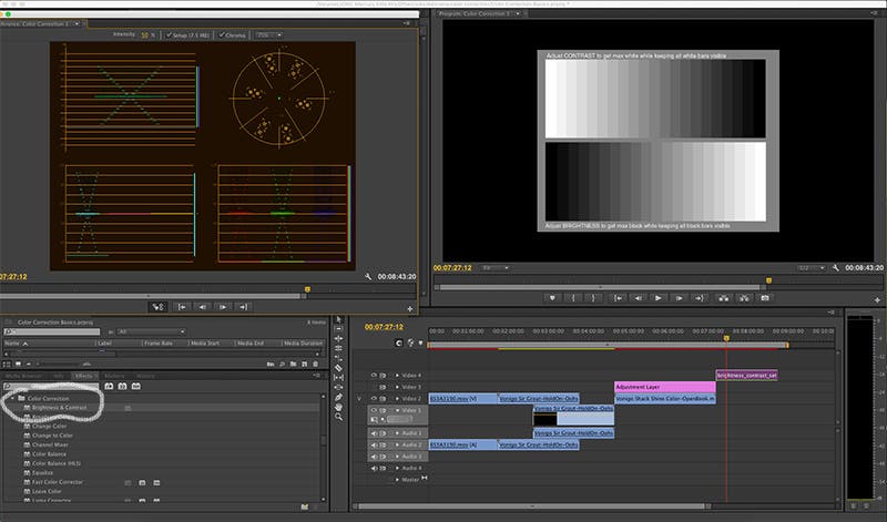
Now let’s check out the image again but this time with the brightness/contrast effect applied while raising the brightness factor a bit.
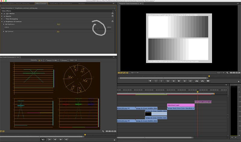
See how the different shades of black blend together? And how it’s the same with the whites? You’re losing that much ballyhooed dynamic range thanks to the brightness & contrast effect. So never, ever use this if you want to brighten or darken your footage. You’re much better off using the simple Fast Color Corrector in Premiere or Three-Way Color Corrector in Final Cut Pro. Basically, use any color corrector effect that allows you to adjust the input levels instead of the “brightness” or “contrast.” Take a look at the image below.
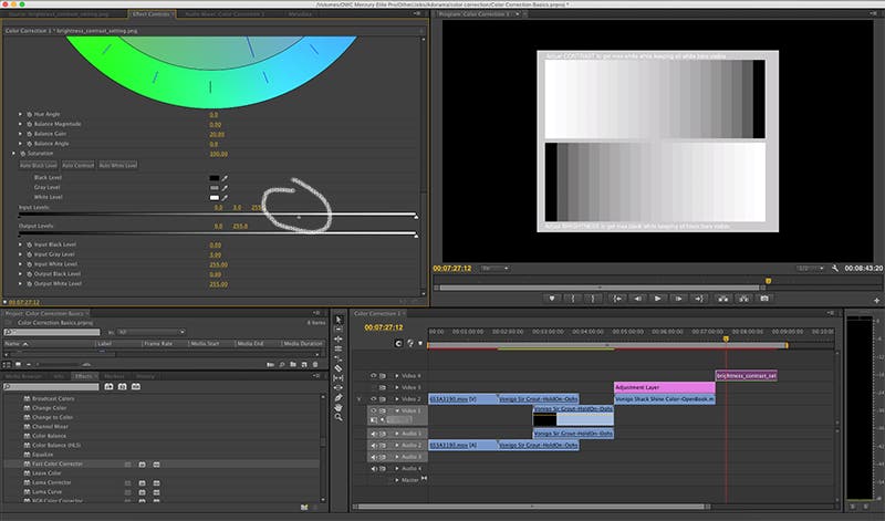
The input levels will lighten or darken your image without losing the dynamic range. So, you know, use that instead. Anywho… If you want to give your image more contrast (for some it gives it more of a film-like look), you would use “level” to darken that image. Hence the term “crushing the blacks.” You are simply making the blacks look darker.
By the way, you might be thinking, “okay, so the input levels are what I should stick with when I want to darken or lighten the image. But what are the output levels?” Good question. Basically, the output level is there to reign in whatever input level you came up with so that it meets broadcast standards. In other words, it doesn’t matter how much dynamic range is contained within an image if the average monitor or television set cannot properly display it. So the output level maximizes the amount of dynamic range for that standard.
Now let’s move on to “color balance.” Anything viewed on a monitor or television set is made up of reds, greens, blues (and everything in between, e.g. cyan, magenta, etc.). It’s a very simple concept to grasp. So while you’re in the process of color correcting, you want to ensure above all else that the reds, blues, etc. are about as evenly balanced as possible. And there are many tools in a post-production application that can help you out with that. Especially when you’re editing two clips together that were shot under different lighting conditions. Or if one clip wasn’t properly white balanced whereas the other was.

If you’re using a Three-Way Color Corrector or Fast Color Corrector, you will see three controls titled “Gamma,” “Pedestal” and “Gain.” Messing with the visual’s gamma will either lighten or darken the shadows (or the blackest of the black) in your film. Messing with the pedestal will lighten or darken the mid-tones of your film. And at this point you can pretty much guess what playing around with the gain will yield. But unlike the level control (which adjusts the lightness/darkness of your dynamic range), the gamma/pedestal/gain controls the lightness/darkness of the RGB colors recorded on that image.
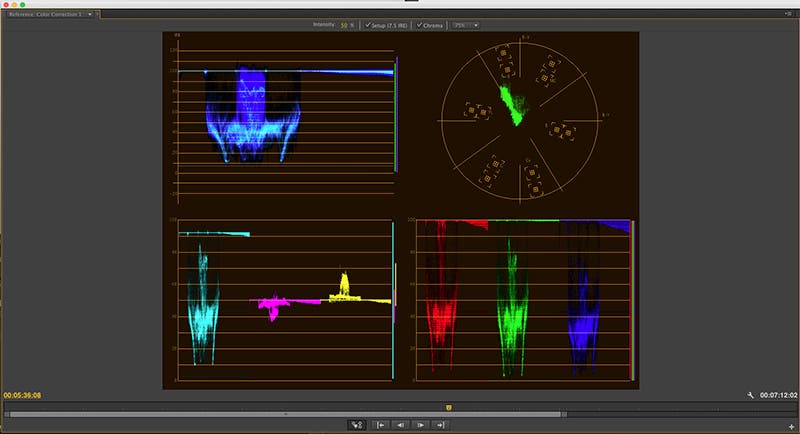
This is important to note when it comes to balancing color and how this relates to using tools like scopes, waveforms and curves. Scopes and waveforms act as visual charts displaying the intensity, saturation or lack thereof of the RGBs. This is how we can easily balance the colors. For example if the reds represented in one scope seem less than that of the blues, we can adjust the amount or size of those reds to match those blues. Or vice versa. These tools are also handy when you don’t have a carefully calibrated monitor to view your footage on. They act as guides. Whereas the curves control the intensity of the RGB represented on each scope or waveform.
Going back to the example of matching one clip to another, you can assess the amount of RGB in your source clip and use that data so that the other clip can match it. And that, my friends, is color correction.
Wait! We’re not finished yet as there are three more terms you should be acquainted with. “Luma” refers to the brightness or luminance of aspects of a certain color. Or rather, the percentage of blacks, greys and whites appearing within that image. If you desaturate your footage, all you’ll have left is the luma (the image will become black n’ white). “Gamma (not to be confused with the gamma that adjusts the darkness of a color)” refers to the luminance visible to the human eye as it appears through a broadcast signal or your computer monitor. And “Chroma” refers to the range of colors that appear once the red, green and blue is combined. In other words, if you’re messing around with either the hue or saturation, you’re changing the chroma. Not only that, by selecting a specific color with a chroma key, you then eliminate that color altogether. Hence the whole idea behind using green screens. They get “keyed out” because of the chroma.
One more thing, I promise. Every color corrector has the ability to adjust the “white balance.” Which is kind of unfortunate because, well, you know, the footage itself should have been white balanced before it arrived on the editor’s desktop. So if you hear tell of a producer, videographer or director dismissing their efforts with a bone headed “we can fix it in post,” slap the back of their heads immediately. Because it should never, ever have to come to that. However, this is an issue that comes up in post-production more often than not. And ergo why a white balance function exists. Just use the color picker to select an area in the footage that should read as white and the white balance should automatically correct everything else. And if you’re not sure what is supposed to be white in that image, desaturate it completely. Then all you’ll have is blacks, whites and greys. Take note of the whitest element there, re-saturate the image and then select that element.
Let’s recap.
Dynamic range refers the levels of black to white to grey in an image.
Use the input level to brighten or darken your image. This way you’ll maintain the dynamic range.
Color images are always a mixture of red, green and blue. We can separate the image into those three components then adjust their darkness-brightness by focusing on the gamma, pedestal and gain. Gamma = shadows. Pedestal = midtones. Gain = highlights.
And when we’re dealing specifically with just the pigment of the red, green and blue…
Luma refers to the luminance or rather the percentage of black to white in a color image.
Gamma refers to the luminance as seen on a television or computer monitor.
Chroma refers the range of colors after the red, blue and green elements have been mixed.