Contributing instructor and Pro Showcase photographer Paul Markow brings his talent and years of commercial experience to bring us this unique lesson.
Guest Author, Paul Markow
Ever wonder how some photographers are able to render vivid colors of ordinary scenes? If you’re thinking it’s all in the camera, well, think again.
Color, like light, is something every photographer should take time to study and experiment with. This lesson demonstrates a straightforward method in altering the color of ambient light in the background of shots, while maintaining neutral light on the subject.
Color Temperature
Most photographers, when shooting a subject with strobe lighting, try to make the color balance on the model neutral. Most strobe systems have a daylight color temperature of 5000° Kelvin or thereabouts. When shooting with a White Balance setting to match, this type of light source gives your subject a natural, neutral-colored skin tone. However, many photographers will go either warmer or cooler on the skin tones by slightly adjusting the color temperature, or White Balance, on their cameras.
5500°K is generally thought of to be the industry standard for both strobe and daylight color-balance. In this lesson, we change the 5500°K NOT in the camera, but at the actual lighting source by incorporating the use of gels. Gels (also known as Lighting Filters) are colored acetate sheets, specifically designed to provide color correction or to add dramatic color to an image.
As you’ll soon see, I distorted the normal White Balance in two photography assignments: a fashion portrait and a business portrait. This was done by placing a fluorescent green gel over the strobe in the shots with Jennie (my fashion model) and by placing a full CTO (Color Temperature Orange) warming gel over the strobe in the interior shots of Doug (my business portrait).
The gel attached to the strobe head caused the color of the light that illuminated Jennie to be green. With Doug, the light transformed into a warm orange color.
Since the strobe had been turned down to minimal power in both cases, its light output had almost no effect on the backgrounds. This allowed the backgrounds to be lit by naturally occurring ambient light, which in turn created images that contained two different color temperatures.
Look One: A Fashion Shoot with Jennie
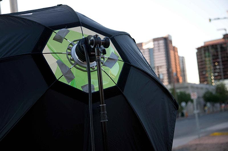
In the fashion shot of Jennie on the railroad tracks, I placed a green gel inside a Photoflex OctoDome that covered the bare ProFoto strobe head. I used gaffer’s tape to secure the gel, taking care not to let the tape touch the hot strobe head. (If the gel is laid directly on the flash tube, it will melt.)
Camera Gear
I used a Canon Mark III 1Ds and a Canon 24-105mm f/4 lens. I opened up the aperture setting to f/4 in order to create a limited depth of field. With a wide aperture setting, though, you don’t need as much power from the strobe to capture a good exposure. So after setting the aperture, I reduced the strobe power to balance for exposure.
I then metered Jennie to make sure that my f/stop was 4.0.
Waiting for Magic Hour
With everything set, then began the waiting game. Specifically, I waited for the dusk light to become interesting. By changing the shutter speed, I was able to control the ambient background without affecting the strobe light illuminating Jennie. Because a dusk exposure can get down to the 1/15th of a second range, I recommend using a tripod for this type of shot.
In most situations, however, I don’t use a tripod and prefer to handhold my camera. Handholding allows me more freedom to move around my subject and be more creative in my shooting angles. If I do get a little camera shake, where the slow shutter speed creates a slight blurring of the background, I often like the ghosting effect it lends to the overall image.
The Setup
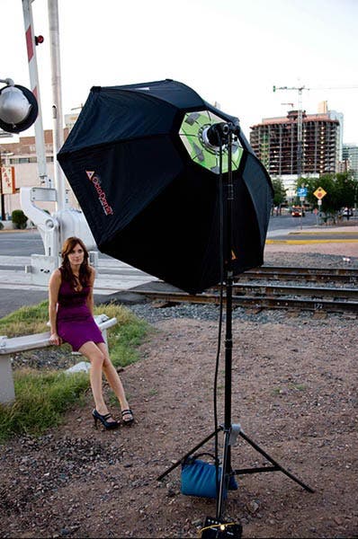
I first set up the 5-foot Photoflex OctoDome, placing a green gel in the front of the strobe head with gaffers tape. I set up the Pro Foto D4 power pack on its lowest power setting: 19 watt/seconds.
Next, I set the OctoDome approximately 6 feet away from Jennie, slightly above her, and just off to her right. I shot with a Canon Mark III 1Ds and I set it to the Manual exposure mode with an ISO of 100 and a color temperature of 5500°K (daylight). I took a meter reading with an aperture of f/4.0.
By shooting several different frames at different shutter speeds and then checking the LCD of the camera, I was able to get a background I liked. The preferred shutter speed ended up being 1/13th of a second.
This first test shot is of Jennie holding a Macbeth color chart. This was a critical frame to have for the post production part of this project. I used it as the primary tool for correcting skin tone after I imported the images onto my computer at the studio.
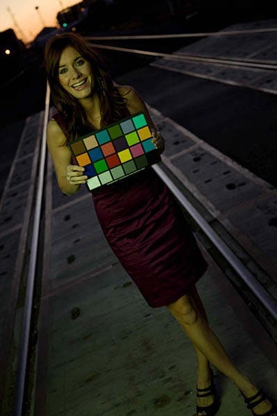
As dusk turned to night, I constantly checked my LCD and slowed my shutter speed duration to keep the background exposure how I wanted it. Remember, Jennie’s exposure remained constant throughout the shoot, as her main exposure was generated from the green strobe light and controlled by the f/4.0 aperture setting.
Here’s our final result: Jennie with a green tint. Though it may seem odd at this point in the lesson, this is exactly what I wanted to come away with!

Post Production
Back at the studio, I uploaded the images to my Apple computer and opened them in my favorite image-editing program, Adobe Lightroom. After my images are downloaded into Lightroom’s “Library”, I edit, organize, store, and do all color corrections to ALL my images on this main system.
Once all of the images were downloaded, I reviewed the original RAW images of Jennie in my “Library”, all of which had a sickly greenish cast to them. Exactly what I wanted.
This is where the fun began. I clicked onto the “Develop” portion of Lightroom, grabbed the “Eyedropper”, dragged across the first shot of Jennie holding the color chart, and pointed to the white square. Note that you could also point to any of the gray squares of the color chart.


With one click, Lightroom immediately corrected the color balance to neutral white. Since the color chart was illuminated with green light, Lightroom essentially added magenta to the overall image to neutralize the green color cast, which made Jennie’s skin tone more neutral. Remember, magenta is opposite green in an additive, or projected light, color wheel. The background, which was not affected by the green strobe, turned magenta with this color balance shift, which was the effect I was looking for.
I then made the same color correction adjustments to the rest of the images from the shoot and begin editing and selecting my favorites. Here’s my final pick.

Look Two: A Professional Business Portrait with Doug
For this portrait, I once again set up my 5′ OctoDome, but this time placed a full CTO (Color Temperature Orange) warming gel in front of the strobe head and secured it with gaffers’ tape. The use of a full CTO is arbitrary; I could have used a ½ or ¼ CTO that would have progressively reduced the amount of blue in the background.
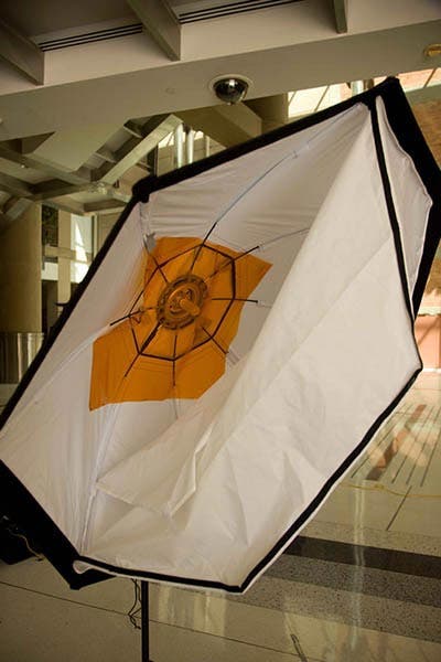
In addition to the main light, I also used two Photoflex HalfDomes, which work great as rim lights. However, I did not add any modifying gels on these soft boxes, as I wanted them to project the same color temperature light as the existing daylight.


The two HalfDomes were placed to the left and right of the model and raised approximately six feet high behind the model, who was situated in the atrium of City Hall facing the darker part of the room. His back faced towards open bright light coming through the windows.
Camera Settings
Once again, I shot with a Canon Mark III 1Ds set on Manual Exposure mode with a 100 ISO and a color temperature of 5340°K. I used a Canon 70-200mm f/4 lens and set it at 105mm.
By setting my aperture at f/4.5, I was able to overexpose the outside by bringing my shutter speed to 1/30th of a second.
This was another creative decision-making moment, as the duration of the shutter speed would have changed the value of the background — from relatively dark at 1/250th of a second to almost white at 1/15th of a second. Either would have been perfectly acceptable, but here I chose 1/30th of a second to hold some detail.
On the first image, I had the model hold the color chart.
Again, this image was important, as it would serve as the primary tool for correcting the skin tone after I uploaded the images onto my computer at the studio.

I continued photographing Doug in various positions and poses. Unlike Jennie, I was not pressed for time since I wasn’t working outside at sunset.
Here is a final image from the shoot, unedited. Notice how the background looks neutral, but that the light on the model is quite warm. The orange gel has done its job!

Post Production
Just as before, after the shoot I uploaded all of the images onto my system back at the studio.
Once the importing was completed, I switched from the Lightroom Library to the Develop mode. On the “Develop” right side panel, there are a number of basic adjustments tools available.

Here, I first selected the “Eyedropper” tool, clicked and dragged it onto my first shot of Doug holding the color chart. I clicked on the white square (you can use a neutral gray square as well) and Lightroom automatically turned the image from a warm white to a neutral white. The skin tones became close to neutral and the background became bluer. This was my desired effect for the shot.

Similar to the processing of shots of Jennie, Lightroom added blue to natural and the background has adjusted to a really cool modern blue.

If you look at the color temperature indicator on the right panel in Lightroom, you will see that the original orange tone was shot at 5340°K, while the corrected image reveals that it was balanced at 3200°K.
After making the same adjustments to the entire batch of images, I began editing and selecting my favorites.

Here’s the final image, color corrected, now with a blue tone to the background.

Final Notes
As you can see from the examples given here, it can be relatively inexpensive and fun to change the color of your backgrounds. By adding gelled light to your subject, and letting the background stay normal, the adjustments can be made in post production and you can create some really stunning, creative images.
Perhaps the most difficult part of this process lies in trusting your ability to correct for the crazy colors that you’ll see on set. It’s sometimes hard to view the scene through your camera and understand that the actual shooting is just step one of this creative process. Step two involves making basic color corrections in Photoshop and/or Lightroom.
This technique, while not appropriate for every shoot, can add a unique creative tool into your arsenal and can allow you to create more interesting, color-saturated images.
Try other colored gels over your strobes, color correct in post-production, and witness the effects!
Photographed and written by Paul Markow, contributing instructor for PhotoflexLightingSchool.com
View Paul’s portfolio work on the Photoflex Pro Showcase or visit his personal websites:
PaulMarkow.com
TajMaPaul Studios
Related Products:
- Photoflex StarFlash 300WS Mono Strobe
- Photoflex StarFlash 300Watt 5’OctoDome Kit with 5 ft. Medium OctoDome SoftBox, StarFlash Connector, Tilt Swivel Mount, Lamp Cover, Medium LiteStand
- Photoflex StarFlash® 2 Lite 300watt Umbrella Kit w/ Case: Two StarFlash 300ws Monolights, FlashFire Sender/Receiver Kit
- ColorChecker Chart, 8.5″ x 11.5″
Learn more at the Adorama Learning Center:
- Man of Steel—Shooting on Location
- Fashion, Portrait, and Fine Art Photographer, Tamar Levine—AdoramaTV
- Fashion Photographer, Ella Manor—AdoramaTV
- Setting up simple studio lighting – Adorama TV

