As you expand your photography education, you may hear photographers talking about the importance of the histogram for understanding exposure. Without a bit of background knowledge, understanding how to read a histogram can be complicated and frustrating. All it takes is a little information and practice and you’ll be reading your histogram easily in no time.
What is a Histogram?
A histogram indicates the amount of each light level (and in more sophisticated versions, the amount of each color at each amount of brightness your photos have. An experienced photographer can glance at a histogram and know in an instant if the exposure is accurate, while a Photoshop jockey can manipulate an image’s levels (which shows the histogram) to improve an image.

How to Read a Histogram?
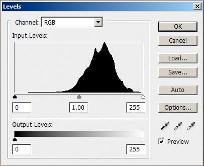
A histogram is a graph of 256 vertical bars, one for each tonality in an 8-bit image. (For a 16-bit image it will show it reduced to 8-bit.) The left end represents black and the right end white. The two ends are very important. In most cases you want them to tail off as shown above. You don’t want them to “push up against the wall” unless the image has a lot of dark or light. There is no right way for the middle to look. It is as variable as images are. (The three shown here are all for the same image at different contrasts.) For an average exposure image the center of the “mountain peaks” will be near the center of the graph.
A histogram is a graph that shows the distribution of image pixels with a particular property. On the X-axis, you have all the possible values that describe the property, and on the Y-axis, the number of image pixels with the same value.
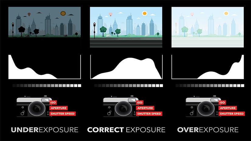
In the case of the luminance histogram, the X-axis corresponds to brightness. Therefore, if many pixels have the smallest brightness value (i.e., black pixels) or the highest brightness value (i.e., white pixels), your image is most likely overexposed or underexposed.
In the case of the color histogram, the X-axis corresponds to a color’s saturation. And agglomeration of pixels at the right end of the histogram denotes a very saturated color, while an agglomeration at the left end denotes a muted color.
Why Should You Use a Histogram?
Now that you know what a histogram is, you probably want to know why the histogram and photography go hand in hand. The first reason for learning how to read a histogram and do it almost for every photograph you take is the valuable insight it provides. Just by looking at the graph, you can know whether your image is good or not in terms of exposure and color distribution.
The second reason for learning how to read a histogram is the endless editing possibilities it provides. All photo editors have tools based on a histogram, and you can do amazing adjustments with them.

Benefits of Using a Histogram
For professional cameras, histograms are a matter of course. They display both the luminance and the color histograms of an image and allow you to perform analysis just after taking the image. Once you’ve seen the small in-camera histogram, you can decide whether to take the photograph again or not, reducing the number of ruined photographs due to exposure mistakes.
The other benefit of using a histogram in photography is fixing exposure, contrast, and color accuracy in post-processing. The histogram shows you what is “wrong” with your exposure and allows you to compensate by making subtle and refined adjustments.
How to Use a Histogram to Take Better Photos
While you don’t want to spend all of your time checking the histogram for each photo you take, it’s a good idea to glance at it every so often during more complicated lighting scenarios.
When you look at your histogram, does the curve seem to stop on one side or the other, or does it taper off smoothly as it approaches the edges?
In most cases, you want the histogram to appear centered. If your histogram curve appears to collide with one side or the other, you can correct the issue by overexposing or underexposing accordingly with exposure compensation.
What Does a Properly Exposed Histogram Look Like?
A properly exposed histogram may appear as a curve with a single peak, or a collection of peaks and valleys. Either type of curve is normal. You want to pay close attention to the edges of the histogram.
If the curve appears to collide with the left side of the grid, then your image is most likely underexposed and you’re losing details in the shadows. If the curve appears to collide with the right side of the grid, then your image is probably overexposed and you’re losing details in the highlights.
You don’t need the histogram curve to taper perfectly to the bottom left and right corners, but the more significant the taper, the less likely detail loss will be. For the best exposure, try to keep both highlights and shadows within the bounds of the histogram grid.
How Will Your Best Photographs Look on a Histogram?
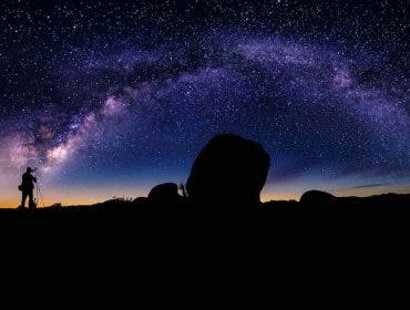
If you aim for a well-exposed photograph, the luminance histogram should cover the entire range of values on the X-axis. You should have a few pixels at the ends of the histogram and more and more of them while you approach the middle of the graph. A well-exposed photograph has most of its pixels in the middle range of brightness and just a few black or white pixels. The histogram of a good photograph will also be smooth, showing continuous growth and no spikes. However, for night photos, the histogram should lean more towards the left side of the middle. If you shoot on a bright beach, a good histogram will lean towards the right because you will have a lot of bright tones, which is all right if that is how the scene looks.
What Does an Average Contrast Image Look Like?
An average contrast image will have the vertical bars spread from darks to lights, as shown above. A lower contrast image will have them more in the center (below, left); A higher contrast image will have them distributed more widely (below, right.)

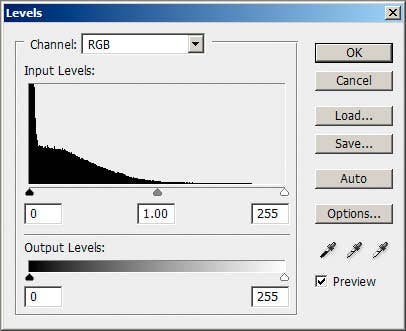
These principles can also be used for reading and evaluating in-camera histograms.A low-key histogram.
What is a Low Key Image?
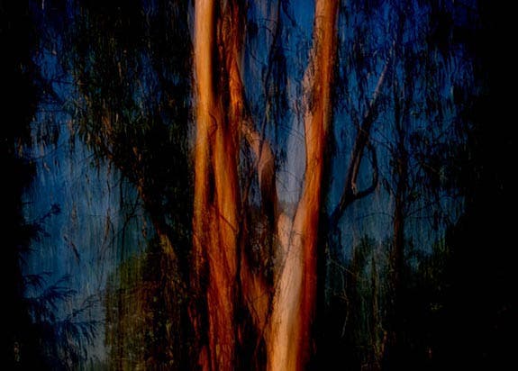
A low-key image contains primarily dark tones, and its histogram skews to the left, with fewer numbers of lighter-toned pixels. Here is an example image and its histogram.
In this image the histogram is pushed against the left “wall” because there are significant areas of pure black in it, and significant areas of very dark tones. But in many more realistic images, this sort of histogram would indicate a loss of detail in the darkest areas, blocked up shadows. In a more conventional image where it is desirable to have detail retained in the dark areas, the histogram should taper to just touch the left edge at the bottom corner, as shown here:
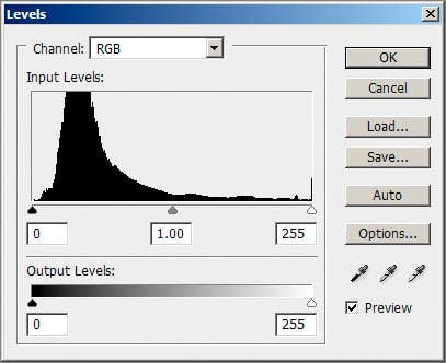
The shape of the histogram will vary with each different image. There isn’t a right or wrong way it should look. It is simply a reflection of the tonalities in an image. A high-key image contains primarily light tones, and its histogram are skewed to the right, with fewer darker-toned pixels. Here is an example image and its histogram.
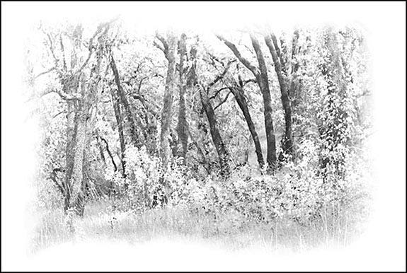
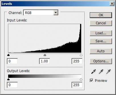
This histogram is pushed against the right “wall” because there are significant areas of pure white in it, as well as significant areas of near-white and light tones. In this image it is an intentional artistic effect. But in many images that are more realistic, this sort of histogram would indicate a loss of detail in the lightest areas, also known as blown-out highlights. In a more conventional image with detail retained in the highlights the histogram would taper to just touch the right edge at the bottom corner:
Conclusion
As you explore the histogram while taking pictures, it’s important to remember that there is no perfect, one-size-fits-all scenario. Your histograms will vary based on available light, contrast of the scene, camera settings, and the dynamic range of your camera.
Focus primarily on using the histogram as a tool to prevent detail clipping in extreme shadows and highlights. The rest is all about preference.
Featured Image by Shutterstock.
