Pink is both timeless and on-trend. Whether the pink that comes to mind is the hot pink of the Barbie movie, the fashion runways dominated by every shade, millennial pink, or your beloved grandmother’s rose lipstick, pink is a powerful tool that can evoke many moods. Pink can invigorate your sensibilities as an artist and even become a defining factor of your style as a photographer. Here are some ways you can incorporate the color pink in your photography.
Pink as a Symbol
Pink is rich in symbolism and can portray many concepts. I love to use it juxtaposed with other symbols as well. For example, the femininity associated with pink can be paired with something masculine (say, a classic suit) to create a dynamic image.
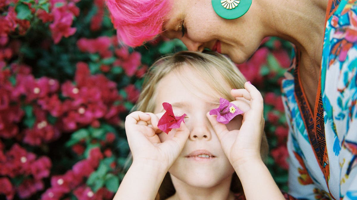
Pink classically symbolizes love and romance, so it is especially appropriate to use when photographing couples, or anytime you want to evoke a feeling of warmth. Romance can exist in everyday life with a flowing pink dress, a gesture between a mother and a child, or pink flowers.
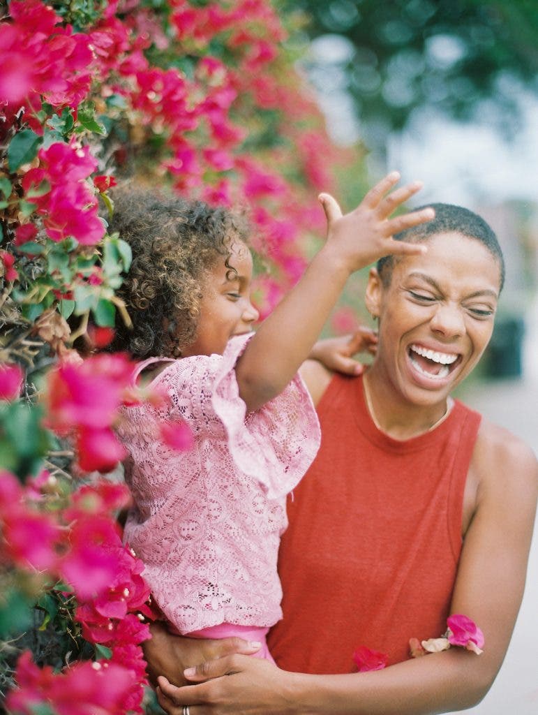
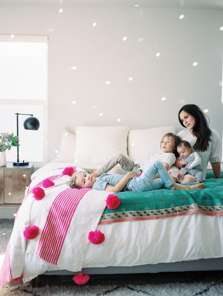
Pink can also symbolize innocence and motherhood — think of the traditional ‘baby pink’ — so incorporating it when photographing families further creates a sense of togetherness. I like to add unexpected pink elements to a family photo shoot so the images don’t feel predictable. A baby girl photo shoot with too much pink can feel cheesy and boring.
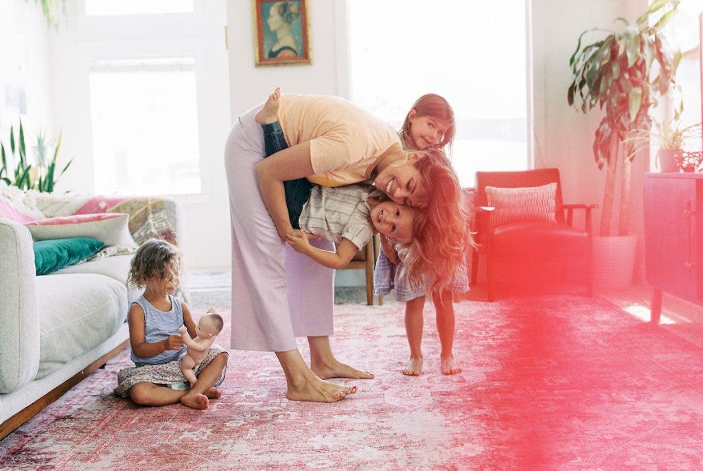
Bring in multiple shades of pink through a background, bedding, or clothing. You can also incorporate textures like woven blankets, wood furniture, or earthy elements like sand and water, to tell a well-rounded and rich story.
Pink can also be a symbol of youth and naivete, so using pink when photographing children can be a fun way to communicate carefree optimism.
Pairing Pink with Other Colors
Monochromatic Colors
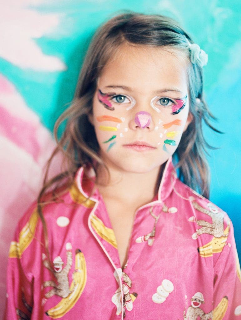
If you love pink as much as I do, or just want to jump in the deep end, go with an entirely monochrome pink scheme. You can use a pink backdrop, pink clothing and accessories, pink makeup and even pink furniture. Utilize varying shades of pink (light pink, hot pink, and magenta) for variety and visual punch, or keep it completely one-tone to create a dreamlike effect (like a Wes Anderson film).
You can also utilize a white backdrop to highlight a pop of pink, such as a dress. Just make sure your varying shades of pink have the same undertone — either warm or cool.
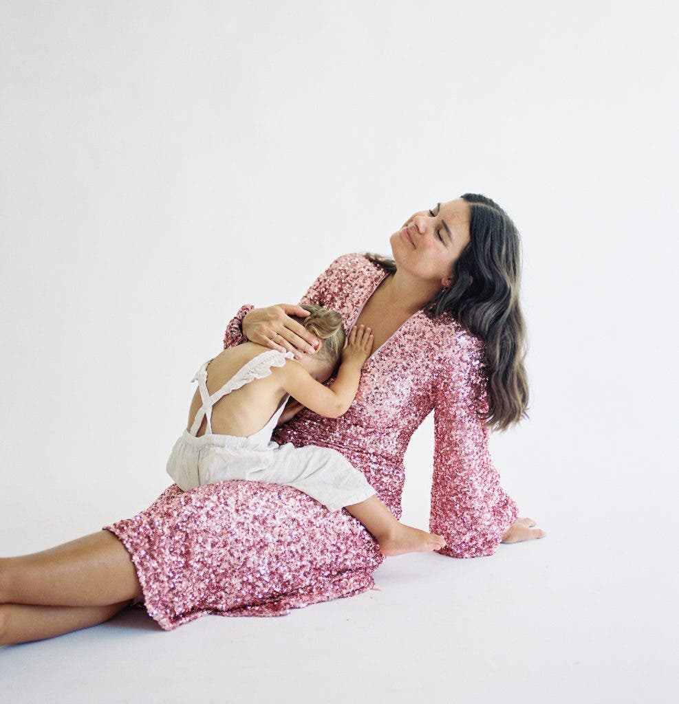
Warm-toned pinks include peachy-pink, bubblegum pink, blush pink, millennial pink, and coral pink. Cool-toned pinks include Barbie hot pink, baby pink, and pinks with hints of purple or blue.
Complementary Colors
Pink and green are close to being opposites on the color wheel and therefore will create visual drama and interest when paired together. The most commonly accessible version of this would be pink clothing, accessories or makeup juxtaposed with a natural green background like grass, forest, or trees.
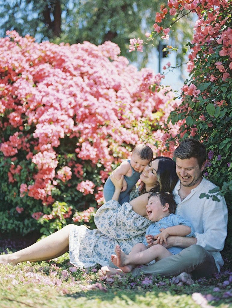
Again, you’ll want to consider the undertones and try to balance them. A cool-toned pink against a very warm, yellowy-green group of trees in the bright mid-morning sun can look fabulous, or it can look sickly, depending on the subject.
Don’t be afraid to mix and match, but just know you may need experiment with juxtaposing cool and warm undertones if your goal is to create visual drama.
Analogous Colors
Pink and red is one of my all-time favorite combinations, and it doesn’t have to be reserved for Valentine’s Day. To keep it from being too on-the-nose, try a lighter blush pink with a fiery cherry red.
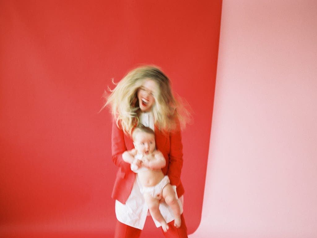
Pink and purple work beautifully together as well. Use a brighter shade of one and a lighter shade of another — for example, hot pink with lavender, or dark eggplant purple with baby pink. You’ll get a sophisticated combination that can work in many contexts.
How to Add Pops of Pink in Photography
There are many ways to add pops of pink in photography. You’ll first want to consider how prominent you want the pink to be in your imagery.
For the most pink in an image, you can add pink to the environment through a seamless paper backdrop, an abundance of fabric on a C-stand, or painted pink walls, floors, or rugs. You can even try an oversized pink painting.
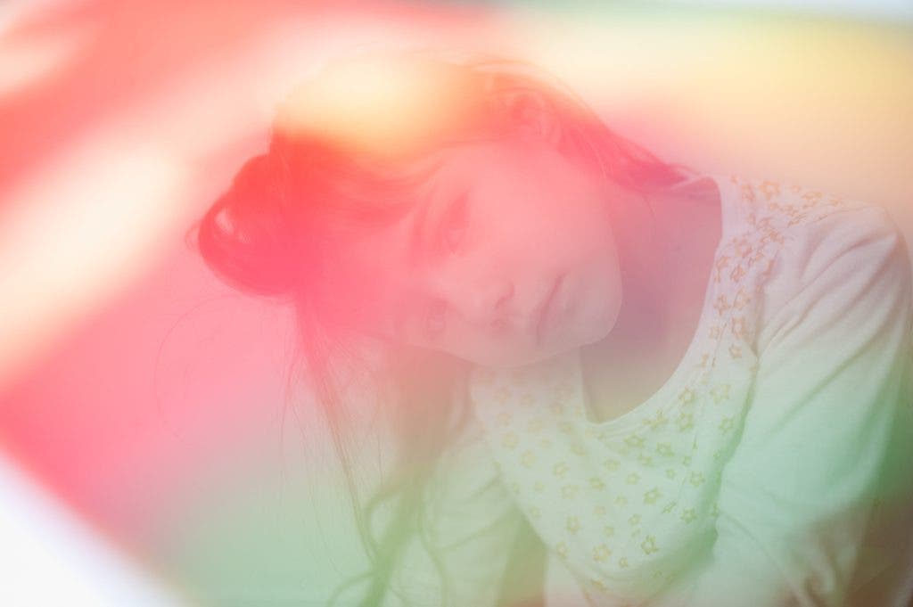
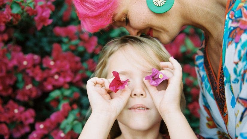
I love bougainvillea and pink flowers as backdrops to add softness, texture, and romance to an image. For an easy on-the-go way to include pink, lens films or even kids’ magna tiles can be held in front of your lens to give a dreamy effect and coat your entire image in the color.
For a more modest amount of pink, consider adding pink furniture like a pink chair, table, or lamp. I especially love using furniture for color because subjects can stand, sit, lie down, or cuddle on furniture to create interesting compositions.
If you just want to dip your toes into pink, add it in your subject’s clothing. A sequined pink gown, hot pink pants, or fabulous vintage pink hat can add a dynamic layer to an image. If you find yourself feeling dull and uninspired in a photo shoot, see if a swipe of dramatic pink lipstick or a pair of pink statement earrings sparks your imagination.
Tips for Capturing Pink
If using natural light, pink will initially photograph much duller and less vibrant than in real life. This is especially applicable to makeup. If your subject is wearing a neon pink lipstick, it will photograph a few shades duller and come out as bright pink.
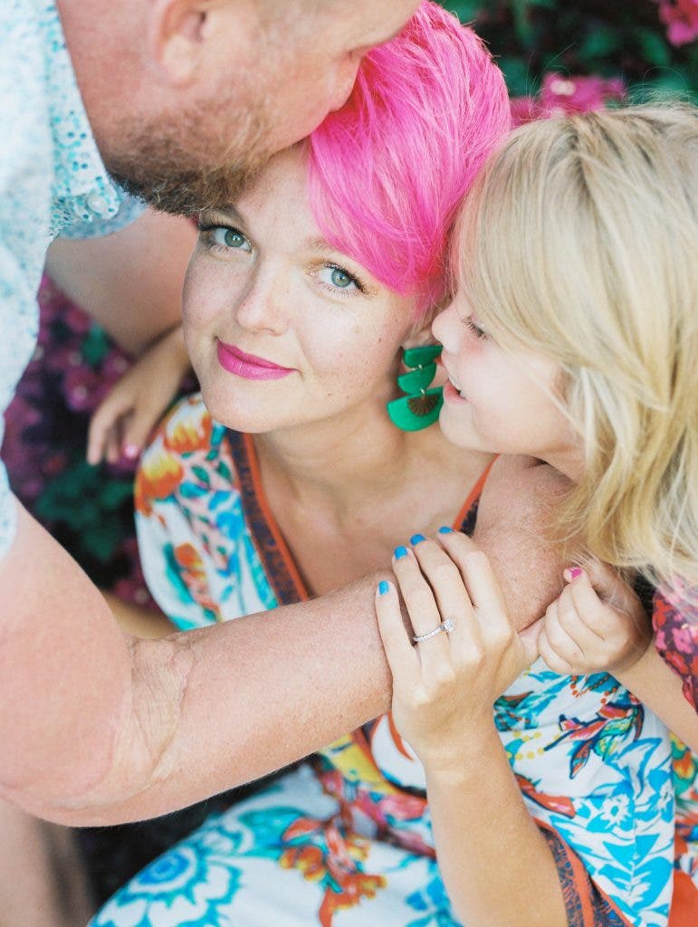
Consider the undertones of the pinks you employ. Warm undertones always look great with other warm undertones, as do cool-on-cool undertones. Although, if you want to experiment and create some drama, try mixing warm and cool pinks together.
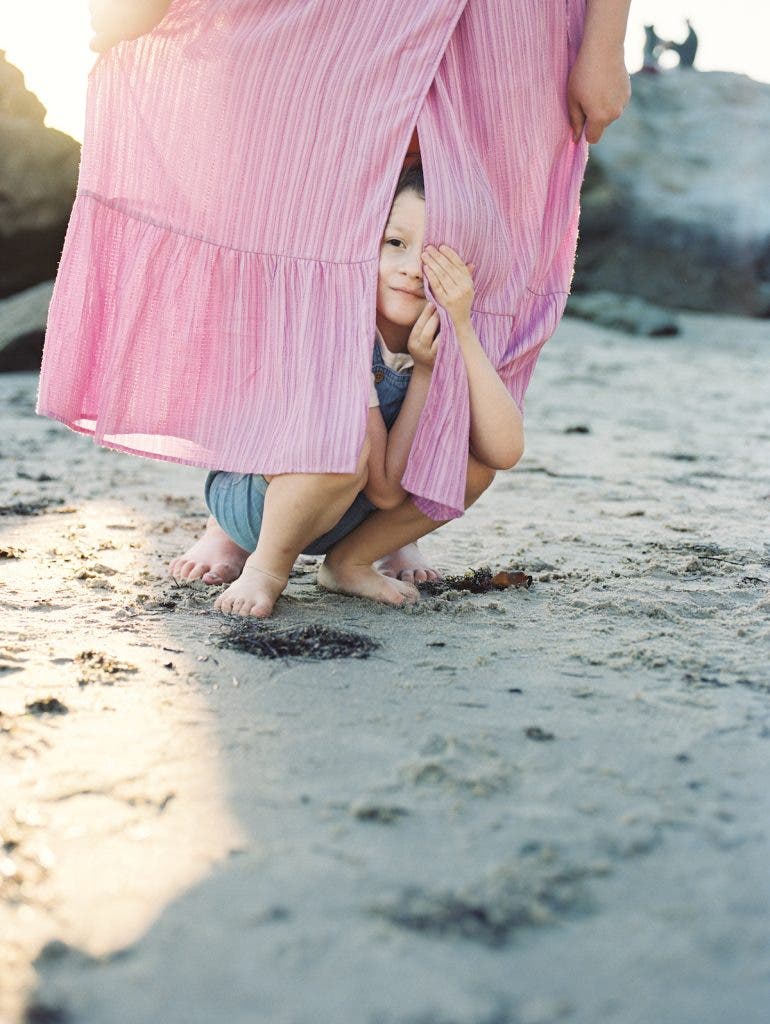
Bright pinks can also reflect onto the skin in an unflattering way if you’re working with an all-pink environment. Think about where your subjects will be in relation to pink and avoid putting bright pinks (like flowers) underneath a subject with bright light. If you need to color-correct a cast from pink onto a subject’s skin, you can do it in post-production. It’s better to avoid it when you’re photographing if possible.
Conclusion
Whether your style is bold and bright, minimal and dreamy, or subtle and romantic, there’s a shade and an application of pink for you. Color is powerful and can alter our mood, so play with pink in your photography and see how it inspires a new side of you and your subjects.


-370x280.jpg)

