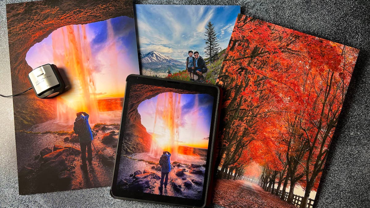
Imagine you take a beautiful photograph and carefully edit it before having it printed. Although, when you look at the final output, it doesn’t quite have the same dynamic range, color, or detail that you expected based on how the image appeared on the screen. Does this sound familiar? It has certainly happened to me before. Along with an instructional video on AdoramaTV, I am writing this blog to help you get detailed and color-accurate prints from all your photographs. I will cover four fundamental principles of photo printing to get you as close as you’ve ever gotten to matching what you see on your monitor to what you see in your prints.
Realistic Expectations
Let me save you a lot of heartache and tell you that you’ll never achieve 100% accuracy between what you see on your monitor and what you see when photo printing. An “exact match” is frankly impossible because, no matter what you do, reflected light is never the same as transmitted light. What you see on your monitor is transmitted light and what you see on a print is reflected light. That’s just physics.
In addition, perceived color accuracy when photo printing depends a lot on what temperature light is hitting it. For example, daylight will make the print appear cooler (bluer) than incandescent light. Finally, how the print is displayed must also be considered. Will you place the print behind a glass frame, an acrylic frame, a glare-resistant material, or will the print be unframed?
For information on how to color correct in post-processing, check out the 42West article, The Basics of Color Correction.
Discussions with Printique.com
In preparation for this article, I reached out to the print masters at Printique and got their perspective as well. Printique makes hundreds of prints a day so I knew they could provide me with useful information. Through their guidance and personal experience, I came up with the following four principles to get you started on making accurate prints.
Principle #1: Monitor Calibration – How Important is it?
I asked Printique if they recommended any hardware monitor calibration tool. They said, “We use X-rite, but we generally find calibration to be imperfect and recommend ordering small proofs to get a sense of where our printing sits in relation to what you see, then adjust accordingly.”
I love this straightforward advice, which I’ve found to be completely true. I calibrate my monitor using a ColorChecker and it does a great job getting me about 90% of the way there. For that extra percent, I rely on test prints.
Principle #2: Upload a Well-Edited File
To get the maximum detail when photo printing, make sure the uploaded files are set to 300 ppi. If you’re making a large print, you may need to “up-rez” your file. For example, when I made a 20” x 30” print, I had to make sure the total dimensions of the print was 6000 x 9000 pixels, which equates to 54 megapixels.
Remember, this is to maximize detail. You can certainly upload a smaller megapixel file, and you may not be able to notice an appreciable loss in detail. This is dependent on factors like the media you print on, viewing distance, and personal tolerance. Although, to maximize the detail, Printique and many other print services recommend 300 ppi.
Now, what about soft proofing your file before uploading? Basically, soft proofing is pre-visualizing your digital file on your monitor prior to printing. Several online printing services publish their International Color Consortium (ICC) profiles. Users can typically download this to soft proof their digital image. In essence, an ICC profile describes the color characteristics and limitations of a particular device or media. While I find soft proofing to be helpful, I still think Printique’s original advice to be much more valuable. Order small proofs to get a sense of where the printing output sits in relation to what you see on the screen, then adjust accordingly.
Principle #3: Pay Attention to the Imbedded Color Profile
What color profile should you imbed into your uploaded digital file? Many online services will accept any color space. Although, I recommend either Adobe RGB or P3, both of which have a wider color range than sRGB.
Principle #4: Upload the Correct File Format
Finally, what file format should you use to save the file? According to Printique, there is no appreciable difference in print quality between uncompressed TIFF files and high quality/low compression JPEG files. This corresponds to Level 10 in Photoshop’s Save option. TIFF files are much larger than JPEG files, and some services have a limit on upload file size. A high-quality JPEG files will look just as good on print. It will also take much less time to upload and help you avoid upload errors because of file size limitations.
Some Frequently Asked Questions
If you are thoughtful about the four principals we just went over before printing, I think you’ll be much happier with the quality of your prints. Let me now go over a few other questions Printique and I frequently get asked:
If I have a relatively low resolution or highly compressed file, is a certain print media (eg. canvas) better at hiding the imperfections?
Any textured media would hide some imperfections. Also, dye-sublimation prints can soften and obscure some imperfections because the production process involves heat transfer from a solid to a gaseous phase without first passing through a liquid phase, and this is all very organic.
If I need to “up-res” my file, do you recommend any software like Photoshop, Gigapixel or something else?
Whatever process you use, see how the final image looks on the screen when you’ve finished increasing the resolution of the file. If there is compression artifact or strong haloing around high contrast areas, it will likely show in the print. However, the imperfections might not matter if you’re making very large prints where people won’t be looking up close.
Is there a certain print media (e.g., canvas, metal, or paper) that does a more faithful job of color reproduction?
It really all comes down to individual preference. Personally, I think actual paper prints on semi-gloss texture are the most accurate overall.
Does Printique accept files in a wide gamut color space (Adobe Wide Gamut RGB) that they then properly convert to a printer profile?
Printique can accept any color space but prefers P3.
For Printique, should the user embed a certain color profile into the files that are uploaded for printing? If so, which one (e.g, Adobe RGB 1998, sRGB, etc.)?
Printique recommends the P3 color profile.
Does Printique have any ICC profiles for downloading to soft proof images?
Printique is going to publish their profiles by the end of 2022. Although, they still recommend ordering small proofs to get a sense of what the printing will look like.
If necessary, is it better for the user to “up-res” files to the appropriate PPI? Should they let Printique handle it?
It is better for the customer to do it. However, please be careful not to over-sharpen the image as that can cause strange grid patters when printing.
Conclusion
Obtaining high quality, color accurate prints require some work and understanding of photo printing on your part. You also need to manage your expectations because of inherent differences between transmitted and reflected light. However, following the four fundamental principles I’ve outlined above should allow you to get pleasing prints if you’ve been struggling with overall print quality. It is also important to print on high-quality media using high quality inks and printers. The correct on-line printing service also make a huge difference. You should only trust your photographs to a well-established company with exemplary customer service and dedication to the art and science of printing, such as Printique.
If you’re looking to print your images at home, we also have a list to find the best printer for photographers.

