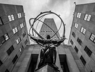
When I was a photography student majoring in Art & Advertising, I had one professor who (despite our tendency to often butt heads) left me with a lesson that completely changed how I see art and how I compose my photos.
Control Through Contrast
For one class, this professor requested that we bring a set of pencils to sketch with. When we began, she started showing us pictures and asking us what was the subject of each photo. For some photos, it was obvious to every student. For others, we were scratching our heads. She told us that the day’s lesson would be how to give your subject “power.”
What she meant by this was that she was going to show us ways to make viewers of our photographs focus on what we wanted the subject to be. This way, viewers would not be confused trying to figure out what they’re supposed to be looking at and see it how we intended it to. This was a lesson I never forgot and it was mostly about contrast. (And no, I am not talking about the contrast slider in ACR or LR. Keep reading)
In short, the professor told us how to use aspects in an image to create an anomaly in a pattern – meaning the one thing that is not like the others. Creating contrast between your subject and your background/foreground will help let the viewers know what they should be focusing on.
Contrast in Exposure
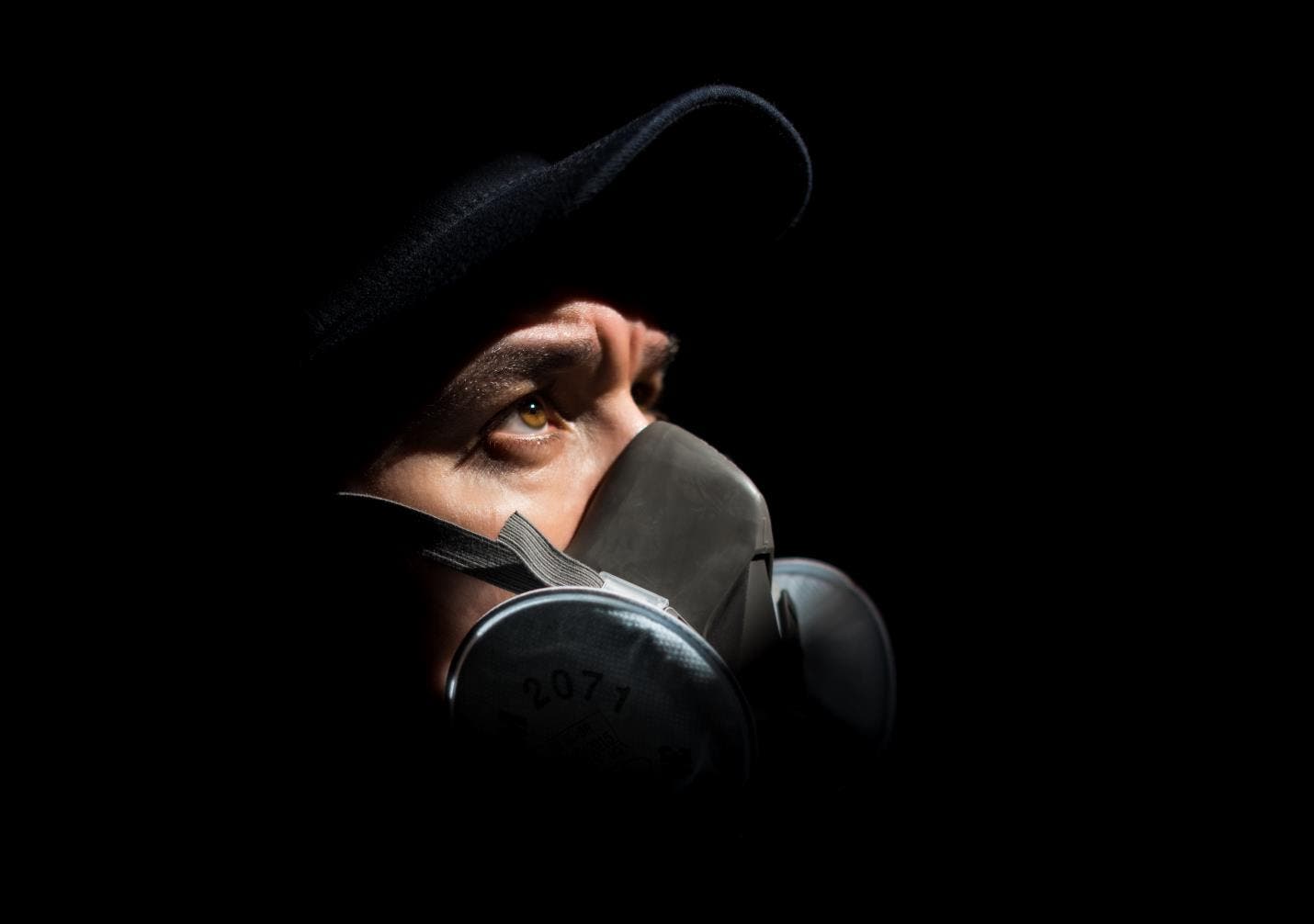
This one is obvious if you’ve ever taken a flash photography course. Most people will tell you that the eye goes to the brightest part of an image, and that is true a good percentage of the time. This is why during intro flash photography classes, you’re taught to under-expose the background slightly and expose it correctly for your subject. Low-key photography is a great example of how to make viewers follow the brightest part of your exposure.
Some people add heavy vignettes around their subject to help the viewer focus on it. (Please don’t [sad emoji here]). This creates contrast in the exposure that helps viewers focus on the subject. Do not be fooled by thinking your subject always has to be the brightest part of an image. Sometimes, if the majority of an image is bright, it’s the shadows that may catch your focus. Either way, it’s still a contrast in exposure.
Contrast in Size
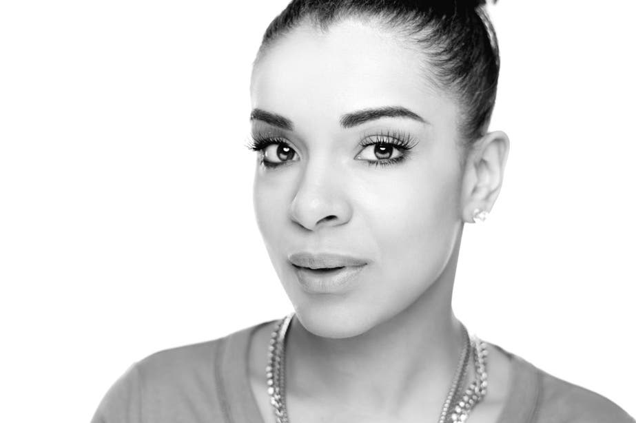
This one is pretty simple to grasp. For example, if you saw a picture of small monkeys dancing with an enormous gorilla, which animal would you likely focus on? The gorilla. Why? Because viewers tend to focus on the biggest object in their view. However, the opposite can also draw the eye. If you have an image where several objects are the same size, but one object is visibly smaller than anything else, this object has become the anomaly in a pattern and may draw the viewers’ eyes.
Contrast in Texture
Have you ever wondered why so many articles written about suggested portrait lenses recommend a very low F-stop (i.e. F2.8)? It’s partly because you can capture a lot of light with these lenses and several other reasons, but it’s also because it enables you to use this technique. Shooting at a low F-stop decreases your depth of field, which means less of what is in your image will be in focus. At really low F-stops (depending on your focal length and focusing distance), the areas that are out of focus can be smooth and blurry.
A common technique is to shoot portraits at low F-stops while focusing on your model. This would result in your model being in focus (and displaying the texture of their hair, clothing, accessories, etc.), while the background is out of focus and smooth (displaying less texture). This comes in handy when shooting at a location where the background is very distracting.
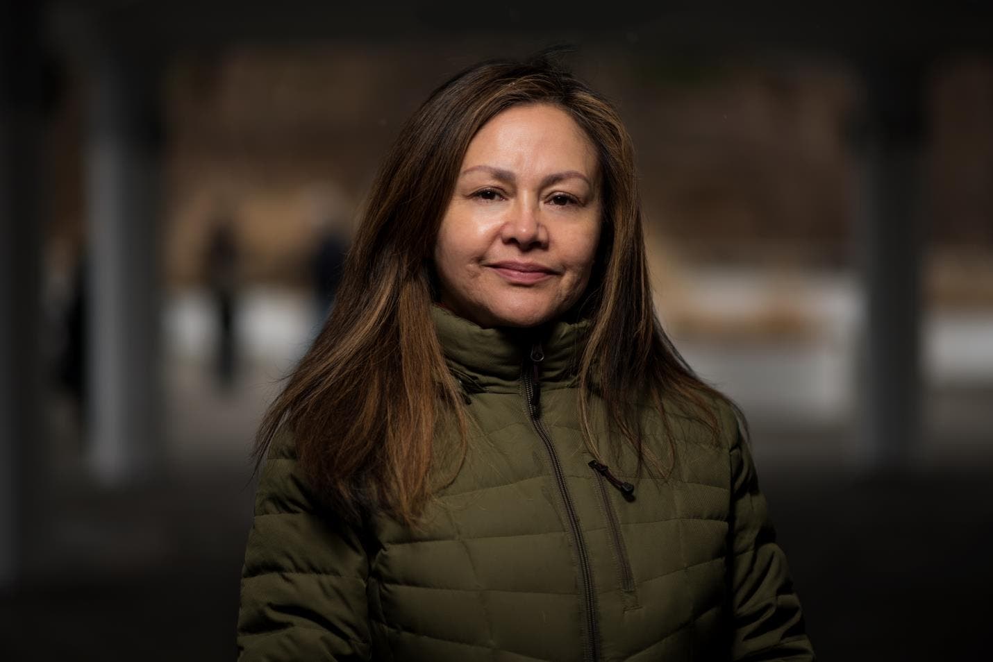
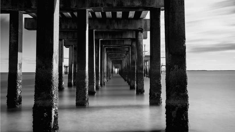
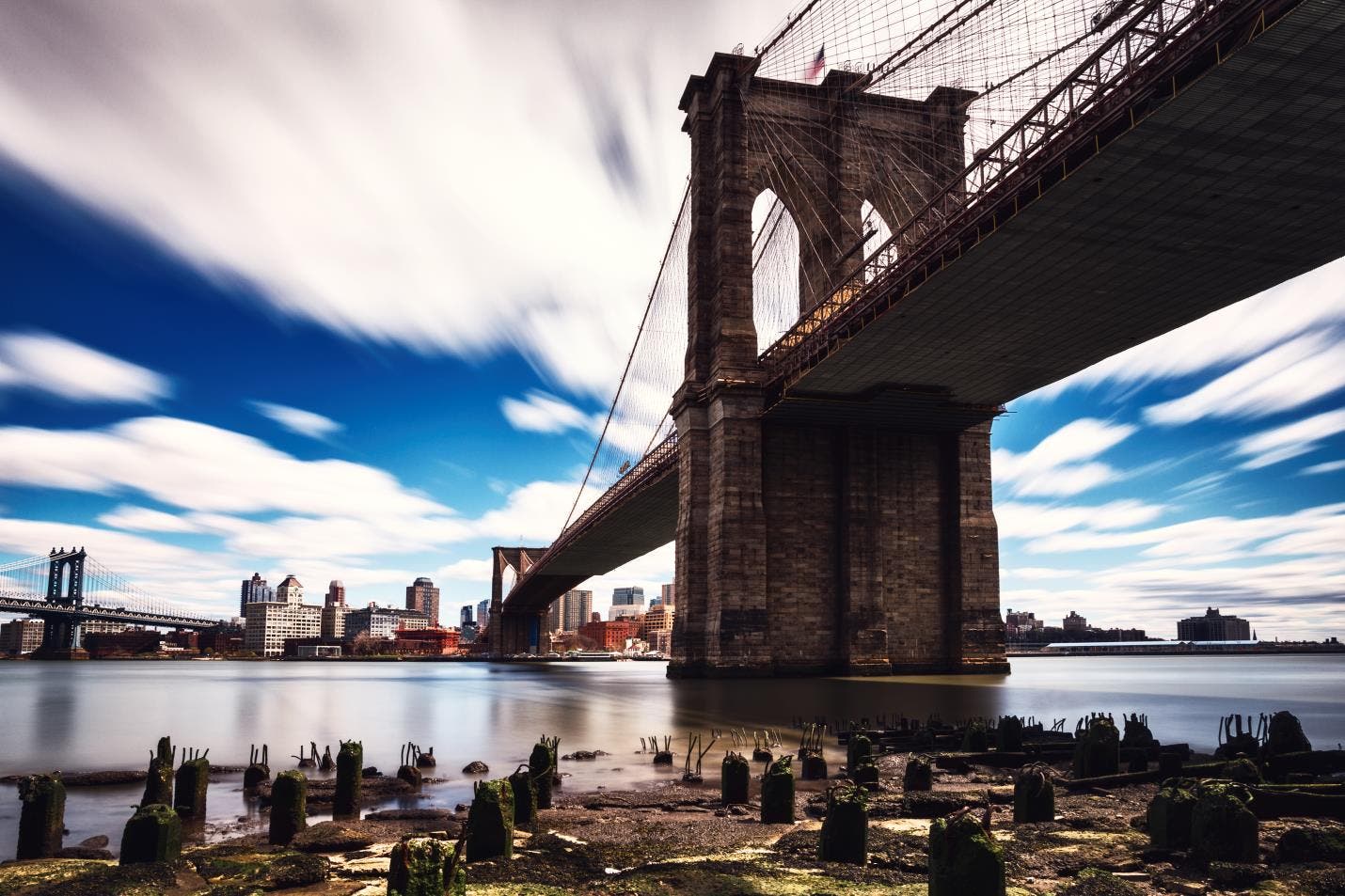
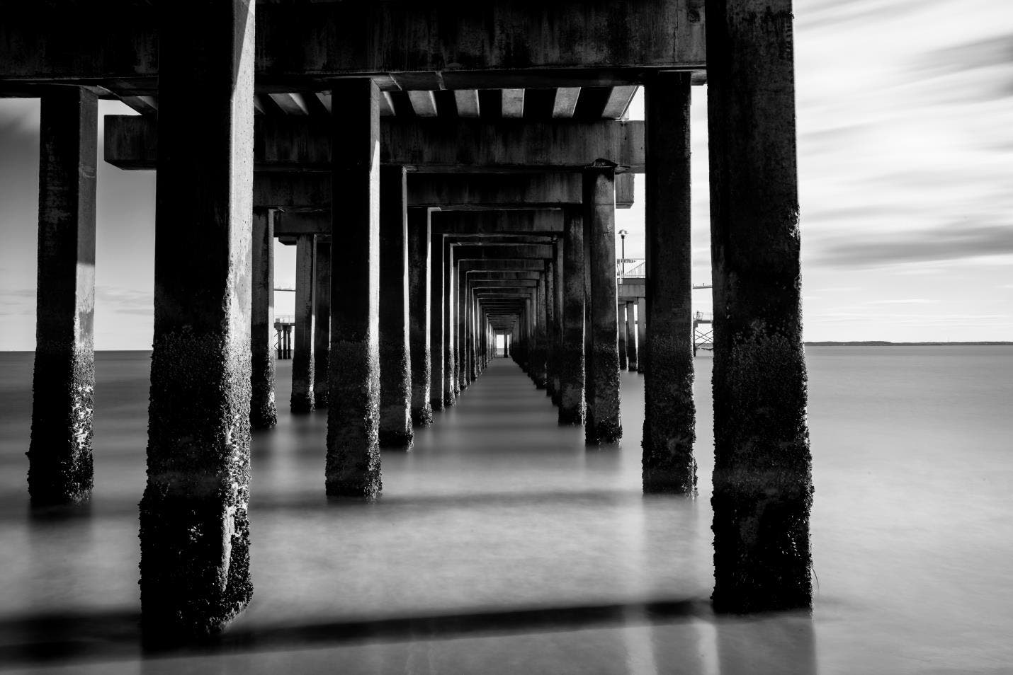
Do note that shallow depths of the field aren’t the only way to get contrasting texture. Choosing a composition with different textures in your frame can also help you lead the viewers’ eyes to your subject. Long exposures can help create smooth textures out of objects that are moving which can also help create a contrast in texture.
The eye will usually go to the area where there is the most texture, but as previously stated, there are always exceptions. If the entire picture has a lot of texture except for one area, that smooth portion becomes the anomaly in a pattern and may draw the viewers’ eyes as well.
Contrast in Color
This concept was easy to understand because I had taken a Design and Color class earlier. In summary, the professor went over a few ways to use color to give your subject “power:”
Contrast in Saturation
This refers to the amount of color in your image and if you’ve ever tried color isolation, you have used this technique. This method refers to having your subject have the most saturation in your image. The viewers’ eyes would usually go to the area with the boldest color. You can shoot a scene where the color of your subject is very bold and saturated, while the colors on the background objects are muted.
Contrast in Hue
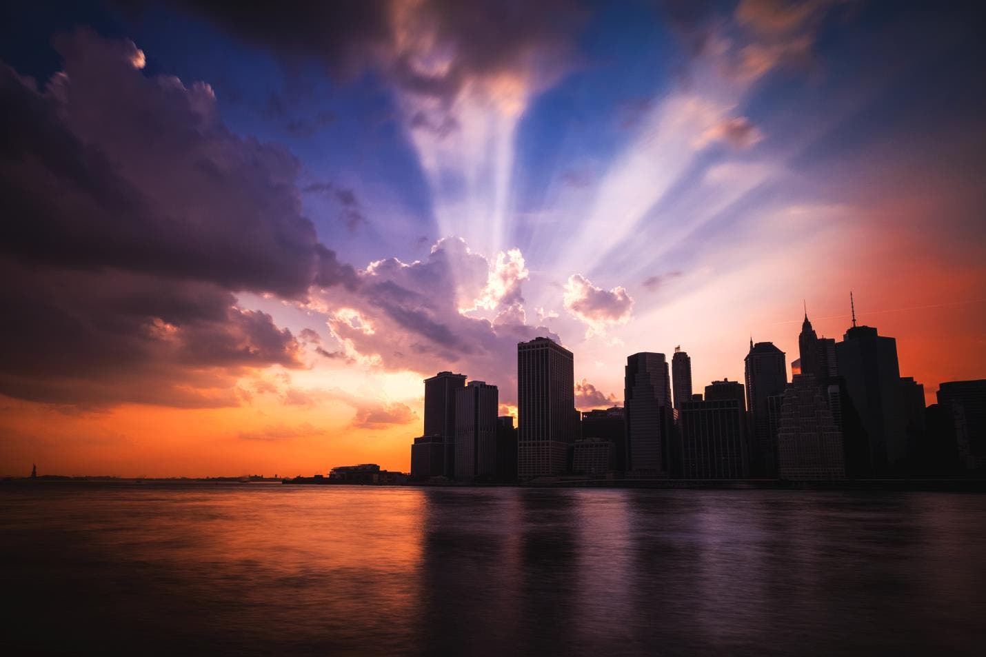
This concept refers to the actual colors and how they relate to each other but is a little more difficult. If you are an art student like me, you’ve seen a color wheel. Color wheels help designers choose color schemes. One of the easiest schemes to point out is Complimentary Color schemes. The colors at opposite ends of a color wheel are complementary: blue and orange, yellow and purple, and red and green.
But in my opinion, just having complementary colors is not enough to draw the eye. If all areas of an image are equally saturated and take up equal amounts of space in the image, it would be difficult to know what you should be focusing on. I like to make sure that the opposing colors are different somehow. For instance, shoot a scene where the subject is a very warm color and the other elements are cooler but darker.
BONUS!
Now I’m not confident these last two are considered types of contrast, but they certainly give power to the subject of your image.
Irregular Shapes
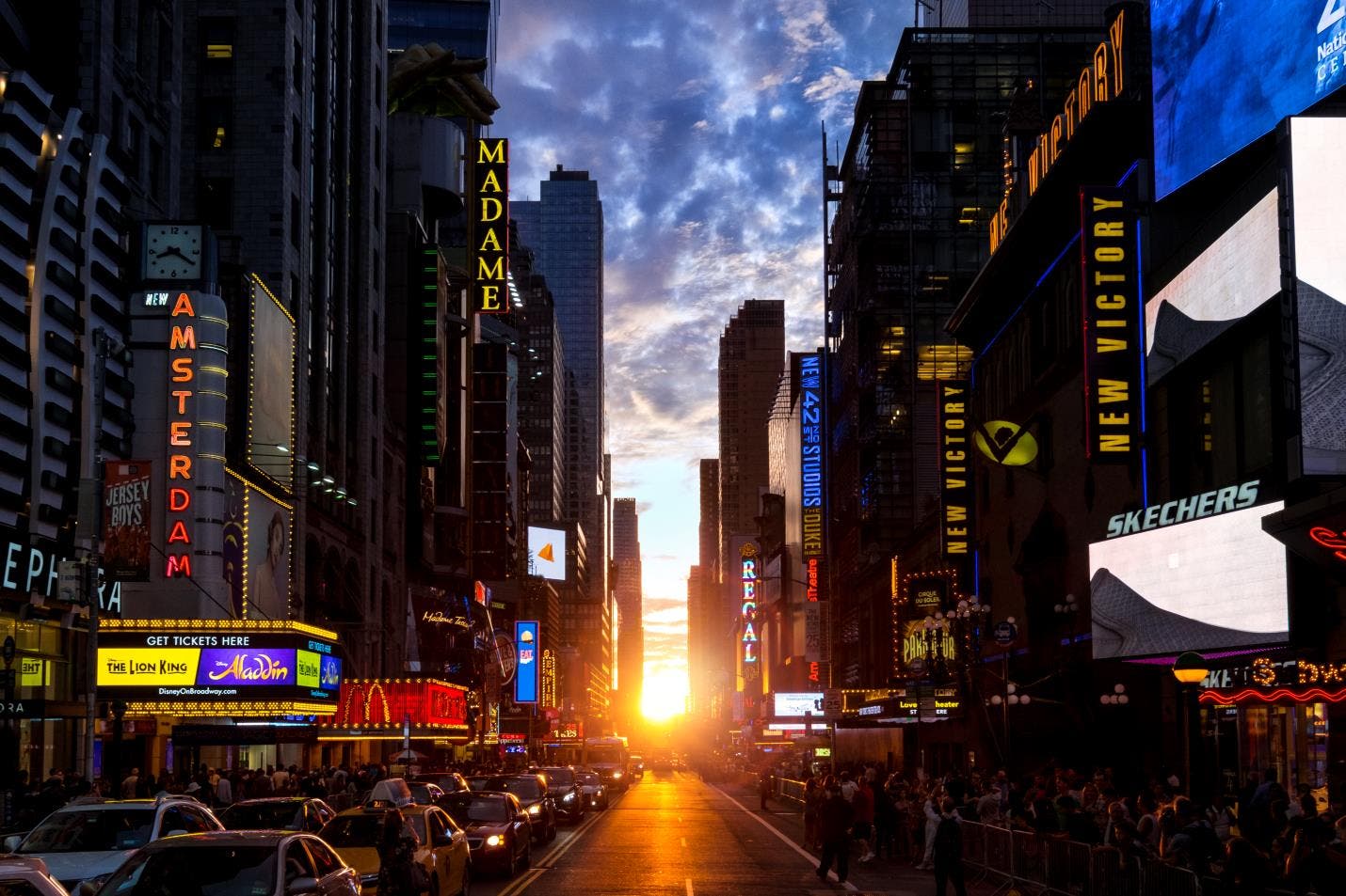
Looking around, you’d probably be able to break most of the things you see down into simple geometric shapes. This is why irregular shapes draw the eye: they’re not the usual shapes you see every day. Silhouette shots are a good example of how irregular shapes draw the eye.
This portrait does not have the person lit to try and compete with the sun. There is almost no texture on the person at all but their shape is what draws the eye, even when the background is very textured and very bright!
Irregular Content
You’ve all heard the phrase “Content is king!” (And if you haven’t, you should be paying extra attention to this section.) This means that the most important thing in an image is its content. However, something that a viewer doesn’t see regularly will draw more attention than a picture of your iced latte.
Now if you’ve noticed a common theme in my photos, it’s this: the subject is not the only part of the image that draws the eye. Part of me thinks that it’s because it’s difficult to take a picture with a background that has no traits at all -unless you’re shooting studio photography with a plain, medium-gray background. But I purposely compose my shots this way because I think it makes a picture interesting. My goal is to give the subject and the background “power,” but to compose in a way to give the subject just a little bit more. For example: if the background is bright and colorful but the subject is dark and colorless, I would try to compose a way to make the subject larger in the frame and capture it where it will make an irregular shape.
Now, are these the only ways to lead your viewers’ eyes? Certainly not. You could spend a lifetime learning ways to attract viewers’ attention to your subjects. However, if you’ve ever had someone look at your picture and tell you they’re not sure what to look at, try incorporating one of these concepts in your images. I’d like to see your images when you do.
