Every year, the design community gears up and holds their breath while waiting for the official announcement Pantone Color of the Year. Some will say, “It’s just a color!” Oh, but they don’t get it. It’s a pretty big deal actually!
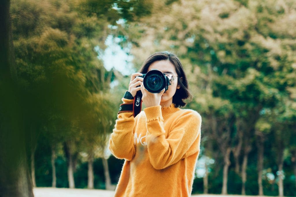
The singular color of the year holds a crazy amount of influence over the visual and creative world. In fact, it affects everything like fashion, interior design, graphic design, and photography. But why do photographers care so much? Let me explain.
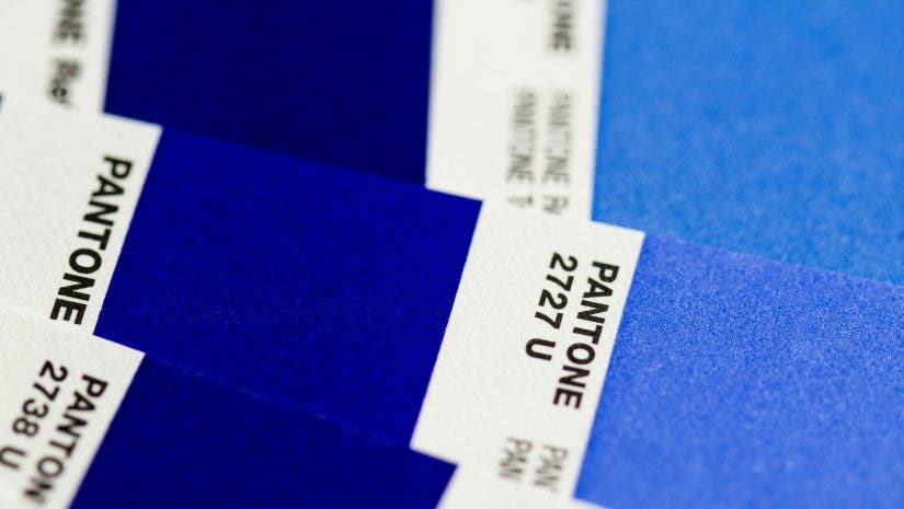
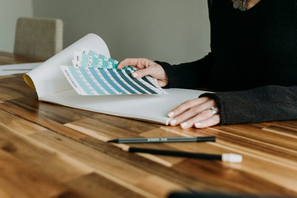
Wait, who is Pantone?
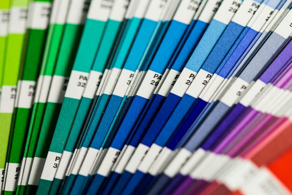
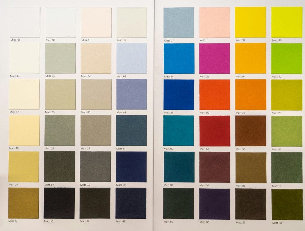
Pantone is basically like the color police. No, like, actually. They’re a global authority on color, deciding what’s what in the world of color shades. Their power goes back to the 1960s thanks to a guy named Lawrence Herbert. Lawrence just wanted to fix a common problem in the printing industry: color inconsistency. You know, like when you order a batch of business cards, and they come out looking like a sad, washed-out version of what you had in mind? Yeah, that kind of headache.
So, Herbert rolled up his sleeves and developed the Pantone Matching System (PMS) — a simple yet genius method to standardize color so that “sunset orange” didn’t end up looking like “burnt toast brown” on someone’s watch. He basically created a dictionary for color, where every shade had its own unique code, like a digital fingerprint.
This meant that designers, printers, and manufacturers could communicate color more accurately, avoiding those awkward, “Well, it looked different on my screen!” moments. Suddenly, everyone was speaking the same color language, and the design world rejoiced.
How does Pantone choose Color of the Year?
Since the year 2000, Pantone has been picking a single color to sum up the mood of the entire planet. This is some serious color strategizing, requiring the heads at Pantone to carefully observe global culture, emotions, and trends.
The job falls to the Pantone Color Institute, which is like Pantone’s secret brain trust of color experts. These folks are not just sitting around with paint chips — they’re out there, fingers on the pulse of the world, studying everything from what’s sashaying down the runways at Fashion Week to the newest gadget colors coming out of Silicon Valley.
And it doesn’t stop there! They’re also peeking into political movements, checking the vibe of major events, and even seeing what’s trending in travel hot spots. They’re looking for patterns, signals, little clues about where the world is headed and what we’re collectively feeling.
When they finally choose a single Color of the Year, it’s like they’ve put everything into a single hue. The chosen color becomes a sort of visual shorthand for the year ahead, setting the tone (quite literally) for fashion, interior design, marketing, tech, and every other corner of the creative universe.
Why do photographers look forward to the Pantone Color of the Year?

Sure, Pantone’s Color of the Year might seem like a big deal mainly for designers, interior decorators, and fashionistas, but don’t be fooled — photographers are just as excited for that announcement. It’s like getting a brand-new crayon in the box, one that makes everyone ask, “How am I going to use this?” Here’s why photographers keep an eye on Pantone’s pick and what it means for their craft:
It’s a fresh color to experiment with in photoshoots.
The chosen color becomes a playground for new ideas. Maybe it becomes the unexpected pop in a serene landscape, the subtle undertone in a moody portrait, or the bold centerpiece in a fashion editorial. It’s about experimenting, breaking away from routine, and aligning their art with the current color trend — because come on, who doesn’t want to feel relevant and inspired?
Think about it: if everyone’s talking about a particular shade of purple and your portfolio screams blue, you might miss the boat. But if you’re the one showing up with photos that make the Pantone pick pop, you’re instantly ahead in the game, catching the eye of those looking to ride the same wave.
A chance to push photographers’ creative visions.
The Color of the Year offers a timely excuse to dive deep into how colors interact, influence, and enhance each other. It’s a hands-on lesson in experimenting with harmony, contrast, and mood.
It keeps photographers relevant.
The Pantone Color of the Year often embodies a certain emotion, theme, or narrative that resonates with the entire world. Photographers who weave this color into their work can tap into that collective story, adding layers of depth and meaning to their photos.
Imagine using Living Coral (from 2019) to highlight themes of environmental awareness or playing with Classic Blue (from 2020) to evoke calm and stability in a time of uncertainty. By consciously incorporating these color stories, photographers can connect with their audience on a deeper level. Plus, keeps them aware of what’s happening in the world, if they aren’t already.
How Pantone Color of the Year Affected Photography in the Past
Classic Blue: Pantone Color of the Year 2020
It was a shade of blue that Pantone said seemed “solid and dependable.” A color that seemed almost like an anchor amid turbulent seas! “Classic Blue” quickly became a favorite for photographers who wanted to convey a sense of calm, trust, and dependability in their work.
Minimalist photographers, in particular, found a new muse in this color. Its rich, deep hue worked wonders in landscape photography. It turned skies into endless, tranquil canvases, or waters into serene pools of reflection. Photographers who specialized in mindfulness and well-being themes found themselves drawn to “Classic Blue” as well. They used it to communicate peace and inner calm in their imagery.
Editorial photographers loved it, too, for its ability to invoke a sense of clarity and focus in spreads. It brought an element of reassurance to the tumultuous beginning of the 2020s. It worked out well, as it was a perfect backdrop for narratives that needed a touch of comfort and reliability.
Ultra Violet: Pantone Color of the Year 2018
Ultra Violet was a deep type of purple that looked like it had been plucked straight from a celestial dream. This color felt a bit like magic — mysterious, otherworldly, and full of potential. In photography, “Ultra Violet” acted as a portal to unknown realms.
Conceptual photographers embraced this shade to convey themes of the cosmic and the spiritual. The rich, dark hue was perfect for shots of the night sky, nebulous galaxies, and even eerie, fog-filled landscapes that seemed to hum with hidden energy.
Fashion photographers also found in “Ultra Violet” a partner in crime for moody, atmospheric shoots. It quickly became a go-to for avant-garde editorials, lending a futuristic feel to everything.
Even portrait photographers began experimenting with violet lighting techniques, using the hue to evoke a sense of mystery and depth in their subjects’ expressions.
FAQs: Pantone Color of the Year and Photographers
Yes, they care! While it might sound like a marketing gimmick, the Color of the Year is actually helps them stay relevant, experiment with new ideas, and attract clients who are tuned into the latest trends.
They don’t have to use it! It’s not a mandate, it’s more of an opportunity. Some may challenge themselves to find a way to love it or make it work in a surprising way.
Pantone sets the trends, creates a common language for designers and creatives, and help everyone from fashionistas to interior decorators speak the same language color-wise.
Yes — if you want your work to feel fresh, trendy, and on-point! Plus, Pantone colors make sure everyone’s on the same page, so what you see is what you get.
Pantone Color Institute has declared the Pantone Color of the Year for 2025 as Mocha Mousse. PANTONE 17-1230 is its Pantone code.
Ready for Pantone Color of the Year 2025?
So, here we are, more than halfway through the year 2024, waiting for Pantone to drop a vibrant new hue and shake things up. It’ll be the color compass guiding us into fresh adventures, new stories, and unexpected collaborations.
So, grab your camera, your creativity, and maybe a splash of curiosity. Who knows? That next color might just change the way you see the world, one click at a time.