The soft light of a day with light clouds or fog is wonderful for photography, but if you include any of the sky in your composition it will be boring and washed-out white.
But sometimes you can’t exclude all of the sky and still get the image you want. In such a case I would choose to shoot the image I wanted and try to salvage the sky later in the digital darkroom. Depending on the image, you can:
- Add a sky: If the sky is easy to select the best solution may be to add a sky from another shot. Just be sure the lighting and colors match, and make sure the edge of the selection is just barely feathered into the adjacent areas so there is no halo. (I’ll show you an example of this technique in my next tutorial.) But when there are fine tree branches or wispy clouds intruding on the sky, you have a more difficult situation.
- Shoot it twice: Make two exposures, one for the sky and one for the foreground, and composite them digitally. You need to shoot with the camera on a tripod so you can overlay the two shots exactly as two layers and mask the top layer to reveal only the needed areas.
- Do it RAW: If you are shooting RAW and only have a single exposure to work with, in some cases you can gain more information in a washed-out area by making two conversions, one favoring highlight areas and one shadows, and composite them in the same way. You can then often gain even more information in the highlights by judicious use of the Shadow-Highlight adjustment. (Caution: The default settings are far too strong.)
How I fixed a single exposure
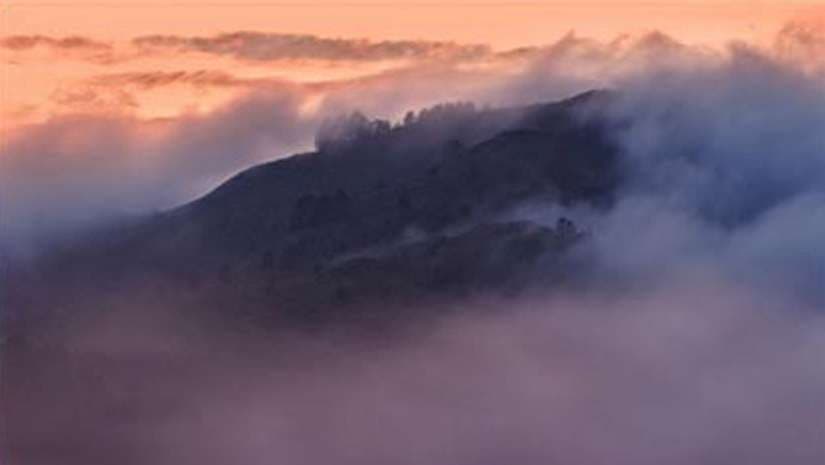
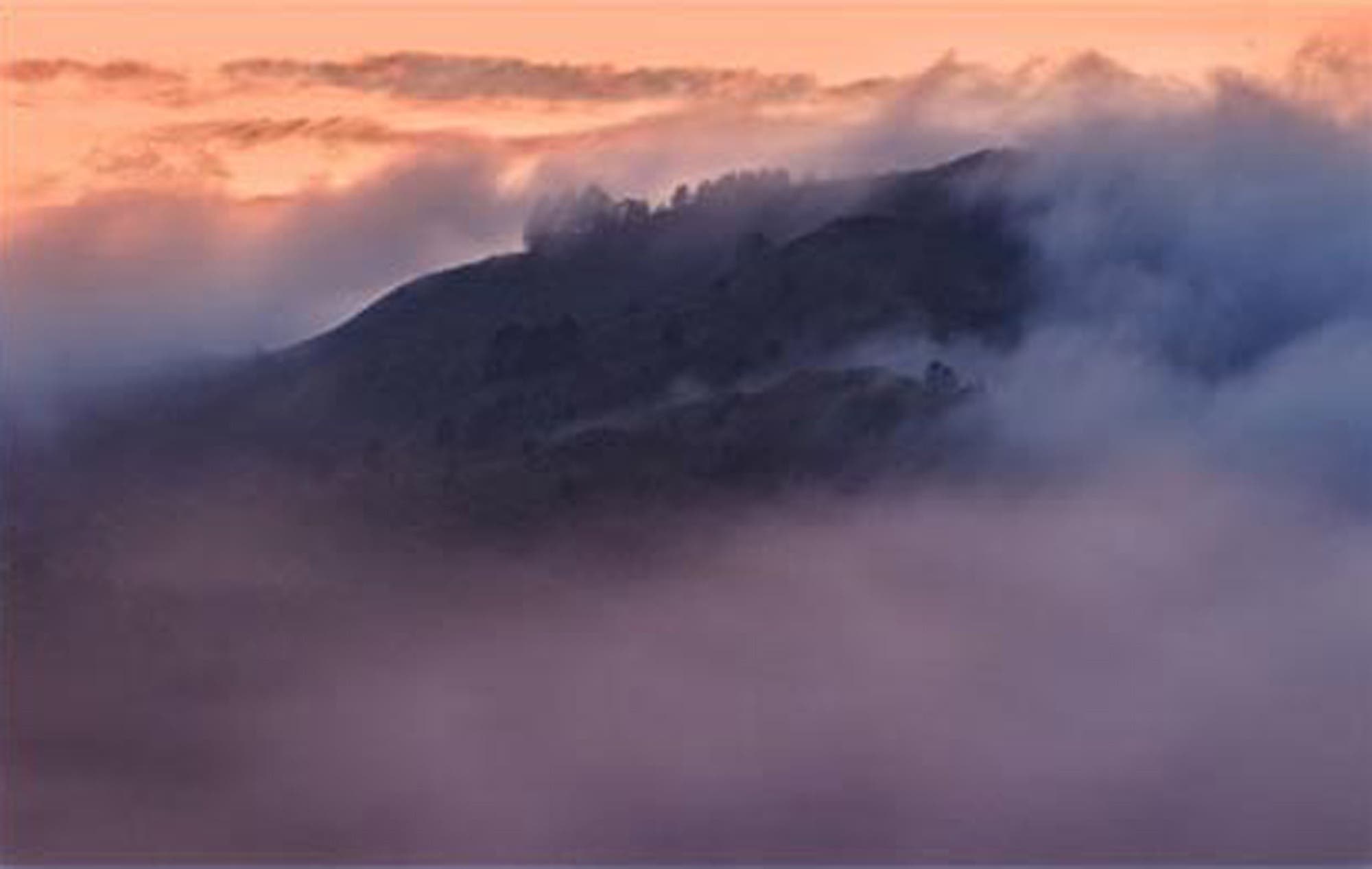
My friend Marcia Hart shot this lovely image recently on the Marin Headlands, a part of the Golden Gate National Recreation Area in California, but she only shot a single exposure. (Our eyes fool us because we see a wider range of light than film or a digital sensor, so she didn’t anticipate how much the sky would wash out.) She was concerned that the white sky would detract from the image.

This is a case where I would not crop the sky. I like the way the top of the fog ends before the top of the frame, giving it breathing room. The right and left edges are also lovely, with interesting but subtle details. I especially like what the fog is doing on the left edge. I might consider cropping the right ten percent, at a point halfway between the right edge of the dark hills and the edge of the frame. I might also consider cropping about an equal amount off the bottom. But this is one image where I can’t see a good way to move the dark area into a “rule of thirds” position so I’ll leave it as it is. Not every image can conform to that rule.
I always crop to the demands of the image itself, to give the best composition, with no regard for making the aspect ratio fit a standard mat or frame size. Cut the mat and make the frame to fit the image, not the other way around.
With cropping the sky ruled out, I showed Marcia a method to bring some color into the lightest areas with minimal impact on middle and dark tones, by using the Output sliders in the Levels dialog box. This is similar to using a graduated color filter (a colored version of a split neutral density filter) but with more control.
First, open an adjustment layer for Levels. From the top menu bar choose Layer > New Adjustment Layer > Levels, or click the shortcut at the bottom of the Layers palette, circled in red, and choose Levels from the pop-up menu.
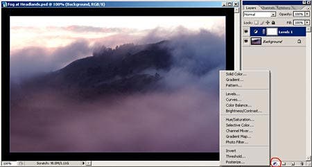
I’m using Adobe Photoshop CS 2. You may be able to use different image editing software, as a Levels adjustment is pretty fundamental. I highly recommend you use an adjustment layer for every adjustment where one is possible. In this case it is especially important because it allows you to play with the various colors you can create in the sky without making irreversible changes to the Background image.
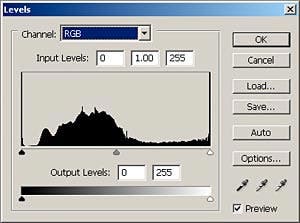
The Levels dialog box looks like this:
To add color to the highlight areas with minimal impact on darker tones you use the Output Levels highlight slider in the bottom bar. If you grab that slider (the right-hand one) and move it left you will turn the white areas gray. But if you go to the color channels you can add and mix colors.
Click on the top dropdown box, labeled Channel, and choose any one of the three color channels, and move its highlight Output slider left. If you are in the Red channel you will get a cyan cast. If you are in the Green channel you will get a magenta cast, and in the Blue channel, a yellow cast. The magic comes when you do this in two channels, which lets you mix any color you want, depending on which two channels you use and how far you move each slider. If you add in the third channel, you will tone down the saturation.
Here I used the Green and Blue channels to make a peach color, to see if it would successfully accentuate the complementary peach color in the clouds.
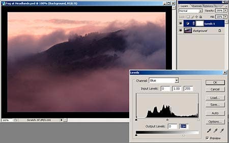
Unfortunately I have altered the mid-tones in the fog in the bottom part of the image, which I don’t care for. But the fix is easy. I’ll mask that area off from my correction. (I couldn’t do this if I had not used an adjustment layer.)
Since I just worked on this layer, it is the active one (highlighted in blue.) If I had done other things in the meantime and another layer was active, I would click on the Levels layer to make it active.
I’ll select the Brush tool, make sure the Foreground color is black and the brush is 100 percent opaque and at zero hardness. I’ll move the brush cursor into the image and set the brush size fairly large, as shown below, and just paint over the area in which I don’t want the color altered. As I paint I can change the size, opacity and hardness of the brush to give me complete control over the area I am masking off. If I go too far, I can switch the Foreground color to white to erase the mask. Usually you need to keep the edges very soft so the effect blends and is not obvious.
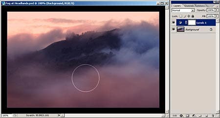
Using a stylus and Wacom pressure-sensitive tablet, I started the brush with its edge just under the horizon line and swept it across and back in a zigzag pattern to fully paint over (mask off) the area covered by the hillside. Here I am in the middle of the brush stroke, with the brush moving from left to right, so the color to the right of the brush and below it is not yet masked out.
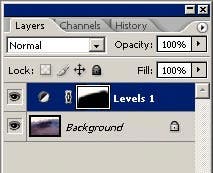
When you have finished painting over the area you can see the mask you made in the thumbnail of the Levels 1 layer in the Layers palette (right).
You can see the mask in more detail by going to the Channels palette (make sure the Layers 1 level is the active one, the blue one) and clicking on the eyeball for the Levels 1 Mask. You can see the mask in even more detail by turning off the eyeball of the RGB layer while the visibility of the Levels 1 Mask is turned on. (The shortcut to the black and white mask is to Alt-click the mask thumbnail in the Layers palette, or Option-click for Mac users.) You can paint further on the mask in either of these states.

You can even go into the fine wisps of fog and mask them off, but this needs to be done subtly, with several passes of a low-opacity brush. Choose one whose diameter is just smaller than the cloud wisp. It doesn’t look right to fully mask off these delicate clouds so I would leave the effect here at about 50 percent.
I did that along with a little more tweaking of the mask. Then I added a little more intensity to the sky color by double-clicking on the adjustment thumbnail of the Levels layer (to get the adjustment dialog box back) and pulled the sliders a little more to the left.
Here is my final image:
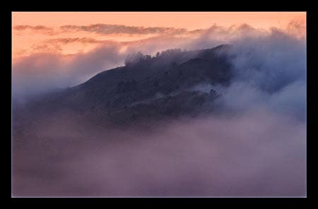
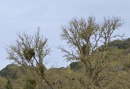
I went for a very dramatic effect on this image, which some people won’t care for, but done more subtly this technique is a good way to add a touch of blue to a white sky. Use the Red and Green channels, with a lesser amount in the Blue channel to add a little yellow for desaturation. This is a good technique for a sky that has fine tree branches intruding into it so you can’t make a good selection. In that case you won’t be able to mask the fine branches and unless they are very dark they will be tinted a little, so you will have to be subtle in the color you add.
Here is a before and after example. To get a blue color I used the sliders in the Red and Green channels.

Diane Miller is a widely-exhibited freelance photographer who lives north of San Francisco, in the Wine Country, and specializes in fine-art nature photography. Her work, which can be found on her web site, www.DianeDMiller.com, has been published and exhibited throughout the Pacific Northwest. Many of her images are represented for stock by www.MonsoonImages.com.
© 2007 Adorama
