
When we analyze what it is that catches our eye in the photos we love, it usually comes down to two things: the significance of the moment and/or composition. Of course, composition covers a lot of ground like the blanket term it is, and it includes common tools like the rule of thirds, leading lines, depth of field, negative space, contrast, and so on. One of the often overlooked compositional elements I’d like to touch on today is also, in my opinion, one of the most impactful: complementary colors. When you learn how to use complementary colors in photography, you gain access to a powerful and visually compelling tool.
Complementary Colors in Photography
So, what are complementary colors, exactly, and how will using them in your imagery improve your photos?
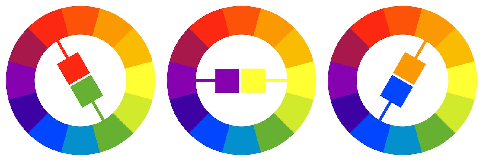
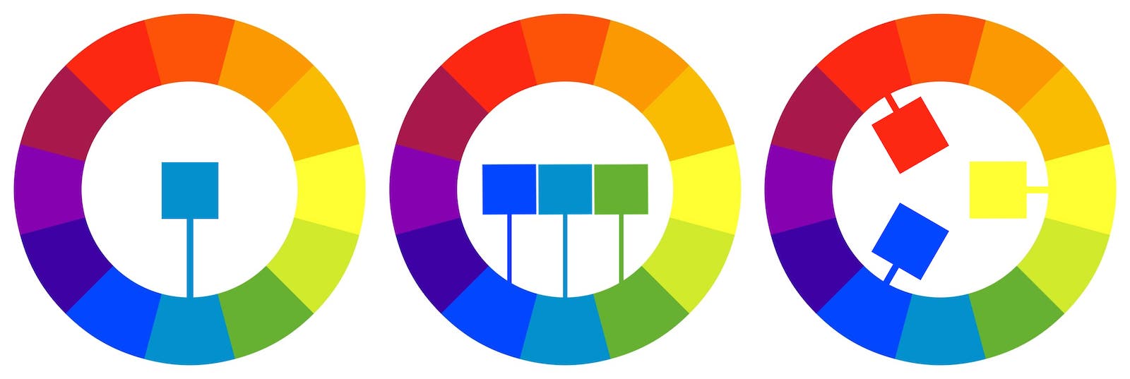
Simply put, complementary colors are colors that exist opposite one another on the color wheel. Complementary colors represent one of many color schemes included in color theory. In the example above, we can see three pairs of complementary colors. When we pair together complementary colors in photography, we create the maximum amount of contrast between the colors in our images. But why is this important? Well, this color contrast draws our attention and can impact how we view the photo, how we feel about its contents, and more.
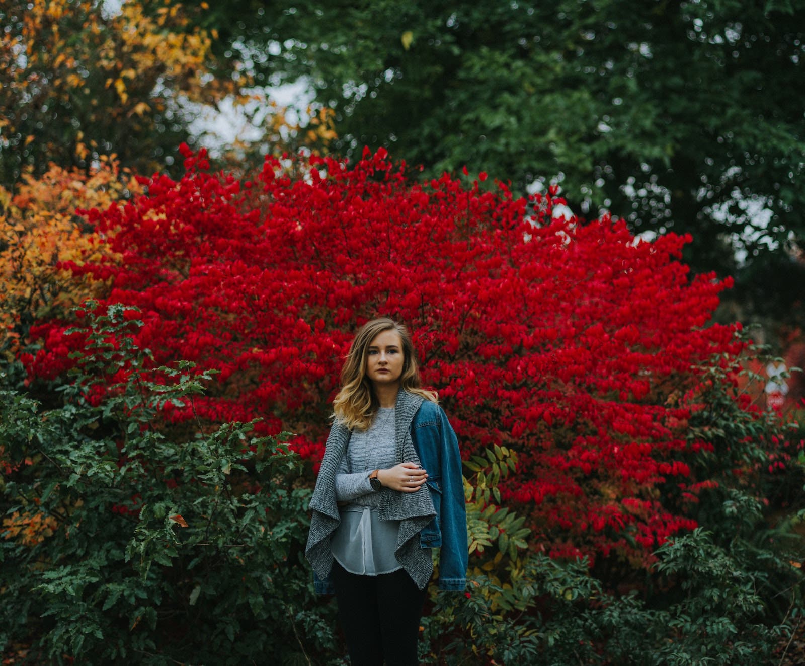
For example, using brighter colors will add visual energy to the image, which is great if the outcome suits your purpose. If you’re photographing kids at play and want to amplify the playfulness of the image, dressing the kids in bright colors that pop against the backdrop (such as green grass and trees at a park, for example) will help you achieve the look and effect you’re after. We get a different sense when looking at the naturally occurring colors of sunset, as the orange hue of the fading sun blends into the deep blue shade of the early night sky.
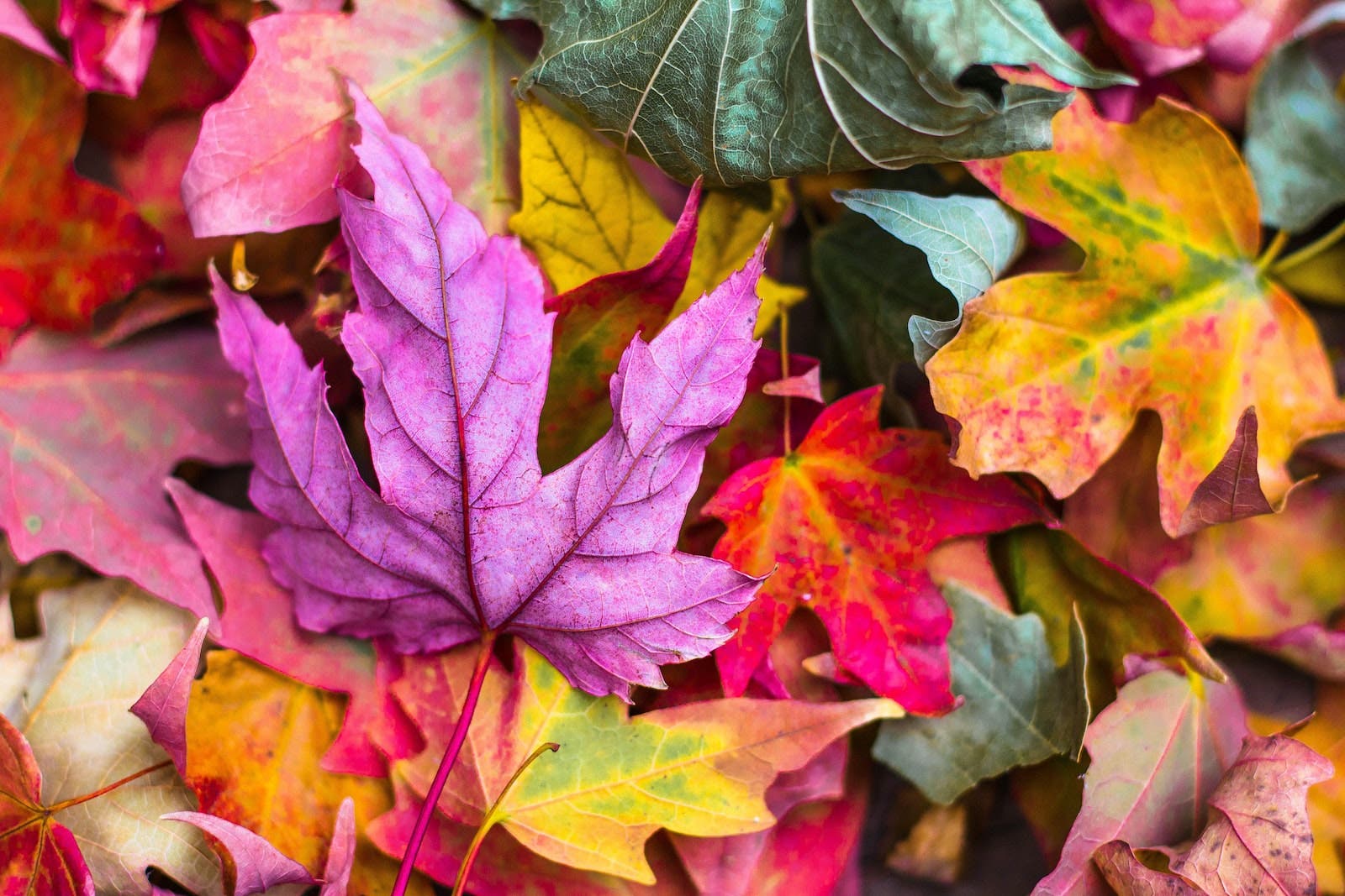
On that note, it’s worth pointing out that not all complementary colors create the same level of contrast. The more vibrant the colors, the more contrast we’ll create. It’s important to recognize the impact of the colors you choose when planning your shoot. You can choose bold, soft, warm, or even cool color tones and those choices will impact how viewers perceive the image.
How to Use Complementary Colors in Photography
- Practice Working with Complementary Colors at Home
- Limit One of the Complementary Colors to Serving as an Accent Color
- Experiment with a Split-Complementary Color Scheme
- Combine Color Schemes
- Add Complementary Colors with Flash
- Adjust the Colors in Post-Production
Tip #1: Practice Working with Complementary Colors at Home

As simple as the concept of using complementary colors seems, mastering it does require a bit of practice. Before adding this visual tool to your photography sessions, practice in the comfort of your own home with non-photography-related objects. Here’s a quick color blocking exercise to help you snap some photos while focusing on one pair of complementary colors at a time:
- Choose a Backdrop. Use anything from dinner plates to colorful walls, or any objects wide enough to fill most of the frame.
- Select a Subject. Depending on the color of your backdrop, select an object with a complementary color that lies directly across from the backdrop’s color on the color wheel. For example, if you’re capturing a top-down shot of a blue tablecloth, then look for something orange to photograph against it.
- Compose Your “Shot.” You’re already working with complementary colors in photography, so now it’s time to add in some other compositional elements. Place your object along one of the thirds in the frame, or go for perfect symmetry (if possible), or else keep the subject small in the frame and use the backdrop to create negative space, etc.
- Repeat with a Fresh Backdrop, Subject, and Composition. Practice makes perfect, or at least better.
Mood Board
Alternatively, you can use apps like Pinterest or search for images through Google to put together mood boards that focus on photos with complementary colors.
Tip #2 for How to Use Complementary Colors in Photography: Limit One of the Complementary Colors to Serving as an Accent Color

Taking advantage of complementary colors in photography does not require us to use the colors in equal parts. For example, we can use one of the complementary colors as an accent color. This will allow you to include complementary colors in your photos without having them outshine other compositional elements.
Tip #3: Experiment with a Split-Complementary Color Scheme
We can also use a slight variation to standard complementary colors, called split-complementary colors, to reduce the impact the colors will have on your final image while still using them to contribute to your composition.

To use a split-complementary color scheme, simply select your main color (such as red) and then use it with the two colors next to its complementary color (in this case, yellow-green and blue-green). See the chart above for a clear example. Split-complementary colors will have less contrast and appear more balanced in your photos.
Tip #4 for How to Use Complementary Colors in Photography: Combine Color Schemes
If you’re only using complementary colors, the colors may sometimes dominate the image in a way that detracts from your vision. In such instances, you can introduce additional color schemes to mellow the effects of the complementary colors in photography.
There are several other color schemes, but here’s a quick overview of a few go-to’s:
- Monochromatic: A monochromatic color scheme employs the hues and tones of a single color. For example, black and white photography falls under the monochromatic family. Of all the color schemes, this one offers the most effective means of using “color” to convey emotion in photos. When combined with a monochromatic scheme, a complementary color would likely best be used as an accent. While the photo may no longer qualify as a monochromatic image, technically, the dominance of the single color in the image will make any contrast with it more dynamic.
- Analogous: Start with any color from the color wheel and select up to three colors to the left or right. The minimum selection for analogous colors is two colors that sit directly next to one another on the color wheel.
- Triadic: A triadic color scheme is very similar to a split-complementary color scheme, but it pushes the complementary colors of the main color over one color on the color wheel. The primary colors, red, blue, and yellow, make up a triadic color scheme.
Tip #5: Add Complementary Colors with Flash

We’ve focused so far on using clothing and backgrounds for working with complementary colors. However, one quick way to introduce an intentional color scheme into your photos is to add a detachable camera flash. In the video, Daniel Norton demonstrates this technique using Profoto gear, but you can pull this off with other gear. Just get ahold of a couple basic speedlights, a transmitter (or an on-camera flash to serve as a master to the off-camera units), colored gels, and a light stand or two. While some photographers shy away from flash photography, the possibilities it opens up make it worth getting into.
Tip #6: Adjust the Colors in Post-Production

Regardless of whether or not you captured actual complementary colors in-camera, you can work with them in post. Photo editing software like Photoshop makes it possible (and easy) to adjust and fine tune existing colors in your photos. You can even use the software to shift different colors and take advantage of other color schemes.
Here are a couple of quick ways to use editing to enhance the complementary photos in your image.
Hue/Saturation Adjustment Layer
Have you ever used the Hue/Saturation adjustment layer in Photoshop? All you need to do is open your file in Photoshop and then add a Hue/Saturation adjustment layer. With that layer active, select a color from the dropdown menu and adjust the Hue slider. This will change all of the colors in the range of the color that you selected. Other adjustment options in this layer include lightness and saturation.
Select Color Range
Another way to adjust a specific color range in your photo is to simply go to Select > Select Color Range and then select an area of your image and make adjustments like those noted above. This option helps if you only want to change the color in the background or the main object. These adjustments will not affect other colors in the image, particularly the other complementary color.
Paint
Finally, another method you can use to adjust complementary colors in photography involves painting over your image in post. Create a new layer over your image in Photoshop and select a brush. You can dial in the brush characteristics to taste, but be sure to adjust the opacity and flow settings. Adjusting these settings will allow you to control the intensity of the effect. Also, experiment with different blend modes (multiply, overlay, etc.) and choose the one that best suits your needs.
Conclusion
We usually try to stack compositional techniques whenever we can while capturing images, and that’s a good thing. I would also suggest that we take advantage of the power of complementary colors in photography. Because color greatly impacts our images, it’s important to treat color with proper respect and attention. As photographers, we often lose ourselves in dialing in a proper exposure or carefully framing our shot, but we shouldn’t overlook the colors that occupy our frame.
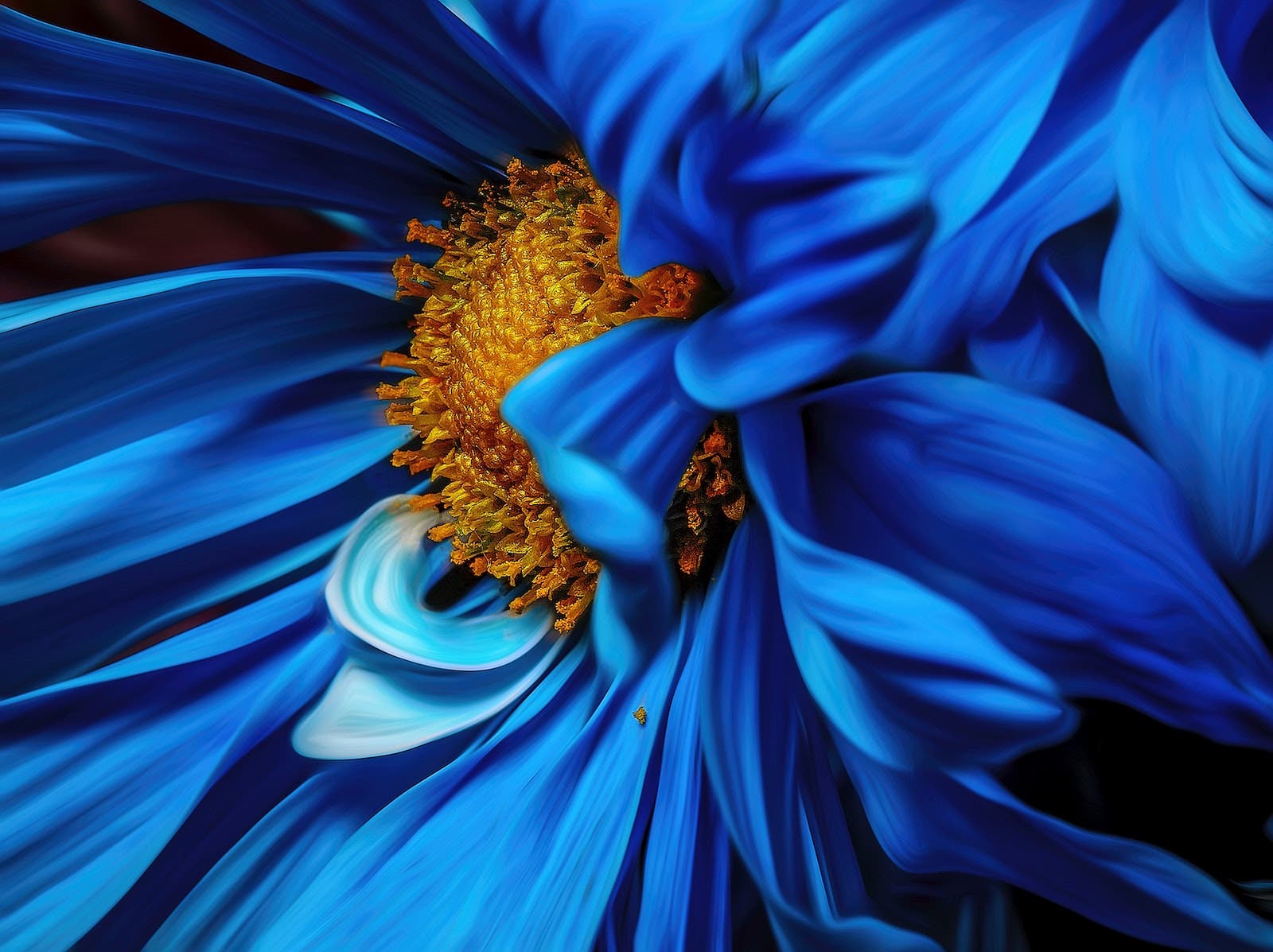
Featured image of the blue and orange flower by Alex Martin.