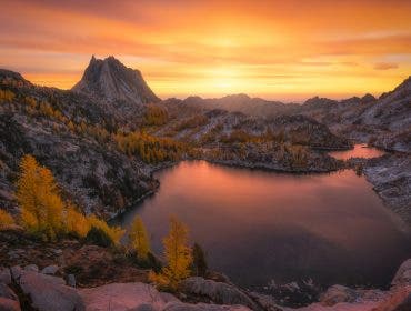
Color grading is all about adjusting the colors and tones in your images. Lightroom and Photoshop recently updated the way color grading works, making it more user friendly and even more powerful than before. Color grading is perfect to add a little interest to your image, and make the light even better than it was before.
Color grading is important and useful in all types of photography. Landscape and portrait photographers especially will love the color grading features in Lightroom and Photoshop. The Color Grading module is the successor to Split Toning, so if you’re wondering where split toning went, it is now considered color grading.
Upon first glance, the color grading tool appears simple, but it has many advanced features and tricks to make your images look amazing. In this guide, you’ll learn all about how to utilize the Color Grading feature in Lightroom and Photoshop.
What is Color Grading?
Color grading is the process of manipulating the color tone of an image to create a certain mood. Color grading is done through a photo editor or video editor by adjusting the hue, saturation, highlights, and other elements. This is a common method used in both photography and film.
Accessing Color Grading
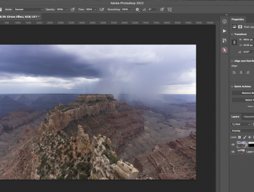
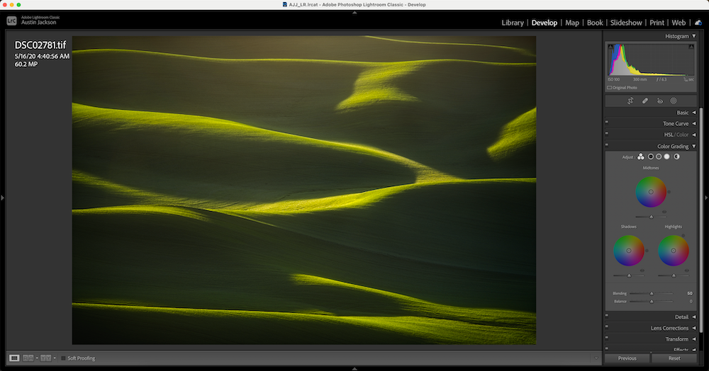
To access the Color Grading feature in Lightroom, choose the photo you wish to edit and access the develop module. Then, scroll down on the right side of the screen until you see the Color Grading dropdown. Select this to drop down three different color wheels.
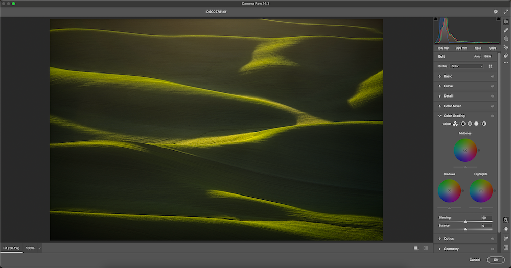
You can find the same options in Photoshop under the Camera Raw Filter. Once you open a photo inside of the Camera Raw Filter, simply scroll down on the right side of the screen until you see Color Grading. In both Photoshop and Lightroom, color grading works the exact same way. For the sake of this blog post, I’ll be showing the example images in Lightroom.
Using Color Grading
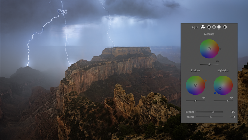
The first thing you’ll notice is that there are three different color wheels that all appear the same. However, each color wheel has a different function:
- Midtones – top wheel
- Shadows – left wheel
- Highlights – right wheel
It’s important to note that you should balance the temperature and tint in your image before you get to the color grading step. Color grading is a way to enhance the colors in the image, not to balance the colors to make the image.
When you first start using the Color Grading feature, avoid using the midtones color wheel. Try adjusting just the highlights and shadows wheel first. In most photos, it looks very nice to add some warm colors in the highlights, and then add some cooler colors in the shadows. However, you can let your creativity run wild when using these sliders to produce some really amazing images!
Color Grading Example
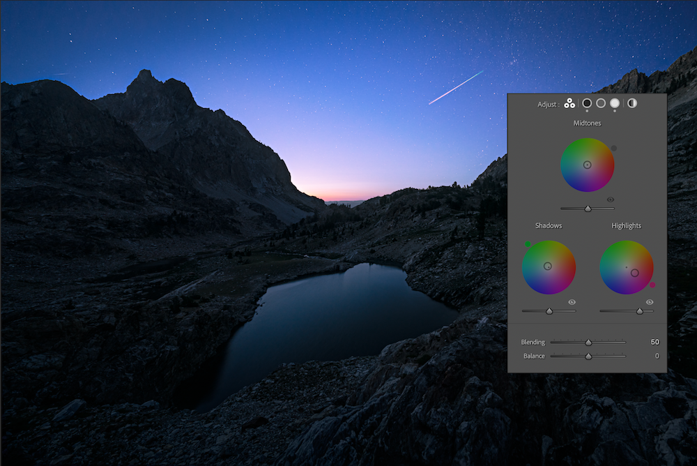
In this particular example, I’ve added some yellow (warmth) to the highlights, and some blue (cool) to the shadows. This helps make the sunlight hitting my image very warm and inviting, and gives the shadows a colder, blue look.
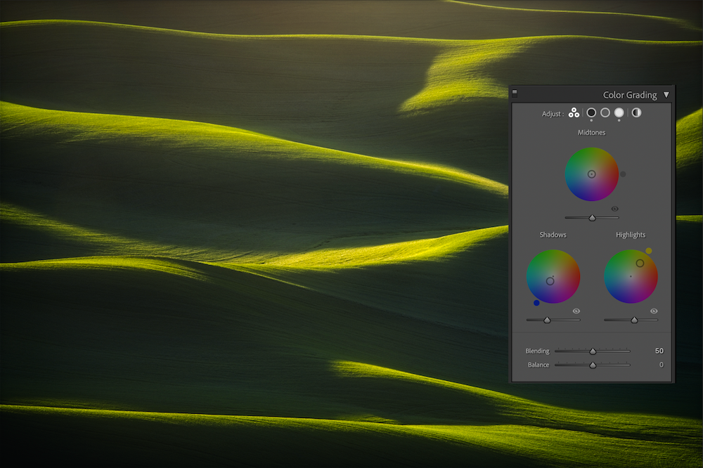
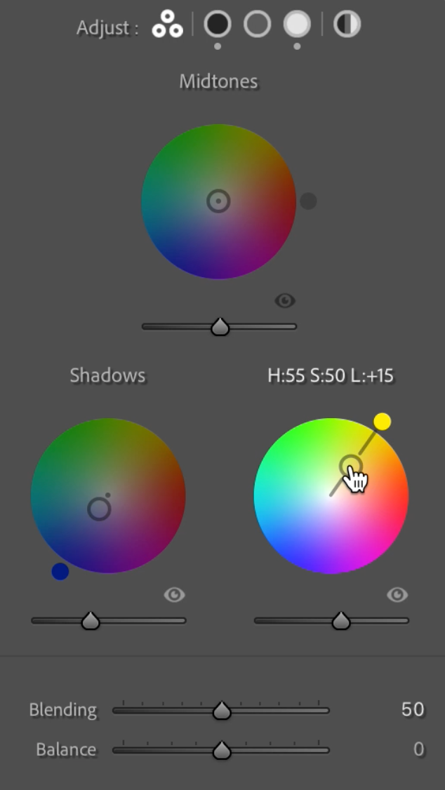
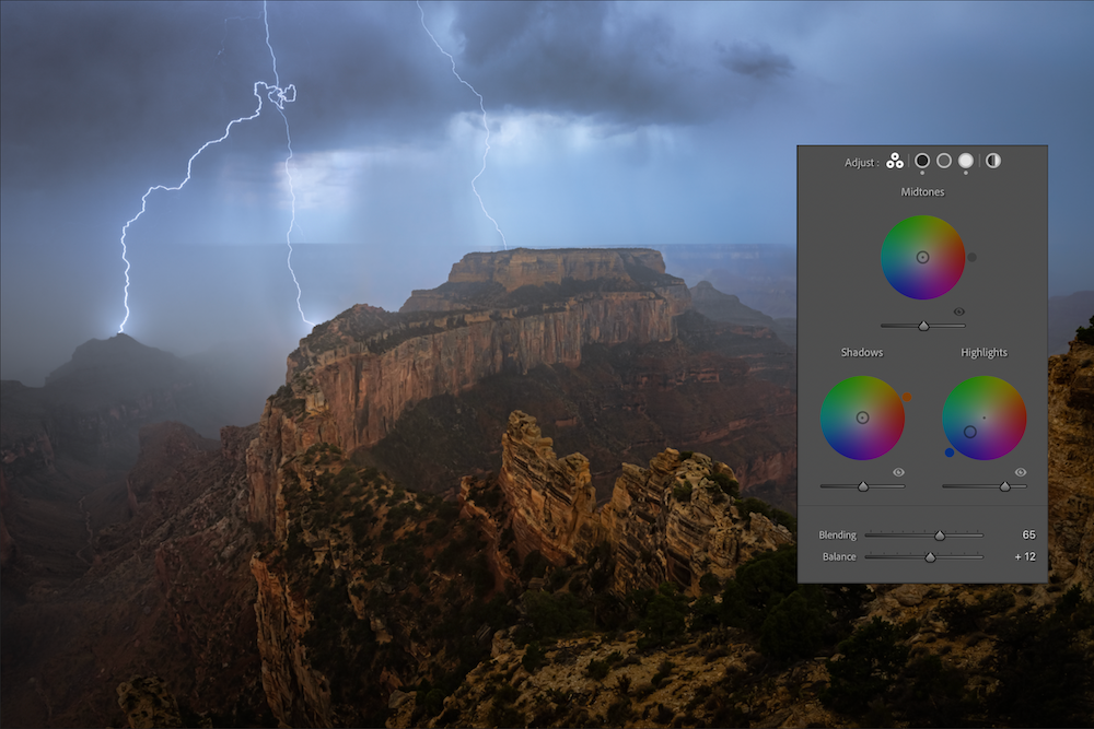
Using the color wheels is actually quite simple. Simply click and drag anywhere inside the color wheel to choose a color. The further you go from the center of the circle, the stronger the color will be. There is an unmarked slider bar right under each circle. This adjusts the luminance value of the corresponding color wheel. This means that if you adjust the bar under the highlights color wheel, you will either brighten or darken the highlights. This is a nice feature to have to make last minute adjustments to the luminosity values in the highlights, shadows, or midtones.
The other two options that you can adjust are blending and balance. The blending slider allows you to change how well the color in the highlights, midtones, or shadows will blend with each other. Bringing the blending slider up will make the colors blend in more seamlessly. The balance slider allows you to adjust how much of the image is considered highlights, shadows, or midtones. For example, if I adjust the balance slider to the right, it will make the adjustment appear on less of the highlights. The adjustment will only appear on the brightest of the highlights.
Tips for Color Grading
Hold shift when increasing or decreasing the color on the color wheel
When selecting the color you’d like to add to your image, grab the small circle on the outside of the color wheel. You can drag this around to adjust which color you’d like to add. Once you’ve roughly selected the color you’d like, you can press and hold shift to add more or less color to the image. When you hold shift, the adjustment will move in a straight line. This allows you to keep the same hue, but adjust the amount of color being added. Without holding shift, the color wheel can become difficult to adjust precisely.
Add warmth into the highlights, and cool down the shadows
My favorite combination is to add yellow or orange to the highlights, and blue to the shadows. This creates a very natural looking effect. The bright light in the image will be warm — like the sun — and the shadows will be cool. This is always a good place to start, but consider trying other things once you learn how to use the tools. Many professional portrait photographers can even utilize blues in the highlights to create very interesting, moody looking portraits.
Use complementary colors
Using complementary colors is a proven theory to make your images more pleasing to look at. The human eye loves to look at colors that complement each other. Complementary colors are colors that lie on the opposite side of the color wheel from each other. This is why the combination of orange or yellow in the highlights, and blue in the shadows works so well together. Consider trying other combinations of complementary colors as well.
Using color grading is a really nice way to add a finishing touch to your images. Professional photographers in all fields utilize this feature as a way to enhance their images and improve on the light in their image. Remember that there are many different combinations of colors that work well together, and consider trying multiple combinations before settling on a final edit.
Color Grading FAQs
Is color grading necessary?
The whole post-production process is centered around altering the color quality of an image. Color grading is necessary to communicate a certain mood to your audience, or to develop your personal photography or video style. It makes your content look more professional and helps to tell the story of your image.
What is the difference between color correction and grading?
Color correcting is the process of fixing the colors in your photo or video to match what you had originally captured. It is required to make your content look as natural as possible.
Color grading is the process of manipulating the colors of your photo or video to meet your stylistic vision.
Should you color correct before color grading?
Yes. You should always color correct before starting your color grading. This is to ensure you start with balanced, natural-looking colors.
Which is better for color grading Photoshop or Lightroom?
If you are new to color editing, Lightroom provide a quick and intuitive approach to color grading. Although, Photoshop provides more creative control if you are looking for a more refined look. Overall, it’s best to stick with the software that you are most familiar with, to keep your post-production process as easy as possible.