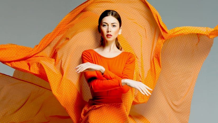
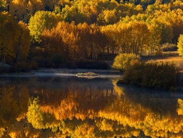
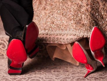
Although you may not know it, we often are attracted by one color more than others. Our homes and wardrobes tend to include more items in one color or group of colors. We consider the local colors when choosing vacation destinations (e.g., turquoise for a near-water destination, green for mountains, yellow for the desert, etc.) and base our shopping preferences on the packaging color. We do all these unconsciously, of course, because colors operate at a deep inner level — the level of emotions. They make us feel in a certain way, and we often take them for granted.
The same applies to photography. In fall, many often find themselves gravitating toward the color orange in photos. Surrounded by shades of green, blue, and brown, a pop of orange immediately catches your attention. You can spot it on flower petals, mushrooms, in the complicated design of insects, in the fur of animals, or in a luxuriant sunset.
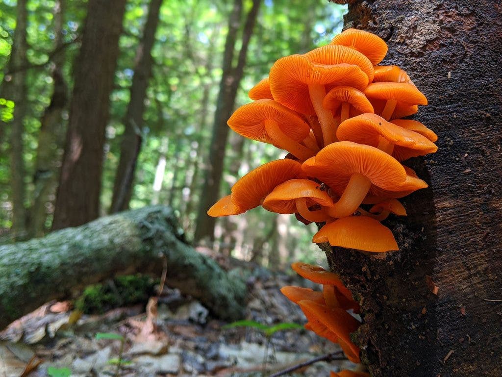
Nature photography isn’t the only genre that benefits from using the color orange. Here is why you should consider it in different aspects of your photography.
Orange as a Symbol
Color symbolism refers to how we use color as a medium for conveying information and feelings. In most cultures, colors are associated with traditions, stages of human life, emotions, or abstract concepts such as luck.
Seeing an orange object in a photograph may mean different things to people from different cultures. However, based on our anthropological development, we are most likely to react in the same way at an emotional level. Thus, when you use orange in your photography, you may expect your viewers to feel one of the following sensations or emotions.
Warmth
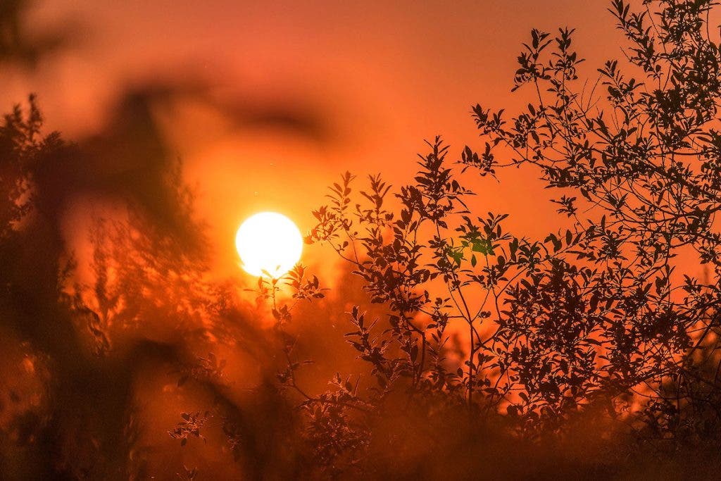
Orange is associated with sunsets, summers, and fires because that’s where you usually see the color orange in nature. As a result, even if the photograph doesn’t provide a tactile sensation, the viewer will feel a certain warmth. Even if the image depicts a snowy winter landscape, if the light has an orange tint, the viewer will perceive it differently.
Energy
Also, based on its association with the sun and fire, the color orange conveys energy. It has the power to boost the viewer’s energy level and make them proactive and reactionary. For this reason, orange is often used for energy drink packaging, gym outfits, and power tools.
Richness
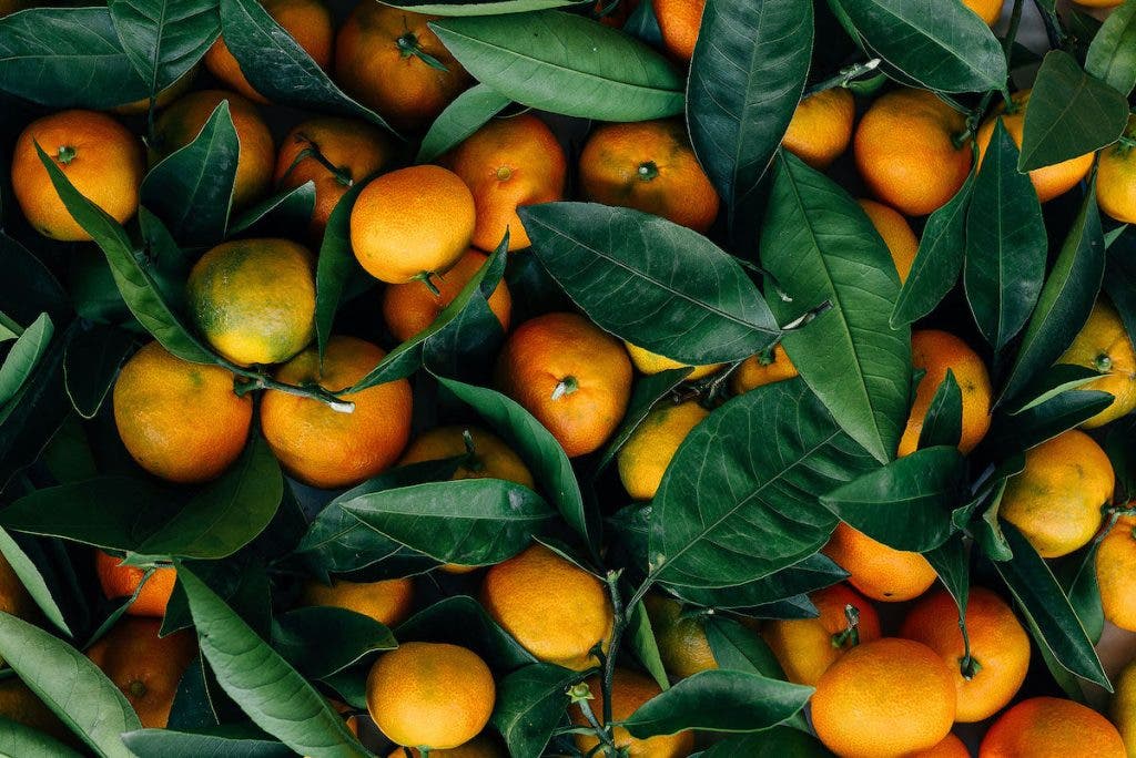
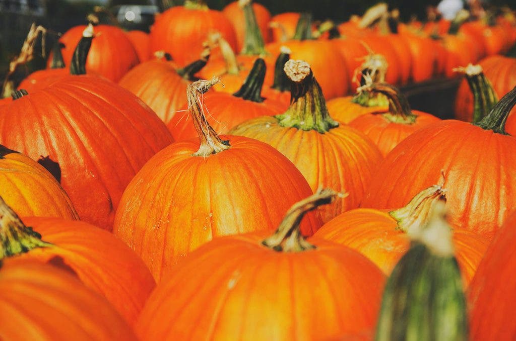
Orange is a predominant color in autumn when people celebrate the harvest. As a result, it is often associated with the richness of the land, harvest feasts, fall foliage, and autumn holidays, such as Halloween.
A monochromatic photograph based on orange shades will convey the end of summer nostalgia, the warmth of family reunions, the enthusiasm of the harvest, fall foliage, and the abundance of a feast.
Optimism
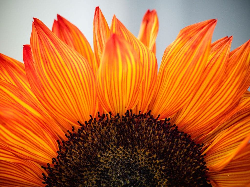
By putting all the above together, we get a very uplifting mood. When you are warm and energetic, chances are you’ll also be joyful and optimistic. That’s the charm of the color orange: it lifts our spirits, makes us hope, emphasizes the enthusiasm of the youth, and provides a favorable environment for growth.
Pairing Orange with Other Colors
While the color orange may be the focal point of your composition, it is never alone in the frame. The negative space that surrounds the orange subject, the background, as well as other secondary subjects, add a broad range of colors. Thus, pairing orange with other colors is imperative for the balance and harmony of your photography.
According to the color wheel, for which Adobe Color Wheel is a great free online tool, you can encounter (or create) one of the following scenarios:
Monochromatic Compositions
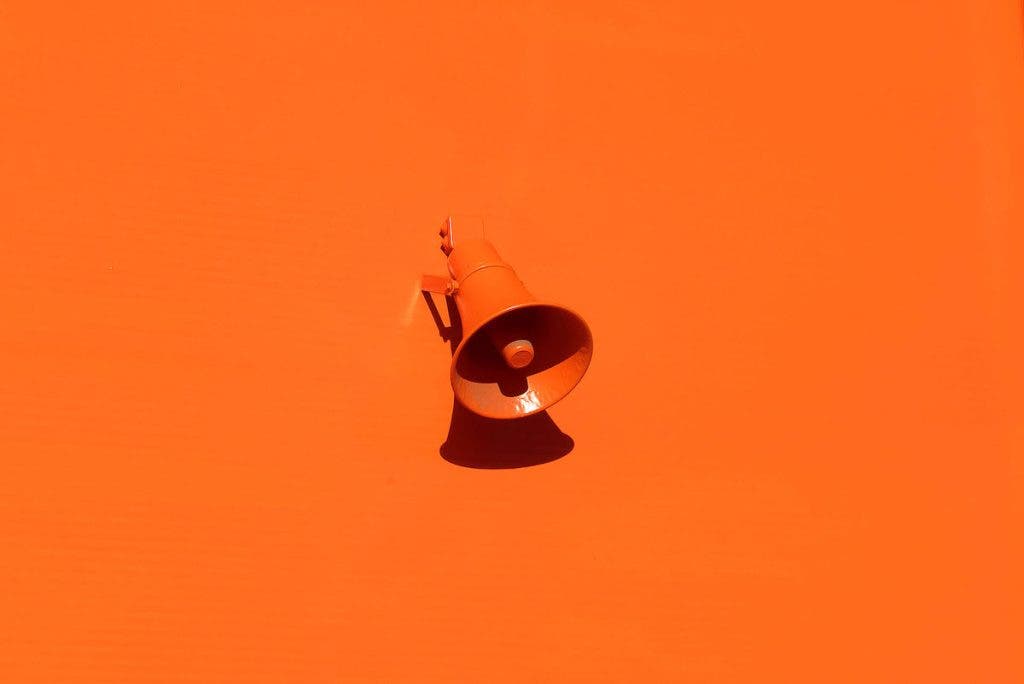
Overlay multiple shades of orange with different brightness and saturation. Monochromatic compositions in orange are impactful and impossible to ignore. To balance such a powerful color experience, you need a minimalist approach, plenty of negative space, and rather neutral subject matter.
Compositions with Complementary Colors
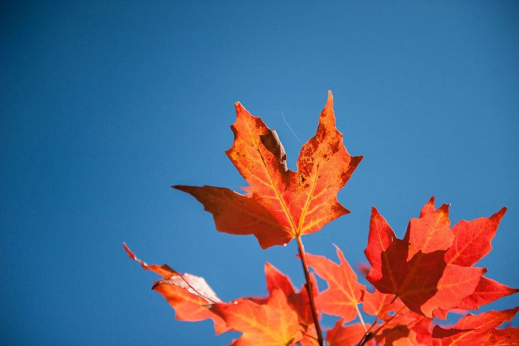
According to the color wheel, the color blue is orange’s complementary color. Together, they produce the highest color contrast possible and, as a result, a strong focal point. Blue and orange is a combination often found in nature because the sky and large water surfaces provide a blue background for every orange subject. Sunsets, autumn foliage on a blue sky, and an orange buoy of a blue sea are the perfect compositions of orange and blue.
Compositions with Analogous Colors
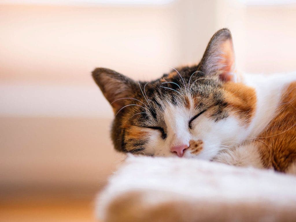
Next to orange on the color wheel are red and yellow. These are the analogous colors that produce an intense feeling of warmth, love, and energy. In nature, pure colors only cover very small areas. There is almost always a mix of analogous colors or similar shades. White and black are considered neutral, so you can include them in your compositions with analogous colors.
Compositions with Triadic Colors
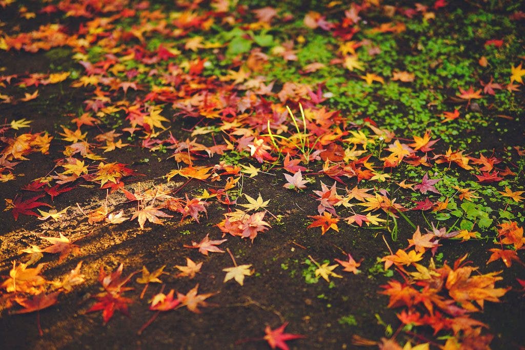
Orange, green, and purple are colors opposite to each other on the color wheel and thus, a triadic combination. They are also autumn’s favorite colors and provide enough contrast to catch the viewer’s attention and enough closeness to create harmony and balance. Triadic colors convey a mix of feelings and emotions, borrowing something from each of the component colors.
How to Add Pops of Orange in Photography
Including the color orange in your compositions can be striking or subtle — depending how you navigate the scene. The color may take the front seat or stand quietly in the background. Regardless of where you position it and how much you use it, ensure your composition is well-balanced and harmonious.
Remember that orange has a strong visual impact, and thus, it makes objects visually heavier. Fiddle with dimensions, distance from the camera, color saturation and brightness, and contrast to achieve the balance you need.
For example, if your subject includes orange (e.g., flower petals, clothing, accessories, etc.), tune down the colors in the background and allow for negative space to balance the composition. A crowded, colorful background will make the image too busy and heavy.

On the contrary, if the background is orange (e.g., sunset, an orange brick wall, studio background, etc.), emphasize the subject using recognizable shapes, reducing the camera-subject distance, or including a foreground element. Otherwise, your composition will lack a focal point.

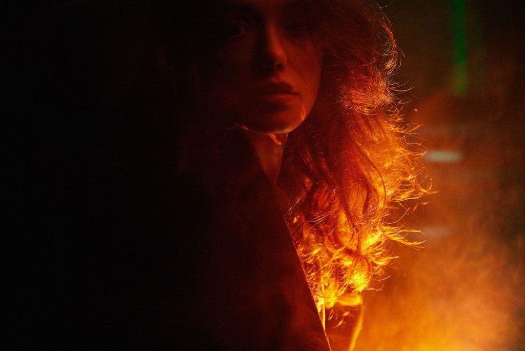
You can also use the color orange more subtly than that by using orange lighting (e.g., sunlight at sunset, candlelight, or an artificial light source with the right color temperature). Orange lighting is very flattering for human skin tones and is used frequently in portraiture. It smoothes the imperfections and makes the hair glow. It also induces a feeling of warmth and loving care, a romantic experience, or a deep feeling of melancholia. Even if it’s subtle and barely noticeable, orange light goes deep into the heart of the viewer. It also makes a stunning bokeh effect.
Tips for Capturing Orange
In large doses, the color orange may overpower the composition and take the scene even when you don’t want to. For example, when focusing on an interesting subject matter while an orange sunset is happening in the background, the viewer will most likely admire the sunset instead of your subject.
The same distracting effect occurs when an orange traffic cone enters the frame by mistake. Even though it may be near the edge of the frame and small, the orange color will make it visible and thus distracting. Don’t overlook orange objects when framing your shots.
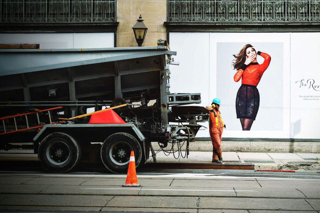
The same applies to orange and blue color contrast. It’s a powerful attention hijacker, even in small doses. Make sure it doesn’t get in the frame by accident.
However, sometimes you want the color orange in the frame but don’t use the correct camera settings. That usually happens when you let the camera decide the white balance because it tries to compensate for the orange shades. If you don’t want the orange to look lifeless and lack saturation, set a white balance for warm colors — one with a color temperature around 7,000-10,000K. Remember that, when you set the white balance, you are telingl the camera which color temperature should appear white. So when you set a cooler color, like 7000-10000K, to appear as white, the orange tones will appear orange.
Exposure settings are also important because if you overexpose the color orange, it will look yellowish or white and lose the colorful effect.
Conclusion
A natural beauty, the color orange provides endless artistic creativity to photographers. It helps them convey emotions, capture the viewer’s attention, create balance and harmony, and enhance their visual stories. The color orange has a rich significance and an impressive visual appeal. It can’t be overlooked. So when you frame a pop of orange, you’d better do it intentionally and purposefully.
