Adobe Color is a free online tool for photographers, designers, and visual creators that allows them to visualize the fascinating world of digital color and provides an endless source of inspiration. You can use Adobe Color Wheel to understand color theory and apply it in your photography, or choose a color palette for your graphic or interior design.
And, of course, being an Adobe product means Adobe Color Wheel offers synchronization with plenty of other Adobe apps, including Creative Cloud, Adobe Express, Lightroom, Photoshop, Behance, and Stock. Here is everything there is to know about Adobe Color Wheel and how to use it to better understand color.
What is the Adobe Color Wheel?
Adobe Color Wheel is a free online tool that maximizes the use of the color wheel. The color wheel has been around since 1666 when Isaac Newton invented it as a color categorizing method. The wheel is the foundation of the color theory and is frequently used in art, design, and even therapy.
Adobe built a tool that allows you to generate color palettes using the wheel and color harmony rules. It includes ten color harmonies, supports three color modes, helps you create gradients, checks contrast ratios, and even matches colors to a particular mood. And if you are just looking for inspiration, Adobe Color Wheel provides a rich color theme library.
Understanding the Color Wheel
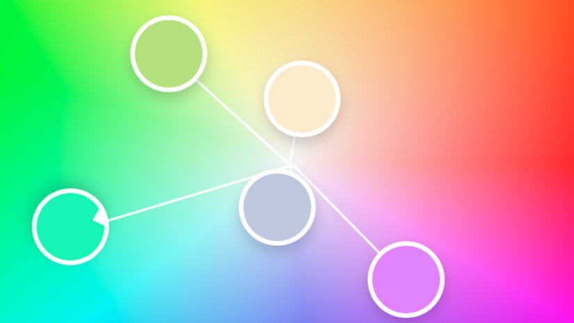
The color wheel is a circular representation of all available colors in a color space. Similar colors are next to each other while contrasting colors stand on opposite positions. The closest they are to the center of the wheel, the brighter they are.
As a result, the color wheel is a visual tool for finding analogous, complementary, or any other significant color combinations. Adobe Color Wheel allows you to select one color of the color harmony and automatically adjusts the rest. You can fine-tune your color by dragging cursors or setting numeric values for each of its color mode components (e.g., R, G, B, and luminosity for the RGB color mode).
Furthermore, each color theme includes five colors (the base is the third in the series) and leaves room for creativity. Every painter, photographer, and graphic designer knows there isn’t just one nuance of yellow or blue. And nuances do matter.
Adobe Color Wheel covers ten color harmony schemes:
Analogous: Similar colors, positioned next to each other on the color wheel, are useful for creating a moody, atmospheric color theme.
Monochromatic: The color theme includes five colors positioned on one of the wheel’s rays. In other words, they are brighter or darker tones of the same color. This is useful for creating themes around iconic colors (e.g., the logo color of a brand, Pantone color of the year, etc.).
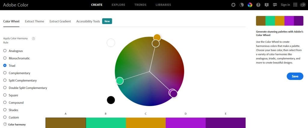
Triad: The triadic harmony includes three equidistant colors on the color wheel. Adobe uses a base color, one very similar to it, and three other colors at equal distances from the base color. The combination creates a well-balanced color contrast and is very popular in design.
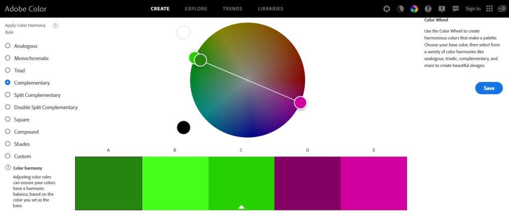
Complementary: Complementary colors sit opposite to each other on the color wheel. The theme includes two colors similar to the base color and two complementary ones. It provides a vibrant color contrast that captures the viewer’s attention.
Split Complementary: It is a version of the complementary color scheme in which Adobe provides four colors slightly closer to the base color than the exact complementary color. The user can adjust how far from the complementary color they need to be.
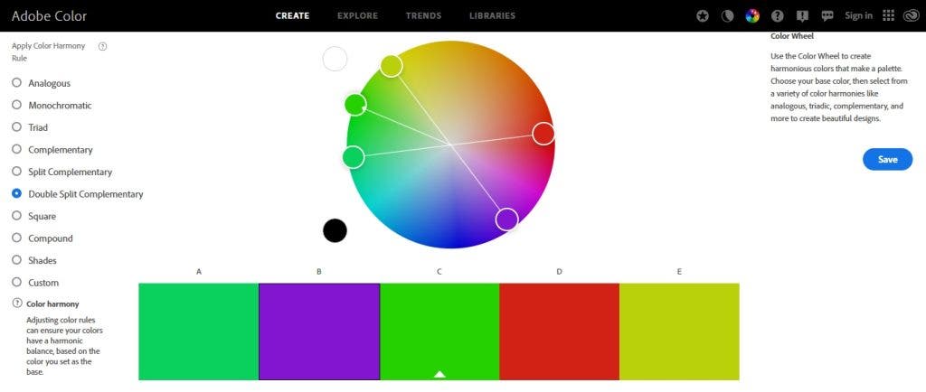
Double Split Complementary: In this version of the complementary color scheme, there are two colors slightly similar to the base color and two close to the complementary color. How similar or distinct is for the user to decide.
Square: The theme includes three colors sitting at equal distances from the base color and one color very similar to the base color for reinforcement. It’s a joyful and appealing color scheme.
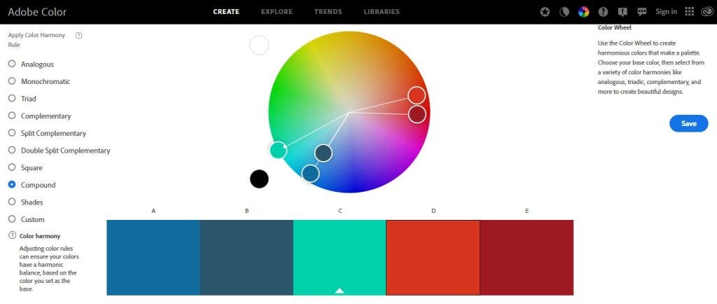
Compound: Including two colors similar to the base color and two almost perfect complementary ones, the compound color scheme places color variations on the same side. As a result, the differences are less obvious, and the color scheme is more harmonious.
Shades: It’s a monochromatic color theme that keeps the variations between the five colors at a minimum.
Custom: This is the user’s chance to imagine any five-color combination. There are no restrictions or support from the tool.
How to Use the Adobe Color Wheel
Adobe Color Wheel is useful in many ways and for many types of visual artists. Because it integrates smoothly with other Adobe products, it makes it easy to find what you need and share it with your current editing software. Here are the most common ways one can use Adobe Color Wheel:
Design a Color Theme
Start with a base color and a design concept. Consider how much contrast you would like to have and what mood you would like to convey. Plotting a color theme is Adobe Color Wheel’s primary function. It works smoothly for graphic design, fashion styling, and photography. For example, imagine you have a background you can’t change, such as a sunset over the ocean. Adobe Color Wheel can help find what colors your model should wear to become the focal point of your photos.
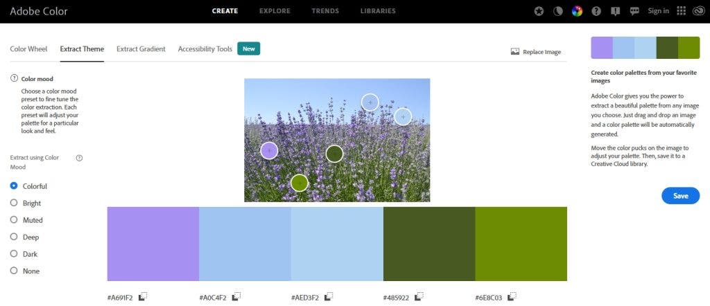
Extract a Theme from a Photo
Let’s say you have a photograph that defines the color mood you achieve perfectly. You can import the photograph into Adobe Color Wheel and let it create a palette for the given look by selecting five colors from the image. You can customize the selection by indicating the focus point: Colorful, Bright, Muted, Deep, Dark, or None.
Each color in the palette is adjustable and ready to be copied and used anywhere else. When you are happy with the result, you can use the color palette for design purposes. The best example is designing a wedding photo album to match the wedding’s color palette.
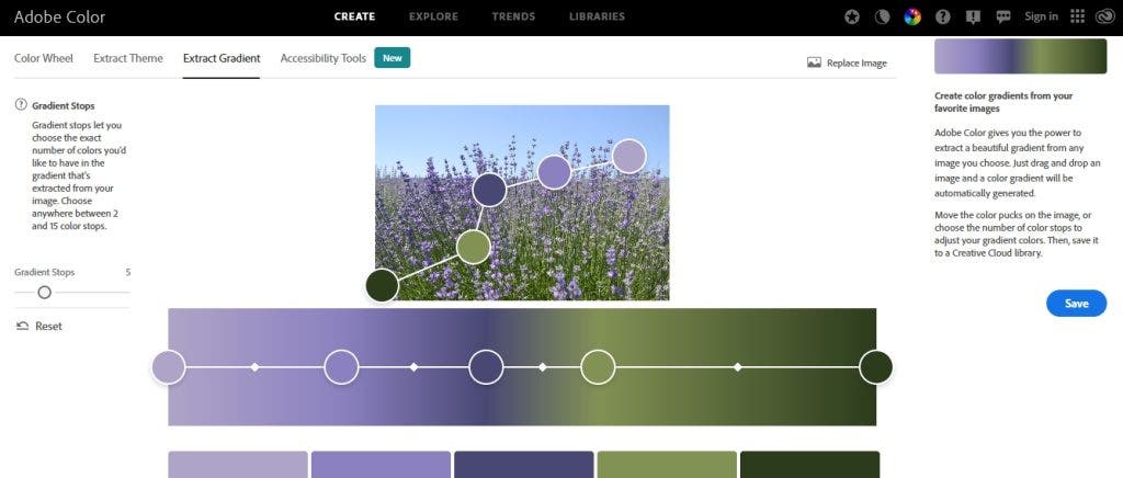
Extract a Gradient Map from a Photo
If you want to create a smooth gradient map leaving from an existing image, Adobe Color Wheel is the tool for you. You just load the image and choose the number of gradient stops (between 2 and 15). The program generates a color theme that takes you subtly from one color to another. You can, of course, adjust each color in the theme. Unlike the Extract Theme feature that extracts any five colors in the image, the Extract Gradient feature links the five colors and creates a smooth separation.
Check Contrast
Adobe Color’s Contrast Checker allows you to verify that you’ve chosen the right colors for your design or photography composition. For example, you can verify the contrast ratio between:
- Background color vs. text color
- Colors of a landscape vs. the model’s outfit
- Color of an artificial background vs. a commercial product
The feature uses WGAG 2.1 accessibility criteria. to make things easier for you, it gives you an exact answer (Fail or Pass) for each of the regular text, large text, and graphics categories.
Check for Color Blind Issues
If your composition creates confusion for people with color blindness, you will “lose” up to 5% of the audience. Adobe Color’s Color Blind Safe feature allows you to verify that the color theme you create doesn’t have color conflicts. It even includes a simulator for different types of color blindness, such as Deuteranopia, Protanopia, and Tritanopia.
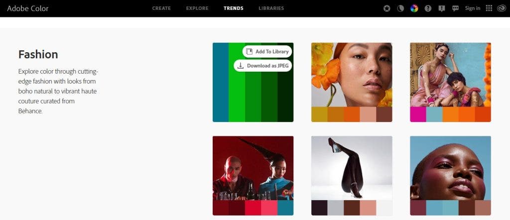
Find Inspiration
Adobe Color Wheel may also constitute a source of inspiration. The tool includes a diverse color theme library organized by color, mood, and keywords. You can also upload an image and look for color themes that resemble the one in your photo.
For those looking to keep up with the latest trends in design and photography, Adobe provides color themes that match the current color trend in the industries. And, for some more color practice, Adobe Color Wheel offers a memory color game that helps you improve your color accuracy and discover new nuances.
Conclusion
Adobe Color Wheel is good practice for working with colors in any artistic field. Furthermore, it’s free and easily accessible through any device. You can start by playing the color game during your commute and end by designing color themes for photo sessions, graphic design, or interior design. You can even use it to match your outfit or find the best color adjustments to apply to your photographs. The list of use cases is endless.