Creating beautiful colorful photographs is easy, right? Just find something colorful and then crank up the saturation in post production. Wrong! Well, what I mean is, there’s so much more to vibrant photography than just that.
In this article, I am going to give you eight tips for truly vibrant photos. In fact, I am not even going to talk about touching your Saturation (or Vibrance) sliders in Lightroom.
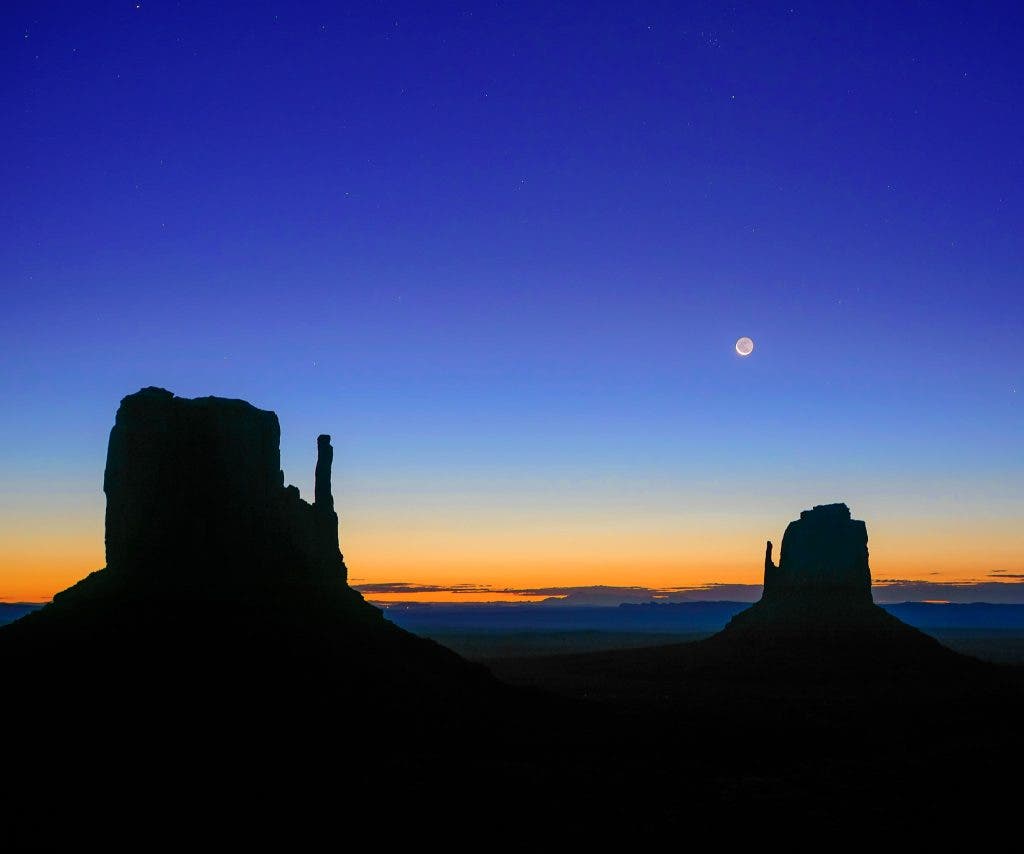
We’re going to go over basic, easy concepts such as how to compose and frame your photos and choose your camera settings for maximum color picture impact, to advanced tips such as studying how different colors complement each other when you put them together. With that said, let’s dive in!
Eliminate Distracting Colors
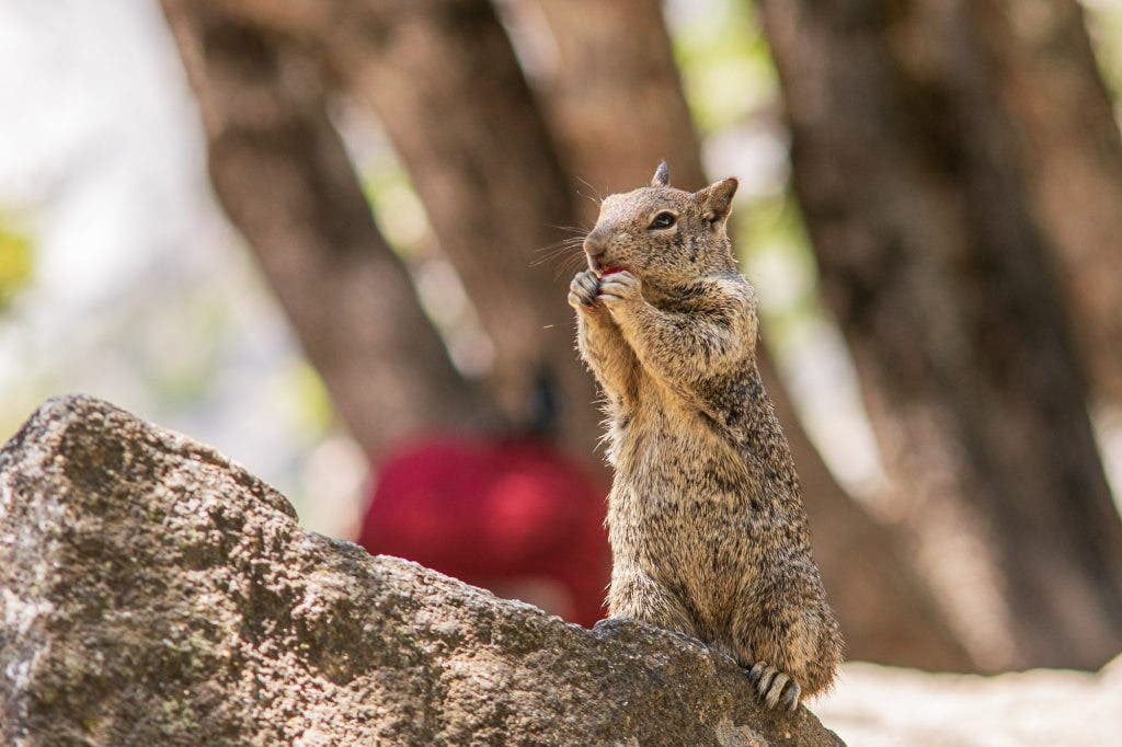
I love this tip because it’s the opposite of what you would think to do however, it is very important. Look through your images. Does a splash of color catch your eye? Here’s the bigger question: Does it make your image stronger, or is it actually a distraction from your main subject?
As a very simple example, what’s that red thing in the background of my photo of this cute squirrel? It’s really bugging me. I wish I had crouched down just a little bit.
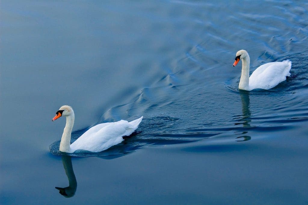
Sometimes, a tiny bit of color surrounded by a different color is a beautiful thing! This “rule” is very easy to get used to. Once you are aware of it, you’ll always know what feels right to you.
Use a Polarizer to Make Colors More Vibrant
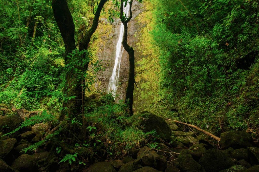
One of the most powerful tools in creating colorful photos — especially in nature where there is greenery involved — is a circular polarizer. If you want to absolutely saturate your greens, and enrich the colors in your shadows, then grab one of these filters.
They’re not just useful for making blue skies a deeper blue, but also, they take the shine off green foliage, or anything that is wet such as the rocks by a river.
In the above image, quite honestly, the greens are too much! You will often find yourself not only avoiding the Saturation and Vibrance sliders when using a polarizer, but you might even have to go into the HSL tools (more on that in a bit) and pull back those crazy greens!
Use Shallow Depth (Bokeh) to Create a Color-Filled Background
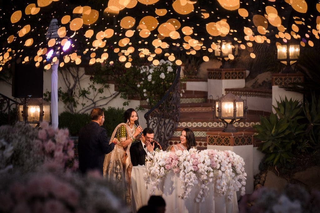
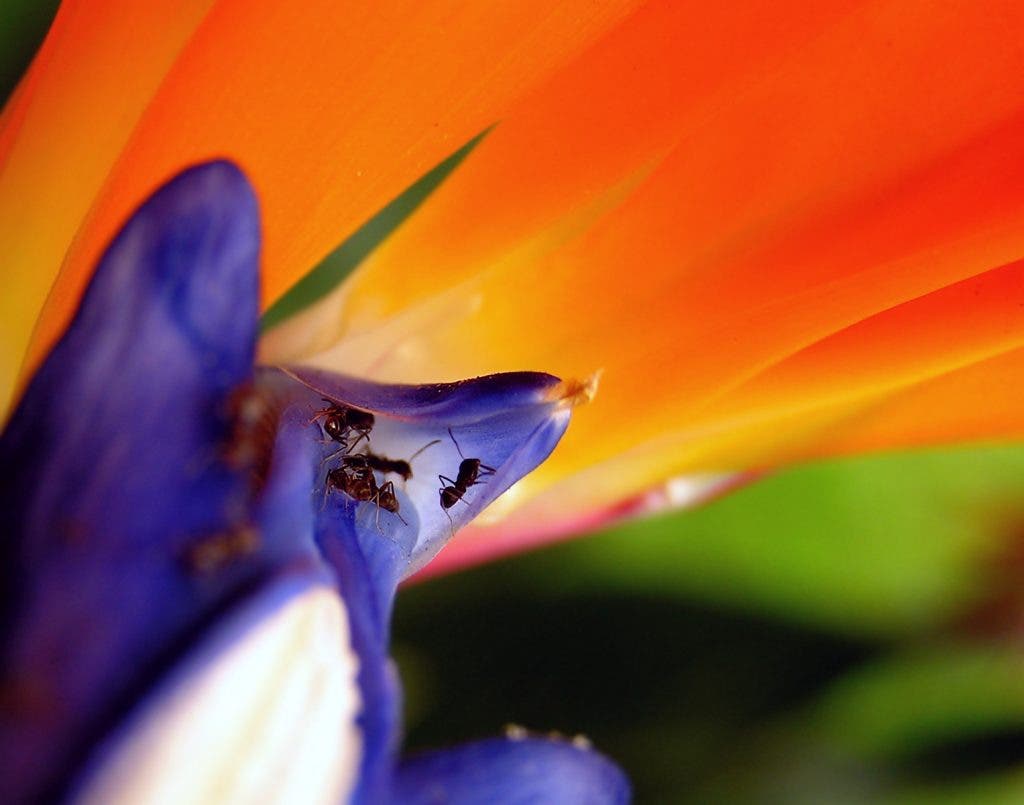
If you’re working with subjects that only have a small splash of color here and there, but are actually quite colorful, then try this tip. Increase their presence in your photo by placing in your background or foreground, and photographing your main subject with a shallow (fast) aperture.
The blurring effect (also know as bokeh) will naturally increase the presence of that color in your image frame, giving you a lot more color to work with.
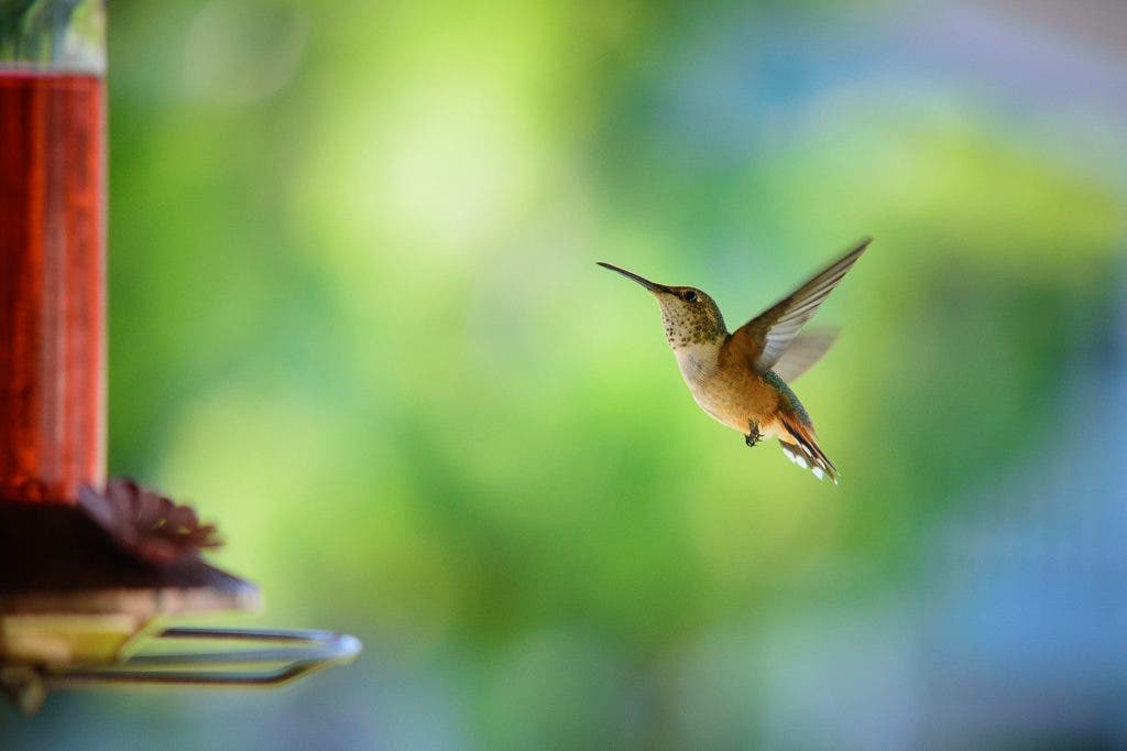
This tip is universal and goes beyond color. Always pay attention to how your foreground frames your subject, of course, but also notice how your subject is framed against your background.
When most photographers think of framing, they only imagine strong foreground elements around the entire edge of the image. However, the background — especially with a splash of color — can help “frame” and emphasize the subject.
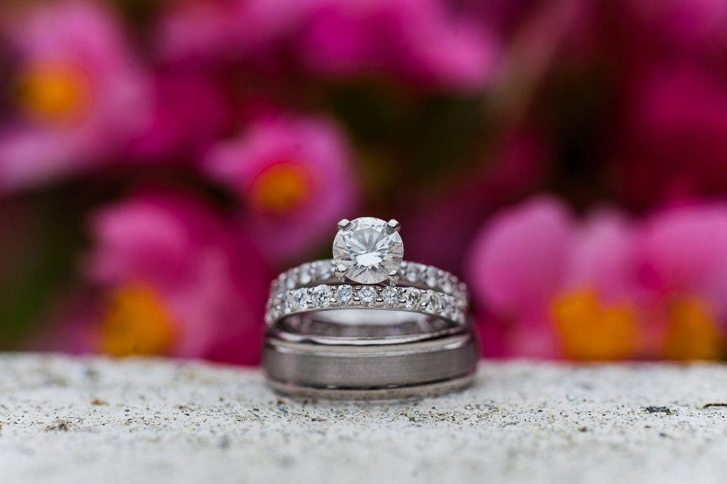
Alternatively, if you simply want to incorporate a strong, vibrant background for a subject that doesn’t have much color, using bokeh will be a must.
Use Exposure to Enrich Certain Colors
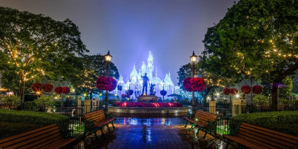
Here’s something you may not even notice every time you’re enjoying some colorful, vibrant photography and yet, it’s almost always present. I’m talking about the use of a darker (or brighter) exposure, to increase the apparent saturation of a scene.
This may not make sense because, for example, when you lower your exposure, you’re not adjusting any colors differently than the rest of the image. Neither are you touching the saturation of the whole image, let alone a particular color.
Still, this is the way colors often work. Some colors, usually greens and blues, appear more rich and vibrant when they are a bit darker. I’m not talking about making them totally under-exposed, of course. Usually, all a color needs in order to pop is to simply be a bit to the left-of-center on your histogram.
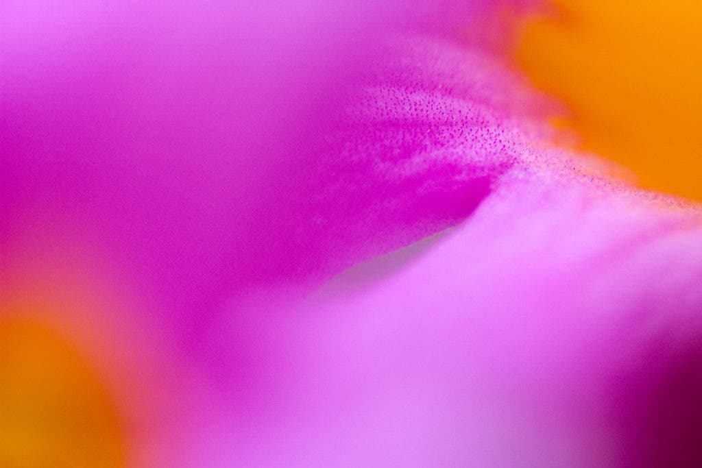
Oppositely, warmer colors such as red, orange, yellow, or pink can look gorgeously saturated when they are bright. Then again, in the above photo, note that the lighter areas are slightly less saturated than the darker ones. The simple explanation here is that saturation will always be lower when a color gets bright enough that it’s close to white.
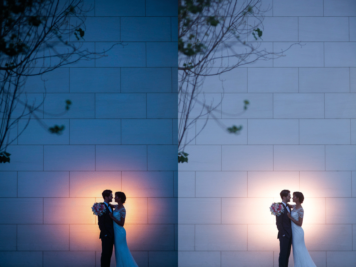
Last but not least, contrast will always enhance colors. In the above example, not only did I darken the exposure by about ½ EV, I also bumped up the contrast by +25.
Understand the Color Wheel
This is something a little more advanced. However, it’s still very easy to grasp once you practice it a few times. So, here’s the basic premise: Have you ever noticed that certain colors just seem to be in harmony with each other, while other colors tend to “clash”? There is actually a whole theory behind it, and of course, it’s simply called Color Theory.
Start by studying this wheel, which is arranged basically like a rainbow, with the color magenta/violet unifying the circle.
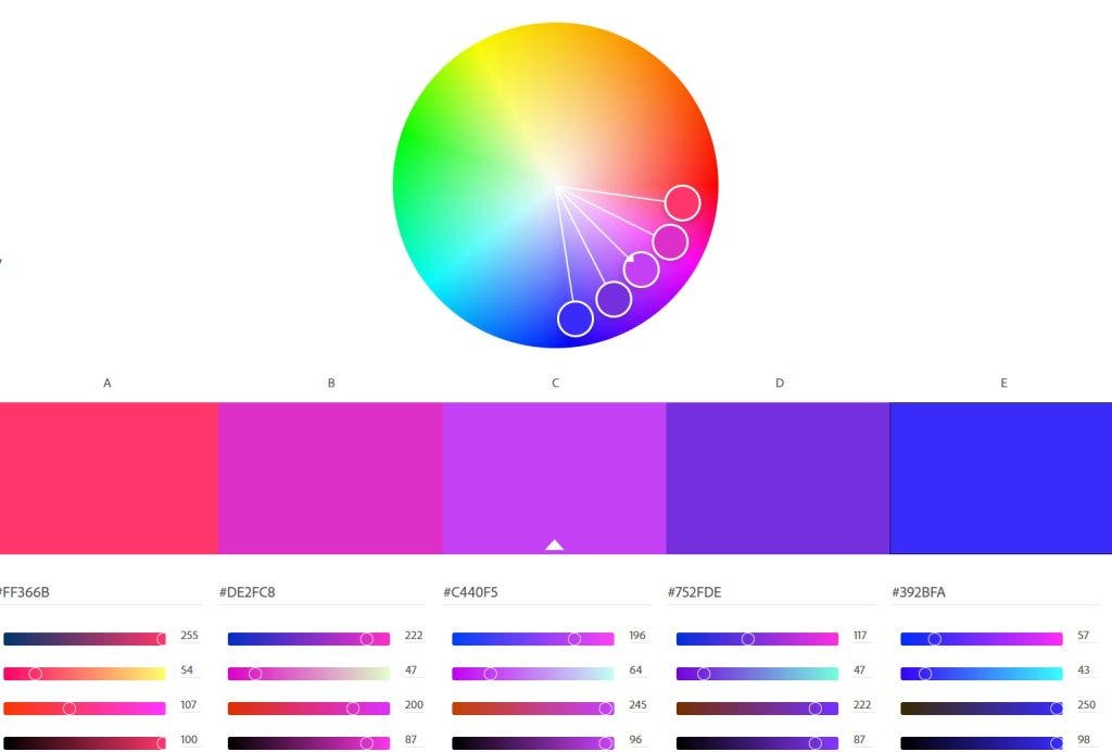
Analogous Colors
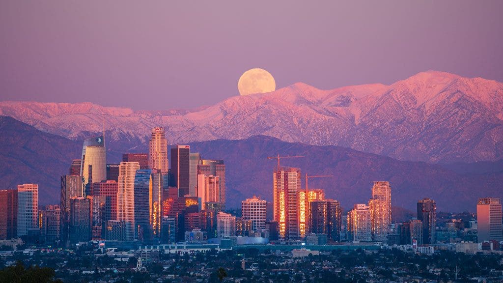
Next, look at the array of five colors selected from that range. They’re from within the same quarter of the circle, as you can see. This is why they seem to go together well in an image, even though when you look at them separately, they look nothing alike. These are called analogous colors.
Complementary Colors

Complementary colors, as you can see below, are two or more colors that are exactly opposite each other on the color wheel. That is why they go together well despite being literal opposites!
The good news is, you don’t have to try very hard to find these types of color schemes in real life, because as you might imagine, a lot of people are already using the color wheel to pick which color to paint their house…or their fighter jets.
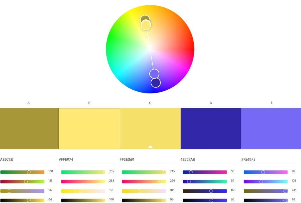
You can learn more about this at How to Use Complementary Colors in Photography.
Split Complementary Colors (Triad Colors)
This one is very exciting to capture when you see it in nature. The mechanics of split complementary colors, or triad colors, should already be self-explanatory just by looking at the color wheel!
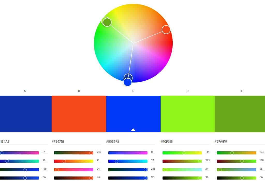
There are a few other official color scheme theories, and you can use the above tool on Adobe’s Color Wheel website to explore them all. I bet you will start seeing color harmony almost everywhere you go!
Understand HSL and Color Grading
Next, let’s tackle two similar advanced subjects. The first is Hue, Saturation, and Luminance, also known as HSL to most working professional photographers who are already familiar with Adobe Lightroom. The second is color grading, which is different.
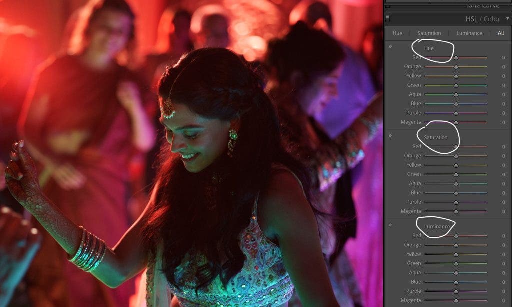
Hue, Saturation, & Luminance (Color Mixer)
HSL, also called the Color Mixer in Adobe Camera Raw, is a tool panel that lets you manipulate specific colors individually. Say, for example, you want to remove a green color cast from someone’s face. Simply go into the Saturation section, and drag the green slider down. It also helps to drag the two adjacent sliders a little bit as well, to avoid any abrupt color posterization effect in the tones of that color.
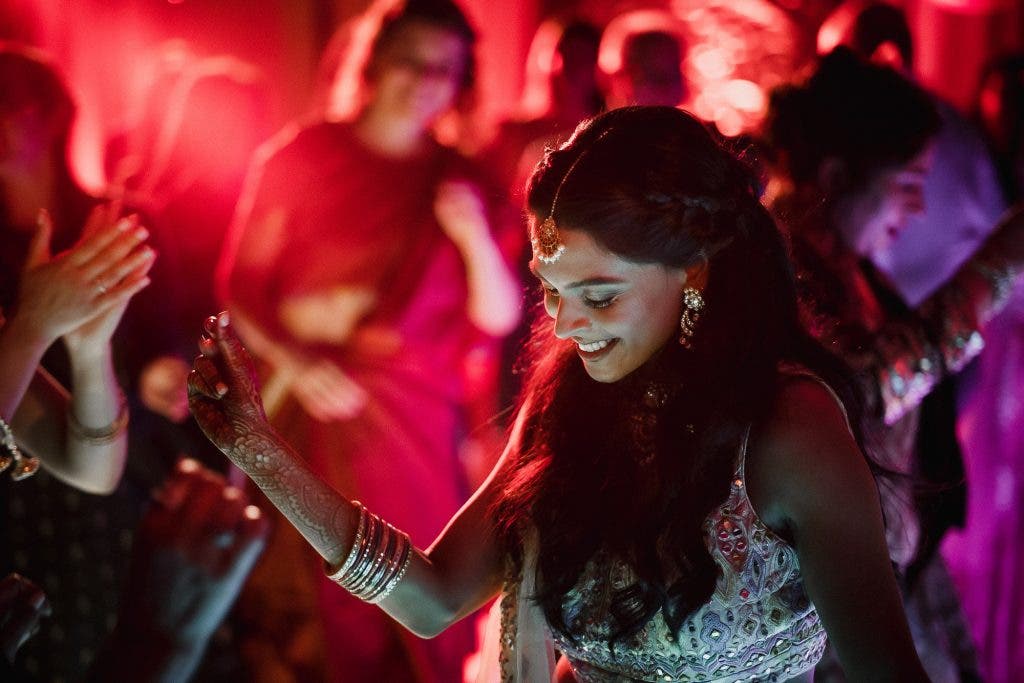
Additionally, you can adjust the hue of each color, to take whatever green does remain, and push it in a direction that is more flattering to skin color. This takes a lot of practice in the Hue section, but it’s worth the learning curve.
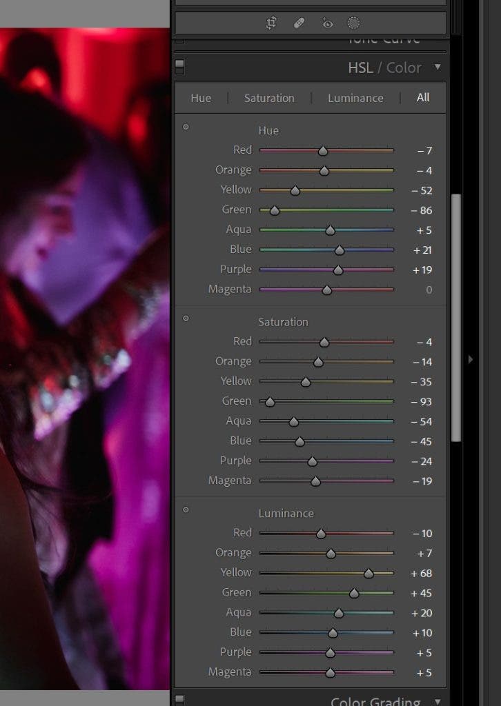
Last but not least, you can lighten or darken specific colors using the Luminance section. To better understand what is going on with all of these adjustments, simply look at the final image above. Compare it against the before image, and then study all of the adjustments below. This edit was performed entirely with HSL adjustments.
To view all three sections of HSL at once, click on the “All” section at the top-left of the tool panel tab.
Color Grading (Formerly Split Toning)
So, HSL allows you to take a specific color and manipulate it three different ways. What is Color grading, then? Color grading, which was previously known as Split Toning for Lightroom users, allows you to manipulate all colors at once, separated into highlights, shadows, and midtones.
This is a more stylized way of adding color to your images and it almost always leads to colors being a bit off, but that’s okay! As long as you apply the previous rules about color harmony, this is one of the strongest tools that is used heavily in cinematography to make a while scene seem unified.
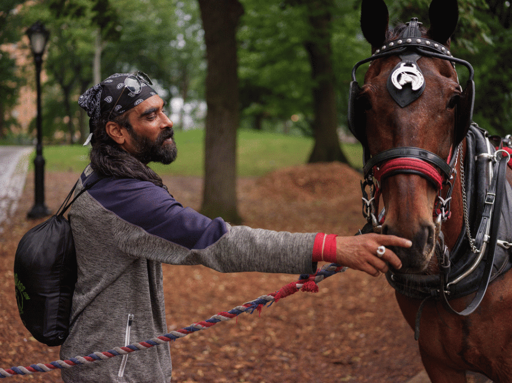
It’s highly subjective, though, and it is extremely easy to overdo it. The above image was created with very faint additions of green to the shadows and midtones, plus a faint addition of magenta/pink to the highlights. There is also a global option to color grade every tone in your image.
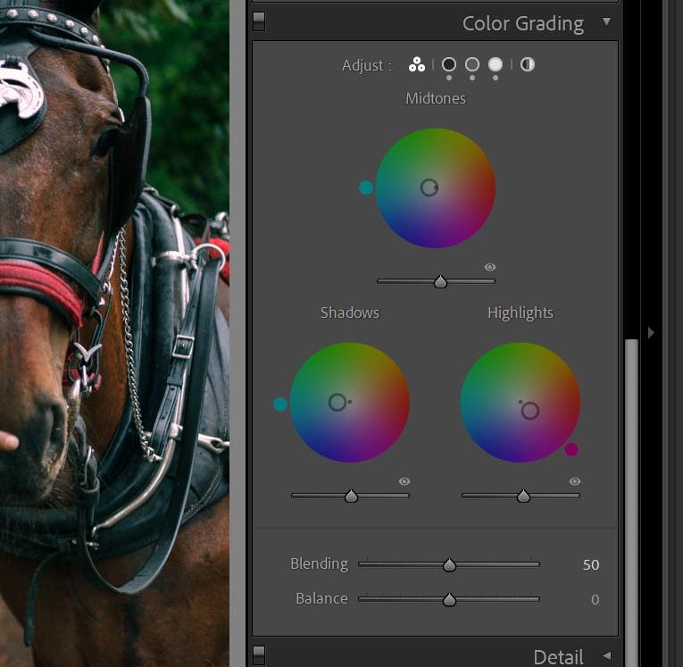
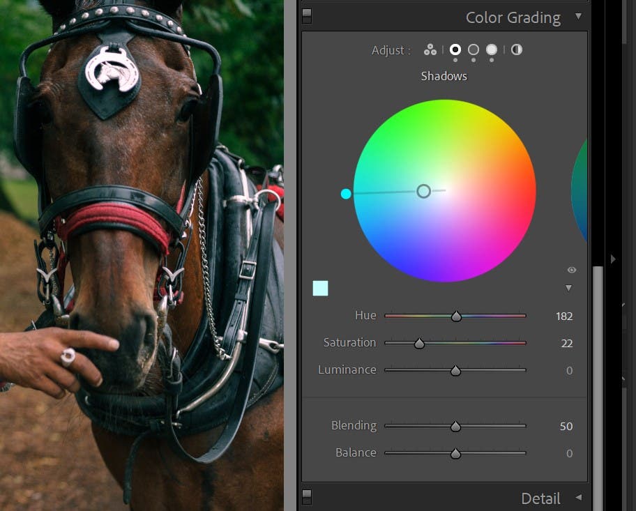
You’ll notice that, within each section, you once again have Hue, Saturation, and Luminance. There is also Blending and Balance. Blending controls the transition between shadows and highlights, and Balance will sway the results more heavily towards one end or the other.
Color Your Light
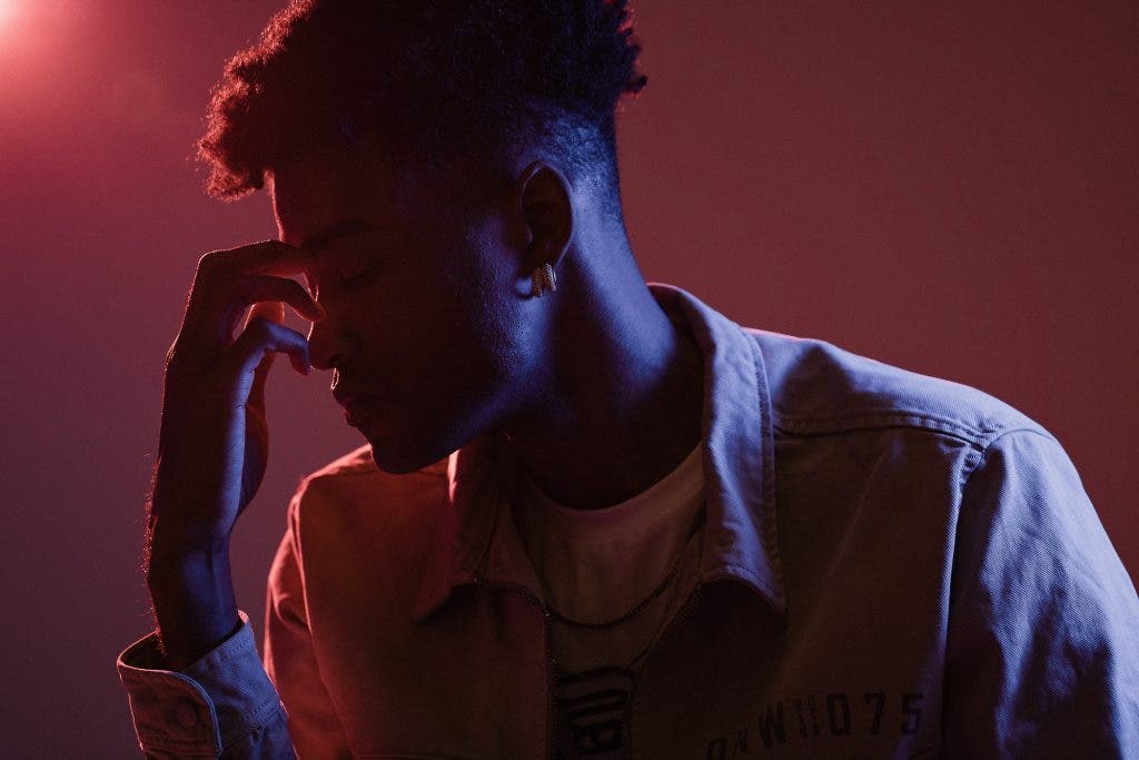
Especially true for portrait and product and other commercial types of photography, this tip opens up a whole world of creative possibilities. All you have to do is take your (daylight-balanced) flash or strobe light, and add a color gel to it! This is an excellent, simple way to experiment with virtually unlimited creative freedom.
You can learn more about this at How to Use Lighting Gels.
Just make sure you didn’t skip over the previous tips because you will absolutely need to go into your HSL tools if you accidentally add too much saturated color with a particular gel.
White Balance Improves Your Vibrant Photography Too


So often, I hear from photographers who are concerned that their white balance is not “correct”. There are even tools that can meaure the color temperature of light, and givey ou a perfectly even WB. (white balance)
Honestly, though? “Correct” is frequently the enemy of creativity. If I am photographing a giant reptile sunning itself on a hot day in the desert, you’d better believe I am going to err slightly in the warm side of “correct” white balance! When you begin to experiment, you’ll realize that white balance is a creative color tool that can enhance your color pictures.
The same goes for any situation that lends itself to a cool, blue-leaning white balance. Maybe a cold winter scene, of course.
Conclusion
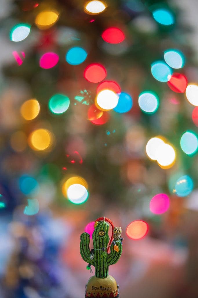
With these tips, you should have everything you need to create colorful photos. And, as promised, you won’t need to ever just crank up your saturation slider! Please feel free to leave a comment or question below.
