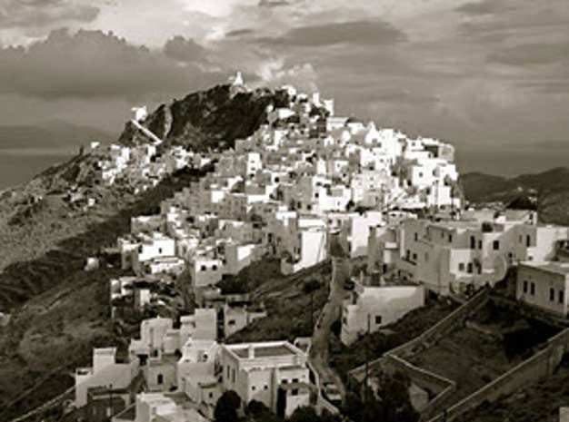
“The range of tonalities is reminiscent of the kind of result one might get on film using the Zone System.”—Mason Resnick

Photo © Tom Pappas, Moraga, CA. Canon Digital Rebel, 18-55mm kit lens with UV filter, on a tripod. Exposure: f/8 at 1/400 sec, ISO 200, overexposed 1 stop. Converted color original into black-and-white, boosted highlights by 27%.
Photographer’s statement: “Timing is everything. I was lucky to be in the right place at the right time for this shot. The clouds were also unusual for the time of year and they certainly make the shot more interesting. I also tried to capture the distant islands in the photo.”
Our critics say…
Jack Howard: This is simply beautiful and the directional light and nearly pure white sun-facing walls works exceptionally well, as does the monochrome palette. I love that there is so much depth to the background, including those islands across the water. What I’m not crazy about is all that dead, dark space in the lower third of the frame, particular in the lower right quadrant. I’d crop a good chunk of this out, going with a more panoramic aspect ratio overall which will give a more intimate feeling to being in the village, as opposed to on the edges of this tiny hilltop town.
Mason Resnick: This is a gorgeous scene and the range of tonalities is wonderful, reminiscent of the kind of result one might get on film using the Zone System. I agree with Jack that the image kind of dies in the lower right, but I wouldn’t crop it out. Instead, I’d try to bring out the shadow details. Using Diane Miller’s suggestions, working from a color original I’d mask the shadow areas and then play with the relative color tonalities in Photoshop’s Black & White Adjustment or Channel Mixer.
Ingrid Spangler: I think this is a lovely shot. I’m very fond of the light play on the sides of the white houses and how their pure whiteness contrasts nicely with the layers of color in the clouds and the distant islands in the background. The large chunk of dark, murky space in the lower right does detract from the nice contrasts and layered tones in the rest of the image and I would crop it out, bringing the village closer to the viewer.


