“This very symmetrical image almost succeeds. It is thoughtfully composed and exposed, with wonderful use of background. But little details bother me.”—Mason Resnick

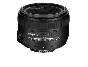
© Chris Fleck, Farmington, MI. Camera: Nikon D3, Nikkor 50mm f/1.4 lens, Nikon SB900 flash. Exposure: 1/2500 sec at f/3.5, ISO 400, Aperture priority.
Photographer’s statement: “I was shooting senior portraits for the local high school. This shot just seemed to jump out at me.”
Our critics say…
Mason Resnick: This very symmetrical image almost succeeds. It is thoughtfully composed and exposed, with wonderful use of background. But little details bother me. First is the hot spot on the ball—a bit of post processing, darkening the highlight details in Photoshop’s powerful Shadows/Highlights controls, could help. Bouncing the flash might also have softened the harshness. Secondly, the ball is out of focus. I would have shot at f/5.6 or even f/8, and used hyperfocal distance so both the face and the ball are sharp while the background stays soft. Finally, I wish I could see more of his face!
Jack Howard: Nice sportrait overall…but a few things could have made it even stronger by simply moving or recomposing the image just a tiny bit so that the elbows don’t get cut out of the frame and the scoreboard doesn’t wear like a hat on the goalie’s head. Nice focus in the eyes, and nice environmental study by balancing the lighting to pop the face and include the net and field background. As it is I’d give it a A- if we were to be using school grades.
Monica Cipnic: I like this photo because it tells a story about this senior’s sports interest and how he wants to be portrayed. I like the inclusion of the net & scoreboard as the background (I don’t have a problem with the centering of it) and that the subject has strong eye contact and position in the frame. Also, the graphic elements and colors reinforce a strong composition– the yellow, orange and red horizontal lines on the field, the brown fence, the orange net, the white stripes on his uniform, the position of his arms and the blue ‘X’ on the ball. I agree that the one improvement, would be taking down the hot spot on the ball.
What do you think? Leave a comment!


