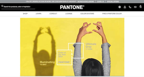
Each year, Pantone selects the “Color of the Year” as a trend forecast of the colors you can expect to see in graphic design, interior design, fashion design, and more! Pantone says the color is chosen because it’s “a color snapshot of what we see taking place in our global culture that serves as an expression of a mood and an attitude.”
I use this chosen color as inspiration to plan some thematic shoots and to stay on top of new trends. Not only does this help me start the new year with a great springboard for a colorful idea, but it also helps me produce images that will be “SEO friendly.”
In other words, when an art director, graphic designer, or art buyer searches for “Pantone Color of the Year,” I want my images to come up! Even if this doesn’t necessarily get me hired for a shoot right away, it keeps my work (and my brand) in front of artistic decision-makers. Here’s how this year’s shoot went:
This year Pantone selected two colors; Illuminating Yellow and Ultimate Gray. The combo gives strength and warmth when paired together. Looking at the company’s reasoning behind the choice makes a lot of sense; we are all craving something stable and strong, but also uplifting and warm. You can read more about the selection of this pairing and thoughts behind the choice on Pantone’s website.
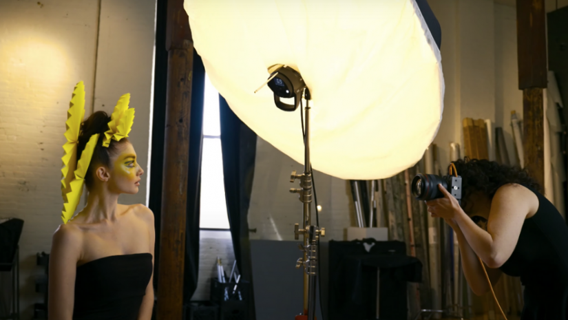
For my Pantone-themed shoot, I decided to keep it simple with one light and a DIY headpiece. Extravagant doesn’t always mean better; often simple will do the trick!
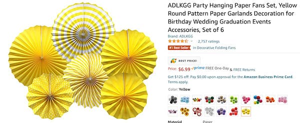
I started searching online for yellow objects that could inspire a fashion shoot. I love looking at everyday objects while trying to envision how they can be “reborn” into something new—a tablecloth into a dress, a wall decoration into a headpiece, and so on.
In my searches, I found affordable bright yellow decorative fans that I instantly envisioned becoming a beautiful headpiece with texture and layers.
On the day of the shoot, my incredibly talented hairstylist manipulated the fans to fit into the hair in a way that created a really beautiful composition around the face. I love working with talented people who take my vision to the next level!
The makeup artist then brought the yellow further into the concept with bright yellow highlights on the subject’s face and details of the ultimate gray color on the eyes. I decided upon a Savage Universal Fashion Gray seamless paper background to further bring the gray into the scene.
Once the look was completed, it was up to me to bring it to life through my lighting, posing, and composition. For this one light setup, I used a Profoto D2 and a Profoto Deep White Large Umbrella with diffusion to create a very soft light source.
My first instinct was to go for something that was flat-lit and high-key (minimal shadows) because yellow is such an upbeat color. I changed my mind, however, because I felt that the gray background called for a bit more sculpting and shadows on the subject.
Placing the light off to the right-hand side of the frame added a bit more dimension to both the face and headpiece. I brought the light source in close to the subject to create very large catchlights and an extremely soft quality of light on the face.
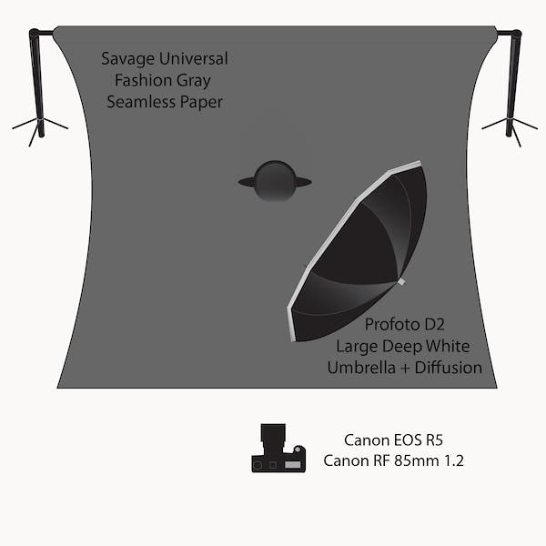
Originally I had the subject more than twice the distance from the background but at the further distance the gray became too dark. I brought both the subject and light closer to the background, allowing more spill light from the umbrella to kick light (and therefore separation) onto the seamless paper. Don’t forget how powerful the inverse square law can be! I was able to lighten the background without adding another strobe.
The final piece of the equation was my color grading (how I adjusted color, tone, contrast, exposure, etc). I decided to target the skin tones to desaturate them, leaving primarily just the yellow of the makeup rather than the yellow/orange of the skin. I dramatically increased the contrast of the image, creating even brighter highlights and a bit more saturation. Lastly, I adjusted the exact hue of the yellow to be more closely in line with the Pantone Color of the Year.

The setup was simple, and the styling was inexpensive, but it was a great way to start off the year in line with 2021 trends! I think the shot looks both warm/welcoming and strong… just like Pantone intended! Be sure to catch the full behind-the-scenes video on Adorama TV.
Creative Team:
- Photography Lindsay Adler
- Video Samuel Bouret
- Hair Linh Nguyen
- Makeup Lijha Stewart
- Model: Monica Ollander
