Is there a disturbing difference between what you see on your monitor and your prints? Here’s how to fix it.

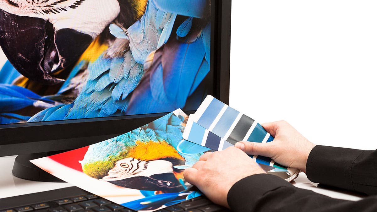
Is your color accurate from monitor to print? Shown: X-Rite Eye-One Scanner Test Chart.
Discrepancies between what we see on our monitor and what we print have always been a frustrating problem, but it is one that can be solved with some understanding of the situation. Everyone has different standards and perceptions, and some people may be happy enough with their monitor and prints without doing anything special. But if you want the best results, and especially if you are contemplating the purchase of a new monitor, here is some important information.
First, it’s important to think about the problem correctly. The goal isn’t to match the prints to the monitor or the converse. The goal is to make sure both the monitor and the prints reflect, as accurately as possible, the information that is actually in the digital file. This is achievable by straightforward means; trying to fudge either the monitor or the printer settings is the wrong approach and won’t yield good or consistent results.
A two-step process
I wrote two tutorials on this subject in 2007, one on printing and one on monitor calibration. The basic premise of those tutorials is still very relevant. In printing, utilize soft proofing and use the correct settings in the printer driver. And calibrate and profile your monitor. Calibration can’t be fudged with the monitor’s contrast and brightness controls; you need the software and hardware of calibration packages.
The software takes you through a two-step process of calibration followed by profiling. (The process is often simply referred to as calibration.) The first step sets the monitor to a standard state of brightness, contrast, gamma, and white point. Calibration is then followed by profiling, in which a series of colors are displayed on the screen and read by a colorimeter.
Measurement is made of the degree to which the colors differ from what they should be, and a color correction ICC profile is written. The calibration settings are loaded by the operating system when the computer boots up and the profile is used by the video card in programs that are color-managed, such as Photoshop and similar applications designed for serious imaging work.
A case study in calibration
Do you really need to calibrate and profile? Only if you believe what that has been written about color management from the beginning, by pioneering giants such as Bruce Fraser, Andrew Rodney and Martin Evening, and has been repeated in hundreds of internet articles.
One of my Photoshop students recently had a problem printing an image of a vase of flowers against a dark background. The image on the monitor showed a lovely gradation of dark gray tones becoming lighter as they went up a wall, from a tabletop draped in black, but the print came out with blacks as dark as the tabletop extending up the wall. He thought the problem was with the printing, but he was using the correct settings.
When I looked at the histogram I saw that the dark tones were heavily pushed up against the left wall. There were some true blacks in the image, but the histogram looked too biased toward the darks.
I asked if his monitor was calibrated and he said yes. But it turned out that it had been calibrated for him several years earlier and he had neither the colorimeter nor the software, although the profile was on the computer. I had him get a calibration package and we re-did it. It is interesting that the outward appearance of the monitor wasn’t noticeably changed but when he opened the problem image in Photoshop it looked horrible; it was an exact match to the print. Fortunately, he was using adjustment layers and all we needed to do was back off the slider in a Levels layer to make the image look and print as it should.

Samsung 2243BWTTA 22-inch LCD monitor. LED backlit LCDs are brighter than previous generation CCFL LCD displays. That’s not necessarily a good thing for photographers.
He had never noticed the problem before. His previous prints had probably not contained the prominent gradation of dark tones that this image did, and the monitor had probably drifted over time. But calibration can make changes that may appear subtle on some images but may be very dramatic on others. I imagine if he opened older files he found the need to tweak some that had been adjusted with the bad monitor settings.
Monitor Viewing angle
In order for a monitor to accurately display the digital file, the image shouldn’t change with reasonable changes in your viewing angle, and monitors suitable for digital darkroom use have a wide range of viewing angles. The image on many consumer-level monitors can vary significantly as the viewing angle changes, with the image becoming lighter or darker. As you sit in front of a monitor, move your head up and down by 6-8 inches or so, or tilt the monitor a corresponding amount. If the screen becomes noticeably lighter or darker you would need to be sure your viewing angle is correct.
With these monitors, your line of sight should be 90 degrees to the surface of the monitor, but can you be sure that’s the angle you are consistently using? (Do your grandchildren use your computer? Is your chair’s height adjustable?) The horizontal angle is easier to keep at 90 degrees, but we are used to adjusting the vertical angle (tilt) of our monitors so it is less obvious than the horizontal if it is off. I have seen monitors where the acceptable vertical viewing angle was less than 15 degrees, but the manufacturer’s specs showed it in the range of 140 to 160 degrees. Don’t rely on the specs; find one and try this simple test.
I am puzzled why the Dell web site doesn’t list their excellent Ultrasharp monitors as accessories for the high-quality Studio XPS computers they present for digital media work, because in my experience their lower-end monitors have a significant vertical viewing angle problem and the Ultrasharp’s don’t.
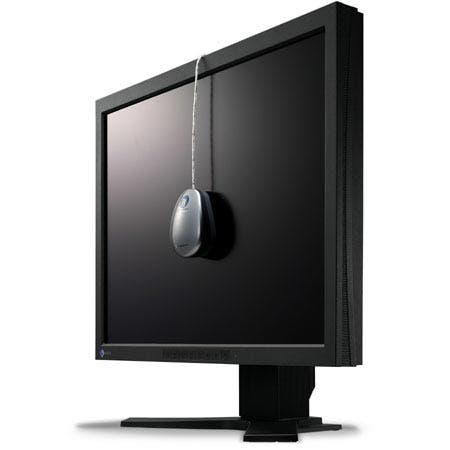
X-Rite’s Eye-One Display is one of several complete monitor profiling kits available now.
The alphabet soup of monitor types
In the old days, back in the last century, we had CRT (cathode ray tube) monitors. Then along came flat screen LCDs (liquid crystal displays) which were backlit by CCFL (cold cathode fluorescent lamp) tubes standardized to a 6500K color temperature. Older ones could only display the sRGB color space, but some new ones now display the larger Adobe RGB color space, and some go beyond it. More recently we have seen the introduction of LED (light emitting diode) backlit LCD monitors, of two types: RGB LED and White LED.
RGB LED backlit LCD monitors are high-end products targeted for advanced professional graphics use, with color gamuts significantly wider than Adobe RGB. They are expensive and are often sold with their own profiling software and colorimeters.
White LED backlit LCD monitors are targeted for home and office use and are brighter than previous generations of CCFL LCD displays. They employ colored LEDs filtered with a dye of the complementary color to emit white light.
Brightness
Many recent monitors are much brighter than older ones and are high in contrast. They look striking and can be an advantage for home and office use in a brightly lighted environment, but excessive brightness is a disadvantage for digital darkroom use. If printing is any part of your workflow, either in your own studio or outsourced, the accepted recommendation is that the luminance of your monitor should be adjusted to match the brightness of white paper under standard illumination, 90 cd/m2 and 6500K color temperature.
If the monitor’s display is very bright relative to the room light, you may be adjusting your images down in brightness and your prints (which will reflect the true information in the file if you are printing correctly) may be too dark or dull. Of course, your perception of the brightness of the monitor depends on the brightness of the room light. Digital darkroom work is best done in a “dimroom” and in that case a very bright monitor will be hard on your eyes as well as misleading. In this case, a monitor with luminance adjusted down to the recommended standard will look good.
Apple iMacs, MacBooks and Cinema displays present a problem with luminance adjustment. In order to adjust white luminance it is necessary to use the ColorEyes Display Pro software, which I understand can interface with the Apple video hardware. None of the other calibration packages have this capability.
Gamut
Many newer monitors display the Adobe RGB (1998) gamut, and that is ideally what you should have if you are using the Adobe RGB working space in your digital darkroom software. Older LCD monitors typically displayed a smaller gamut, matching the sRGB color space. If you are only working with JPEGs out of the camera, this is sufficient, as JPEGs are limited to the sRGB gamut. If you are shooting in raw and wish to take advantage of the color range your camera can capture, you should be using the Adobe RGB space, or the even larger gamut of ProPhoto. Some expensive monitors exceed the Adobe RGB gamut significantly and are desirable if you are using the ProPhoto working space. But working with a high gamut has pitfalls unless you have an advanced understanding of color management.
I just want a decent monitor…
Most monitors are targeted for home and office use and are not the best for digital darkroom work. I follow David Brooks’ column in Shutterbug Magazine and his blog and I have found much useful information there, as he reviews monitors suitable for the digital darkroom on an ongoing basis. He has recently recommended the 24” Dell Ultrasharp U2410, the NEC Spectraview II line, and the Multisync 90 and P series. These all display the Adobe RGB gamut and he has found they calibrate well.
The Eizo Color Edge and Flexscan series are also highly recommended. (Some Eizo models have a significantly wider gamut than Adobe RGB.) There are probably other good monitors but this is the best information I have.
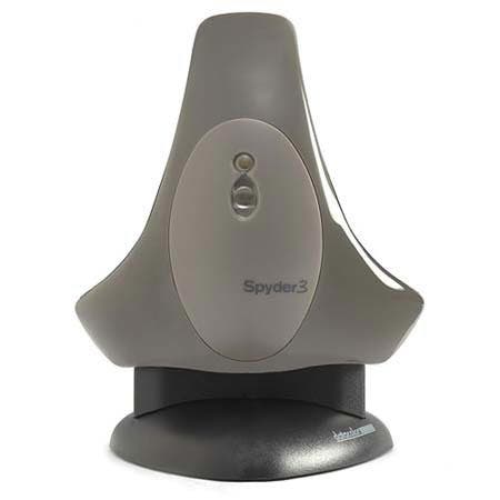
Datacolor’s Spyder 3 Pro calibration hardware.
Which calibration package do I need?
Calibration devices and software have evolved in recent years with the advent of new types of monitors. Older colorimeters were filtered to match the sRGB color space and won’t give correct results with the newer Adobe RGB gamut monitors. Make sure you have a suitably recent product to match your monitor. (All are backward compatible.) And, of course, the colorimeter needs to be matched to the software. You need to upgrade both together.
The major manufacturers of monitor calibration packages for the home user are Datacolor (the Spyder series ), X-Rite (the i1 series, PANTONE Huey and the ColorMunki) and Integrated Color (ColorEyes Display Pro). All these products are of excellent quality. The first two have several price levels of packages with varying capabilities.
The more expensive packages may include features you don’t need, such as printer profiling and projector calibration, and the ability to customize calibration settings beyond the defaults. The accepted standard is to calibrate to a color temperature of 6500K, a gamma of 2.2 (for both PC and Mac platforms) and a luminance of 90 cd/m2 and these will be the default setting in all the packages. But some of the less expensive packages may not do everything you need, such as luminance adjustment. Check the details.
Datacolor’s latest Spyder3 products support the wide gamut color spaces of current monitors, but the Spyder3 Express software does not adjust monitor luminance. The Pro does, but somewhat cryptically. You have luminance choices of Native, CRT and LCD. You need to choose CRT (even though you have an LCD monitor) to get 90 cd/m2. The LCD choice will give you 140 cd/m2. The Elite package gives you these same choices, showing their numeric values, and also lets you set any numeric value, which most home digital darkroom users would not need to do. It also gives a more precise profile compared to the Pro product, but this level of precision may be beyond the needs of the serious home user.
The latest X-Rite monitor calibration products are the i1Display 2 (which has Easy and Advanced modes), the i1Display LT, the ColorMunki, the PANTONE hueyPRO and the new i1 Basic Proi1Photo Pro. ColorEyes has only one package, Display Pro, which is used with the Spyder3.
Some of the colorimeters include ambient light measurement sensors that will adjust the brightness of the screen as room light changes. If you have no way to control your room lighting this could be a good feature, but the best option is to control it with window coverings.
Some high-end monitors come with their own calibration software. Some come with an optional colorimeter or you may be able to use a recent third party unit. Check their documentation.
Other issues
Some laptop screens may not be able to be calibrated properly, and older or very inexpensive computers may not be able to use a profile. Apple laptops will need the ColorEyes software mentioned above.
There is a problem with Windows Vista, which loses the calibration each time a message comes up on the screen asking you to confirm authorization for certain actions. Vista dims the screen when this message is presented and the calibration is lost until you re-boot. The problem has been fixed in Windows 7, but only if you utilize a switch to turn off the warnings.
Another issue with Windows is a utility called Adobe Gamma. If it is in your Startup file it will be loaded on startup and override your calibration settings. Simply go to Start > Programs > Startup, right click the Adobe Gamma Loader and click Delete. (If it’s not there, don’t be concerned.) Don’t be nervous about doing this. It only turns it off as a startup item; it does nothing to what is installed your computer.
New operating systems always have issues and some of them can affect color management. Check on the compatibility of your digital darkroom products; it pays to wait a while before leaping into an OS upgrade.

