The goal of scrapbooking is to make pages that are appealing to anyone who picks up the album, even if they don’t know the people pictured in the photographs. The other goal is to make each page tell a visual story. Let’s get started!
It’s time to have some fun and start making those eye-catching scrapbook pages. That’s one of our goals: to make pages that are appealing to anyone who picks up the album, even if they don’t know the people pictured in the photographs. The other goal is to make each page tell a visual story.
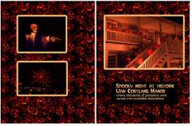
So get out your photographs. No, wait. Decide on your theme for the page and find photographs that go with that theme. In my examples, I’ve created a page about our cat’s birthday party, a page with photographs from the orchid show at the New York Botanical Gardens, and a two-page spread about the “Blaze” exhibit that featured 4,000 carved pumpkins at a historic mansion last Halloween. But your page could simply be about going to the ice-cream store or reading a book to your child at bedtime. Actually, recording the simple everyday things are the photographs that may become most precious as time goes by.

The background color was chosen to match the color of Epson’s bow, the large dots on the background were inspired by the dots on the gift box. Mats around the photos effectively separate the photos from the busy background and the red color adds energy to the party layout. The large picture (taken by Deborah Lea Cohen) makes it unmistakably the focal point.
Selecting the photographs
Gather your photos and start selecting. You’re a photographer, so I know you have zillions of photos, especially if you’re shooting with a digital camera. Now you have to be ruthless. You want to choose good photographs, but they don’t necessarily have to be of contest-winner quality; some lesser ones may depict the emotions of the event better. But you’ll want to eliminate the out-of -focus or poorly exposed ones. And don’t be tempted to choose redundant pictures, where there is just a minor change in expression, action, or camera position.
Choose the photos that will tell your story best. Get your pile of selected photos down to no more than ten for a two-page spread (although there are attractive ways to use many more– but we’ll talk about that later). Editing out lots of photos can seem hard to do, but you can always put the extra photos in a conventional photo album.
Now look at all the photos that made it to the selected list. Just like you want to have a focal point–a main subject– when you take a photograph, you want to have one photograph that will be the focal point of the layout. This is the photo that captures the essence of your theme, or it may be the photo that is the very best one, photographically speaking. All the other photos round out the story as supporting players.
If you have one absolutely terrific photo, you may want to enlarge it and place it alone on a page. You don’t have to have lots of photographs to make a terrific layout.

In this two-page spread, the left and right pages are identical in background and matting. A busy background works because of the isolating mats around the photos. The background colors mimic the colors in the photographs. Note that the skeleton is pointing toward the center of the layout instead of pointing out of the page.
Choosing the background paper
The background paper influences the impact the page makes. Just like background music in a movie sets the mood or enhances the emotion, so does the background paper in your layout. So for a page about a fun-filled birthday party, you’ll want a vibrant paper; for the quiet beauty of a garden, a more elegant paper will work better. Colors can convey moods. Red and orange are exciting, blue and green are tranquil. Black can be dramatic. Think about the impression you want to make and try out several papers behind your photographs.
In addition to setting the mood for your page, you want the background color to coordinate with the photos. An excellent way to insure this is to choose colors that already exist in your images. When you add a mat (a piece of paper that surrounds a photograph) and embellishments, you’ll also want to choose colors that work together in a harmonious color scheme– but more about that in a future article.
What about patterned and textured papers? Or two patterns? These can be wonderfully eye-appealing, but they can compete with the photographs. There’s an easy way to avoid this: Simply surround the photographs with a mat or a border, as I have done on the “Blaze” pages. This provides the needed contrast to separate background and foreground.

A green background paper seems appropriate for a nature page. The focal point photograph is emphasized by its isolated placement and large mat.
Picture placement
Deciding where each photo should go can take some trial and error as you move them around. Placement on the page is composition– and you’ll see many similarities between composing a page and composing a photograph. For one, you want to make sure your focal-point picture is emphasized. When you take a picture, you usually try to emphasize your subject by making it relatively large. So make the focal-point picture the largest one in the layout and there’s no doubt that it is the one you want the viewers to notice first. Even if all the photographs are the same size, you can emphasize one by isolating it from the others, just as you might isolate one person from a group of people in a photograph. Another technique is to surround just the focal-point photo with a mat, as I did with the orange orchid in the “Orchid Show” page. It’s doubly emphasized by its isolation.
Scrapbook pages, with the exception of the first and the last page, are almost always seen with two facing pages. So it makes good design sense to coordinate these facing pages. It’s foolproof if you make the backgrounds identical, and you will most likely want to do that if the spread is about the same theme. As you can see, that’s what I did in the “Blaze” spread.
The two pages don’t necessarily have to be identical. You can coordinate them if you use some repetition of color, embellishments, or other features. to tie them together.. If your entire album is about a single event or theme, you’ll want to unify the pages with repetition throughout.
Repetition is good– but so is variety. One good way to punch up your pages is to vary the size – and even the shape– of your photographs. Occasionally you may want to angle them or overlap them. Arrange and rearrange you photographs before you glue them down. And don’t forget to leave space for some journaling.


